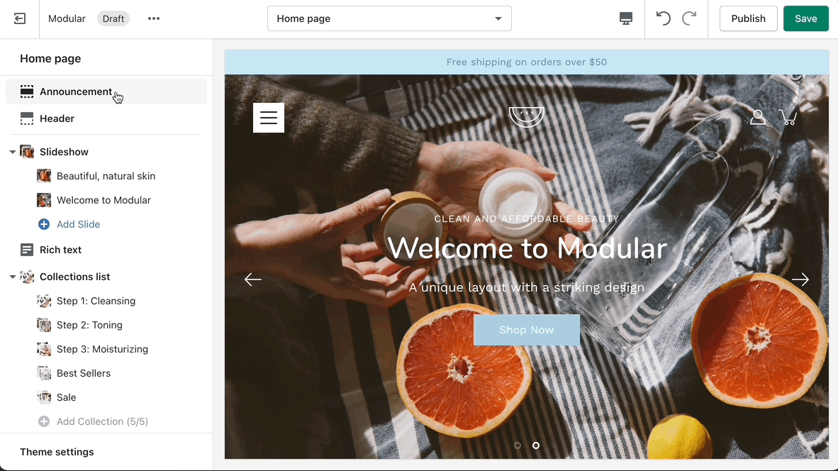
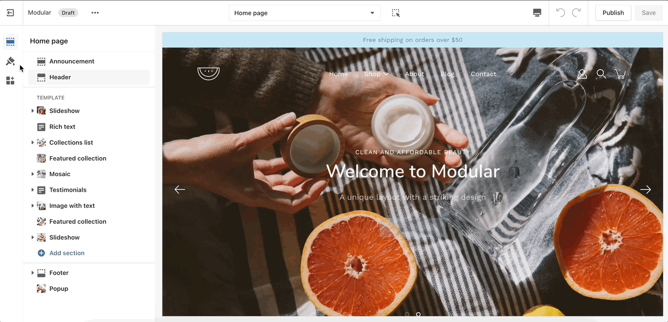
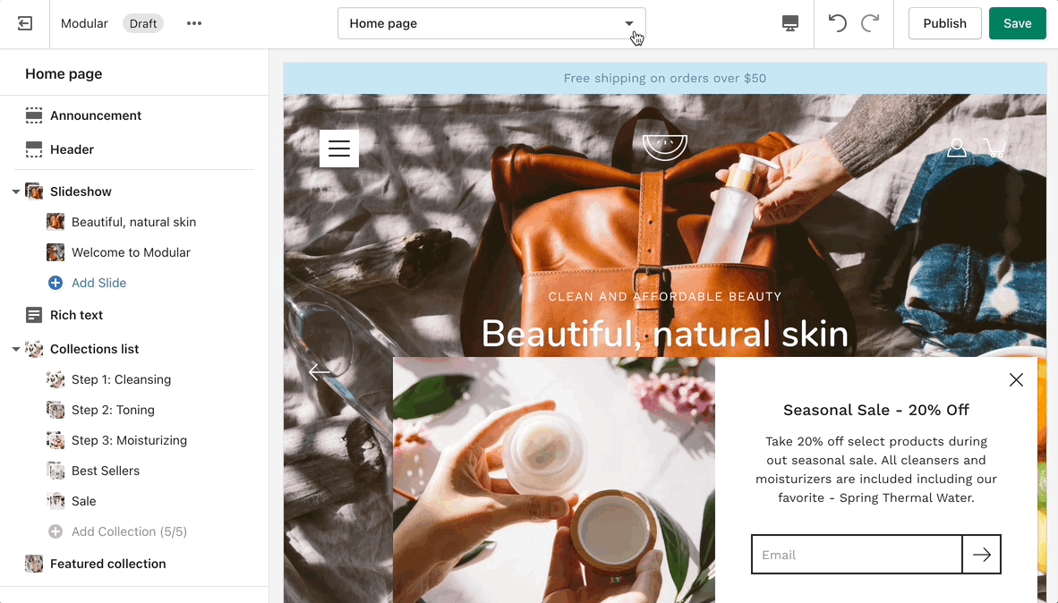
To find the primary settings for each section, click on the section name to view the settings panel. These settings control the elements of the section.
Wider desktop screens will display the settings panel on the right side of your screen.
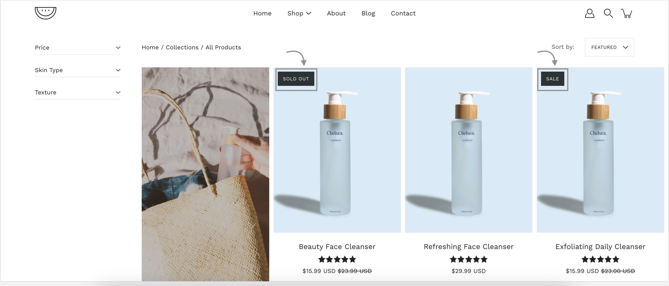
Products
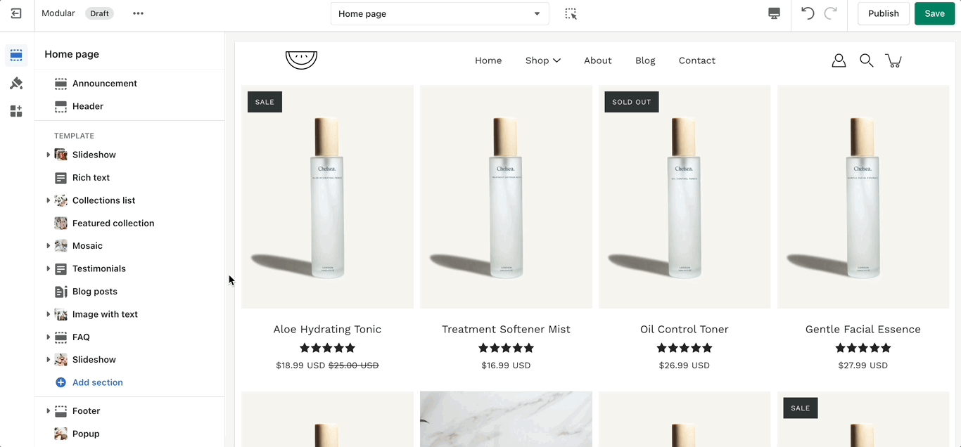
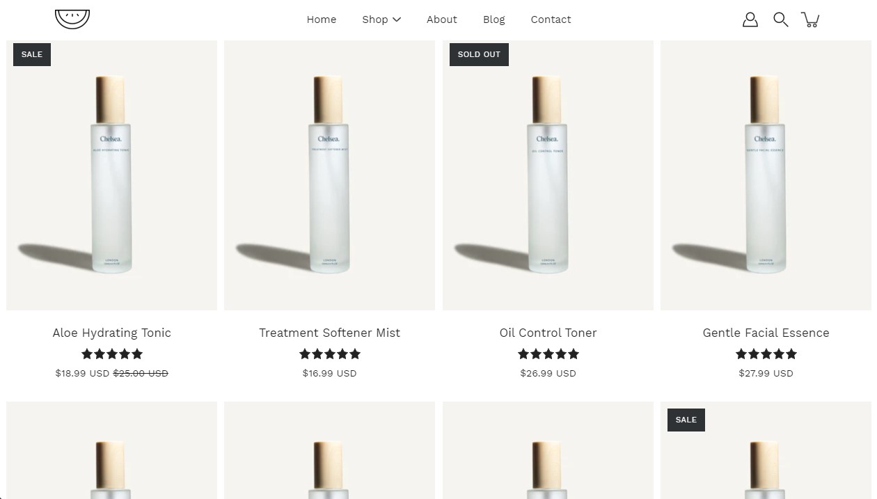
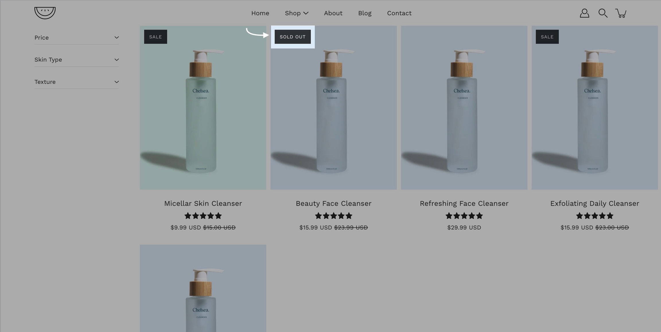
Product grid layout
A crucial and very important part of your store are your product and collection pages. There are global settings that affect both in this tab.
Most notably, you can change the aspect ratio for your product grid to make the blocks wider, taller, or square (1:1)
You can set the image to stretch across the block or to render itself in full inside of it. The latter can result in extra white spaces while the former could cut parts off. The most important thing here is to set the proper aspect ratio.
Another great option tucked away under this tab is the 'products per row'. This is split into two different settings, one for mobile and one for desktop.
Product form
Color Swatches can be toggled here too. This feature can often require additional work to be fully set up. Modular can recognize a few custom color names but not all.
We highly recommend checking out our full-length post on the topic of Color Swatches.
Quick View and Media
Quick View is a desktop-only feature. It works based on a mouse (and touchpad) event called 'hover'. This event is present on touch-based devices (at this time).
Remember, these are global settings so they will affect all pages.
To give an example, your collection page grid is linked to these settings and so is your featured collection section on the home page.
Documentation for Modular 3.1 and earlier. For the latest version,
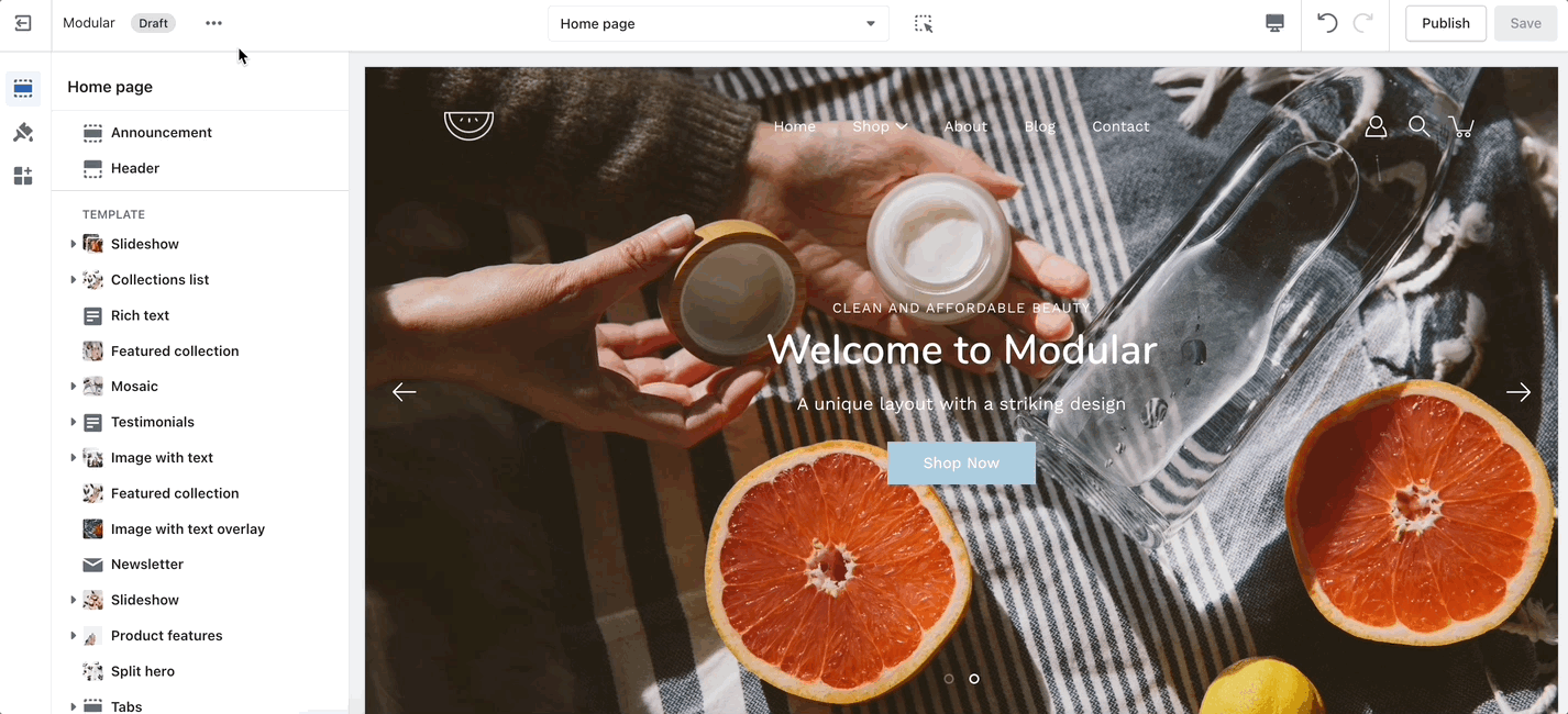
Modular is designed to showcase brand imagery in a minimalist, grid-focused design. Packed with modern sections and blocks, Modular includes a signature product grid to showcase collections and products in a statement collage-style layout.
Discover Modular and our theme documentation to help build and design your store with simplicity.
Download our Modular theme from the Shopify Theme Store:
Support
If you have questions or need additional assistance with using Modular, our support staff is here to help you by email. Reach out to us from our contact form:
Use the toggle (eye) icon next to the section title to toggle the display of the entire section:
Hide an entire section
Tip - Section blocks have toggle icons as well. Using them, you can hide individual blocks.
Be sure to select the section toggle icon to toggle the display of the entire section.
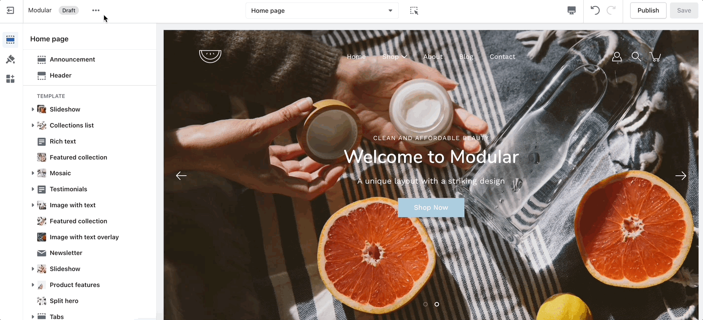
How to use sections
Customize your store using these Modular sections
About our Sections
Modular comes complete with 20+ professional theme sections to help you merchandise your online store. Sections can be added to any page on your store.
Discover the complete range of sections and their settings. Experiment by adding different types of sections and section blocks to the homepage and the other pages within your store.
These sections can be placed on any page including:
Homepage
Product pages
Collection pages and Collection list
Blog index and Blog posts
Shopify pages
404 error page, Search page, Password page
Cart page
Reordering sections
Use the handle icon (stacked dots) which is located next to the eye icon to drag a section and drop it in a new position:
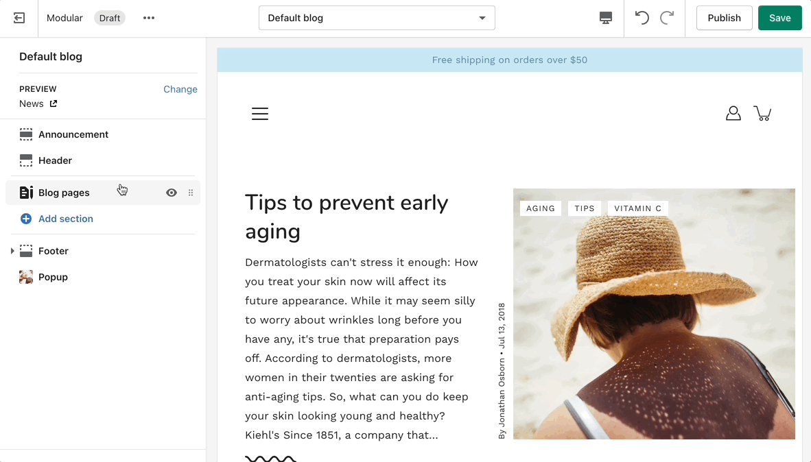
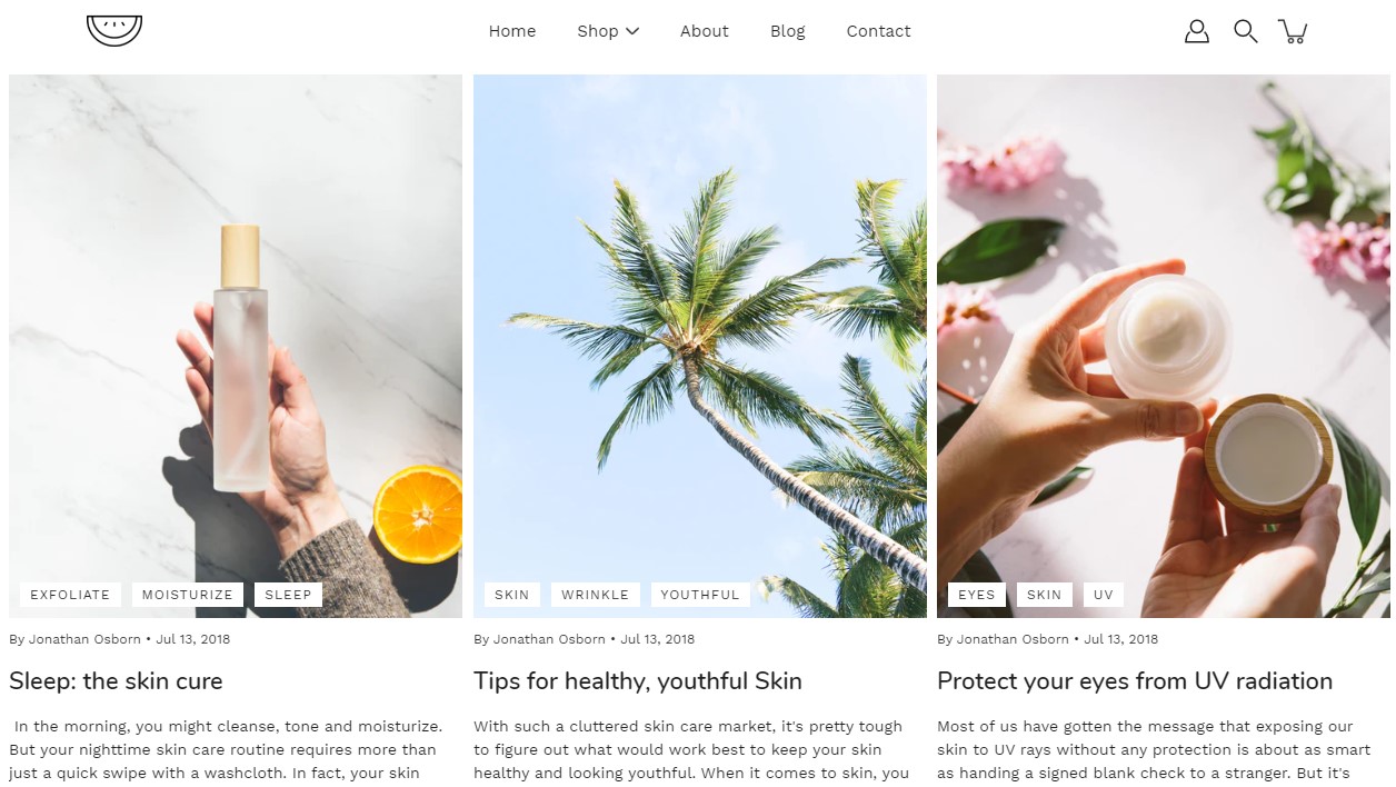
Blog posts
Showcase your recent blog posts on your store pages.
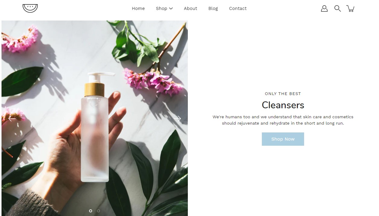
Featured collection
The 'Featured collection' section allows you to highlight a specific collection of products on your store pages. This section generates blocks with links to each product page.
Select the collection you want to highlight on your page. Choose between styles for your buttons and layout.
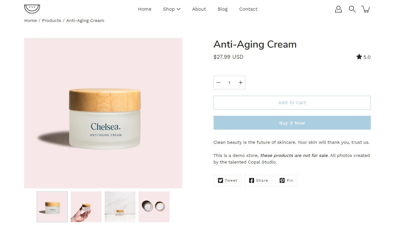
Featured product
Use the 'Featured product' section to bring a product gallery and form to your store pages.
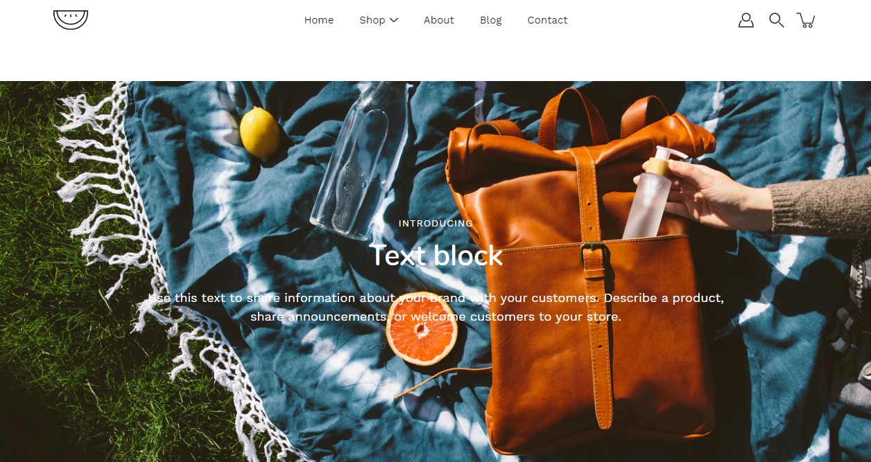
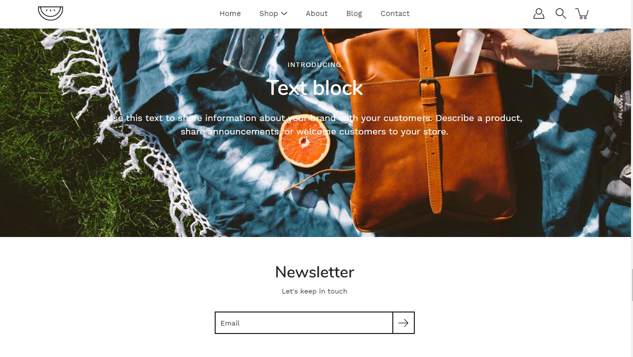
Image with text overlay
Showcase a banner image with text.
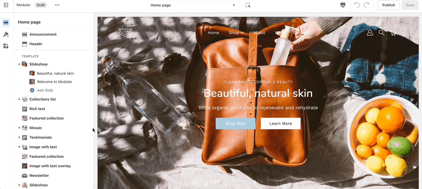
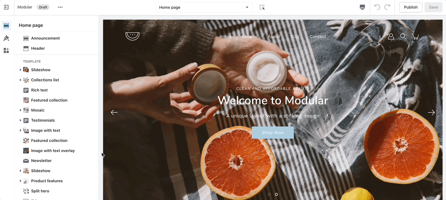
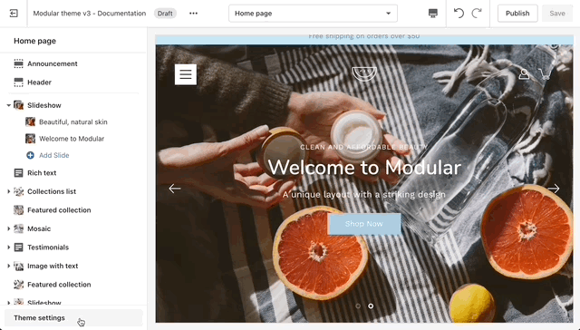
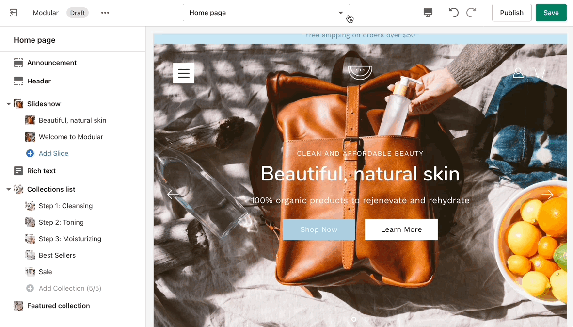
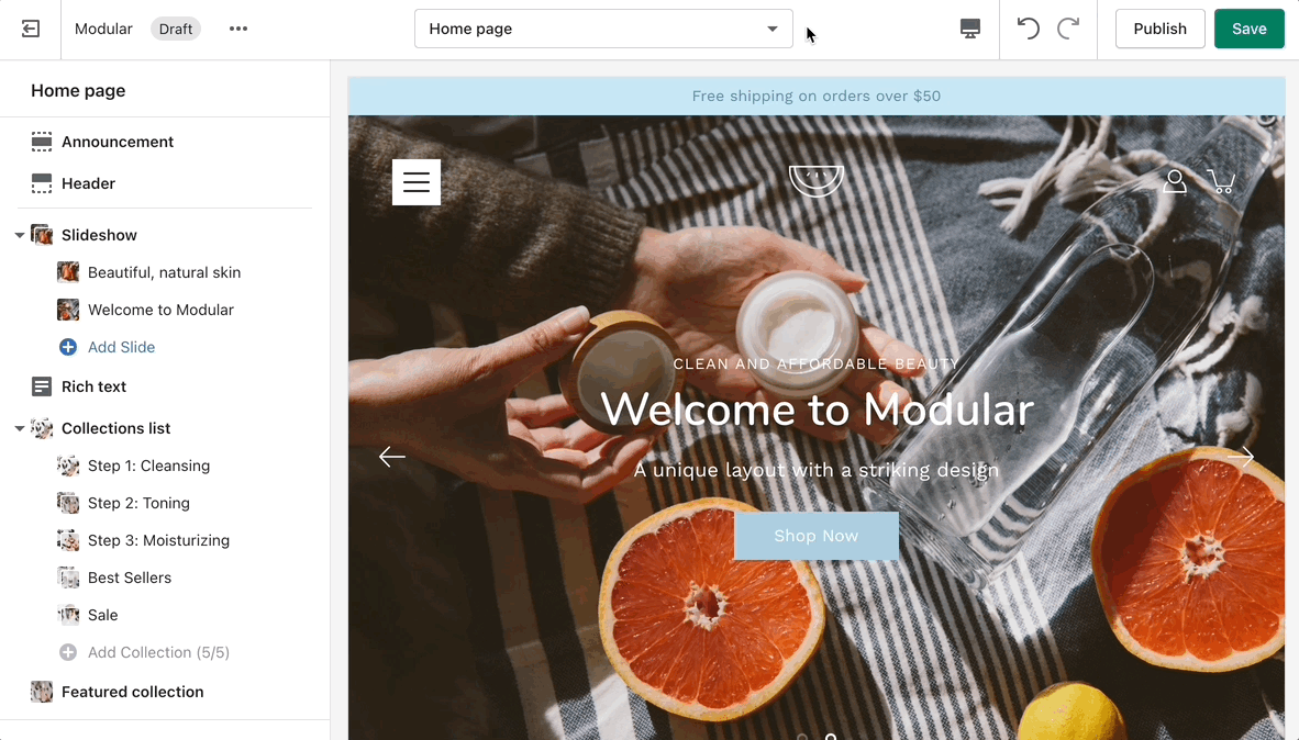
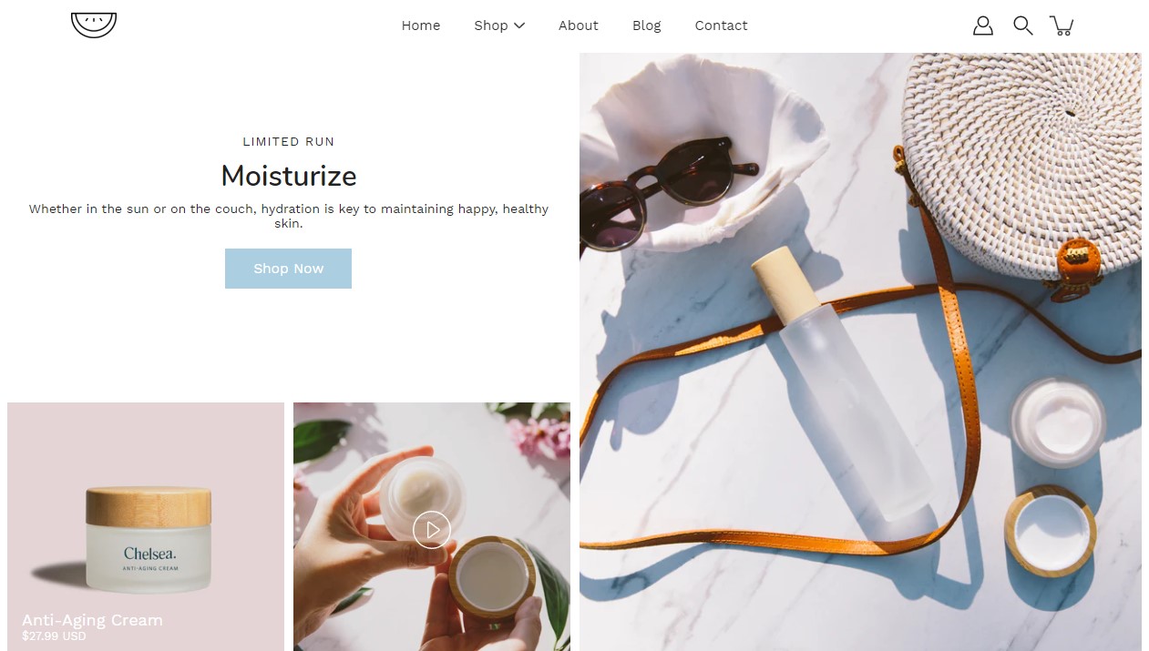
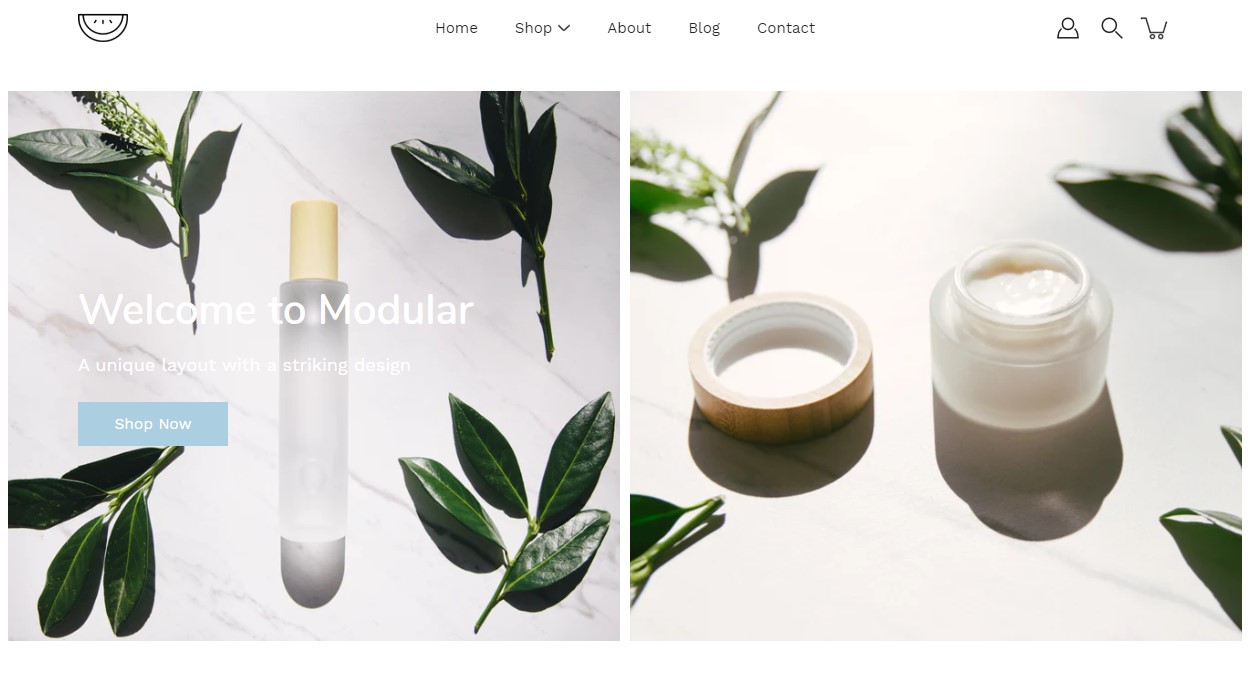
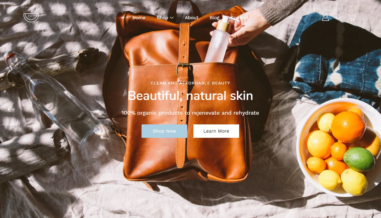
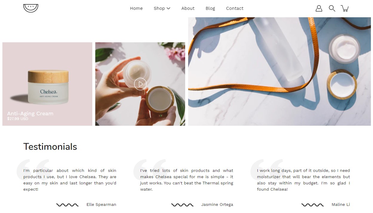
Slideshow
This is the perfect hero section for most stores. Use the Slideshow to create a home page banner with incredible customizability.
Set the individual block settings to customize each slide. Control the image, text, and buttons of each slide.
Theme Settings is a tab that allows you quick access to the global options. These options may affect areas of your store that you do not see on the current page.
Select the product you want to highlight.
Add blocks by clicking on the small arrow next to the section then clicking 'Add block'.
Set the overall style of the section. Set autoplay and autoplay delay.
Select the blog to showcase on your store pages.
Set the image, section size, and content positioning. Control the overlay color and overlay opacity.
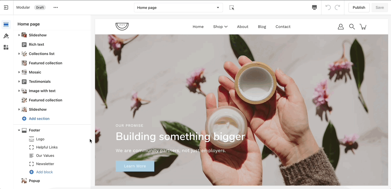
Adding sections
When adding a section to a certain template. The same content will appear on all pages that are also using that template.
You can create additional templates (such as a new page template or collection page template) and then assign them to your pages, products, collections, or blogs. This will allow you to create multiple pages with different content.
Home page sections
Scroll towards the bottom, above Footer and Popups. Choose to Add section:
Product page sections
Navigate to any product page or choose the default product template. Use Add section located above Footer and Popups:
Other pages
Navigate to any page on your site or choose any template from the top drop-down. Choose to Add section, which is located above Footer and Popups on the left panel:
Split hero
Showcase multiple images side by side with text and overlay.
Rich text
Add stylized text to your store pages.
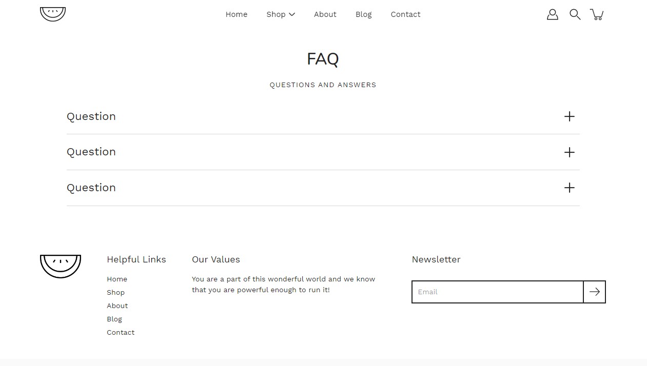
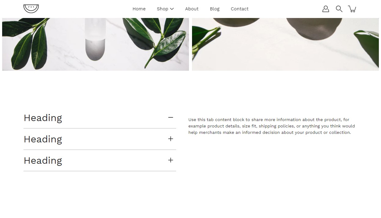
FAQ
Add a questions and answers module to your store pages.
Double use as collapsable tabs.
Set the heading and subheading for the section.
Add blocks by clicking on the small arrow next to the section then clicking 'Add block'.
Set each individual question (tab heading) and answer (tab content).
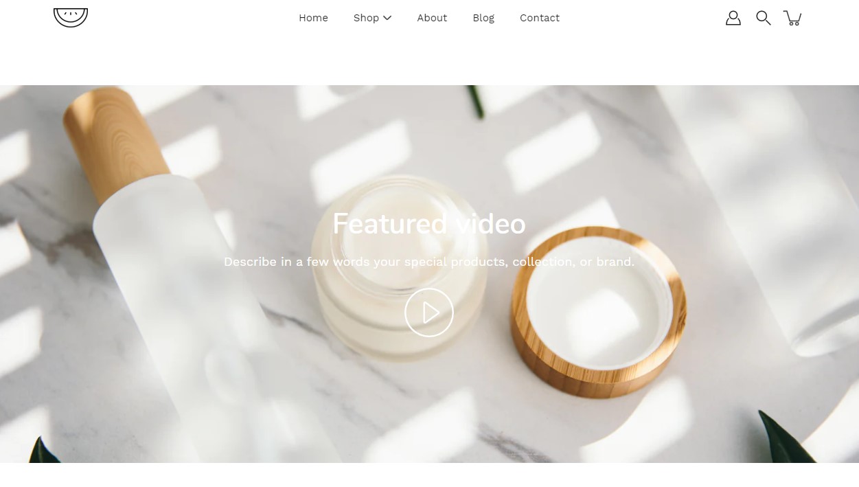
Video
Add a video to your store pages that will autoplay as a background over text.
Add a video link and set the text and overlay for this section.
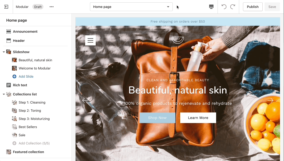
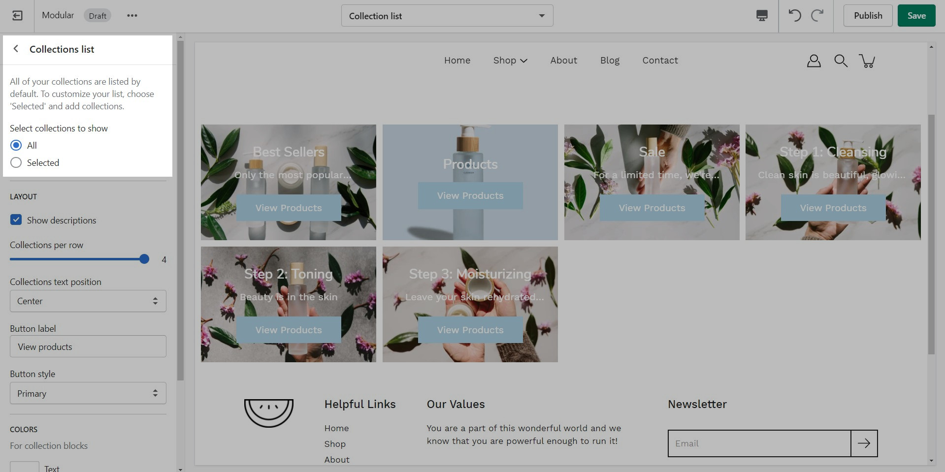
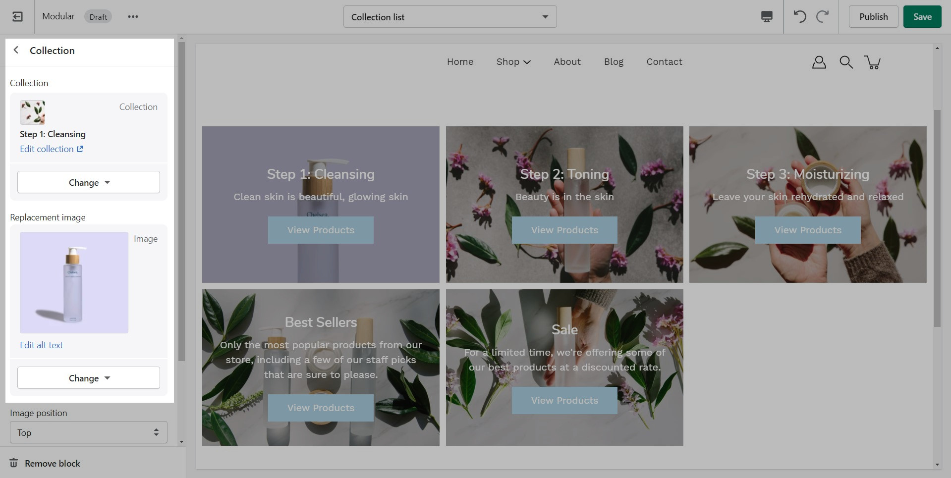
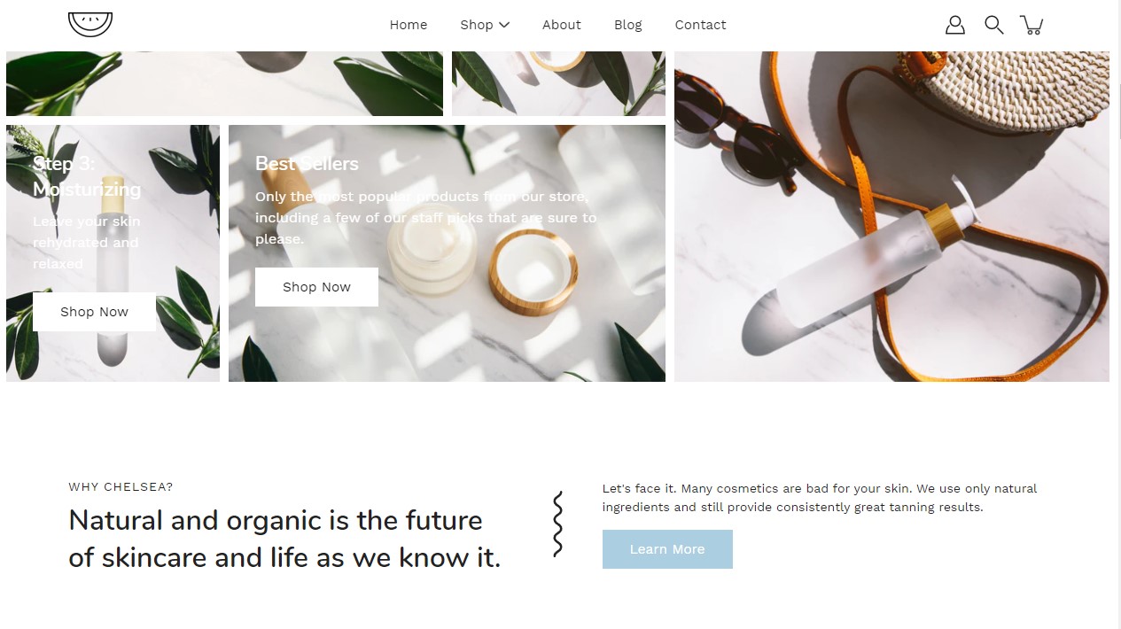
Collections list
The 'Collection list' section is here to help you add links to collections you want to highlight on your store pages. This is a quick and easy way to run promotions or let your customers know about new collections.
Set up the collection link and replacement image for each block.
The 'Collection list' section allows you to add up to 5 collection blocks per section. You can use multiple sections to show more collections.
Add blocks by clicking on the small arrow next to the section then clicking 'Add block'.
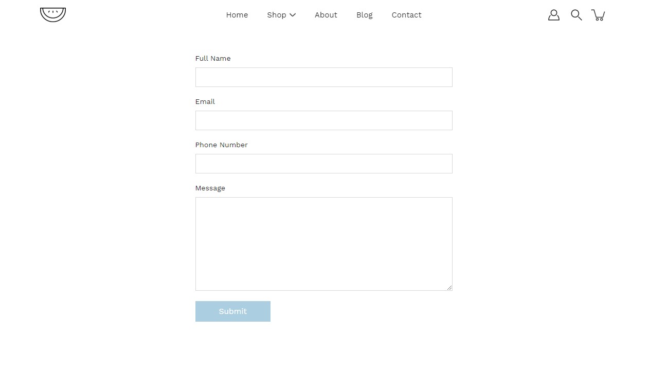
Contact form
Create a custom contact form on any store page. Drag and drop blocks over each other to create a unique look.
Add blocks by clicking on the small arrow next to the section then clicking 'Add block'.
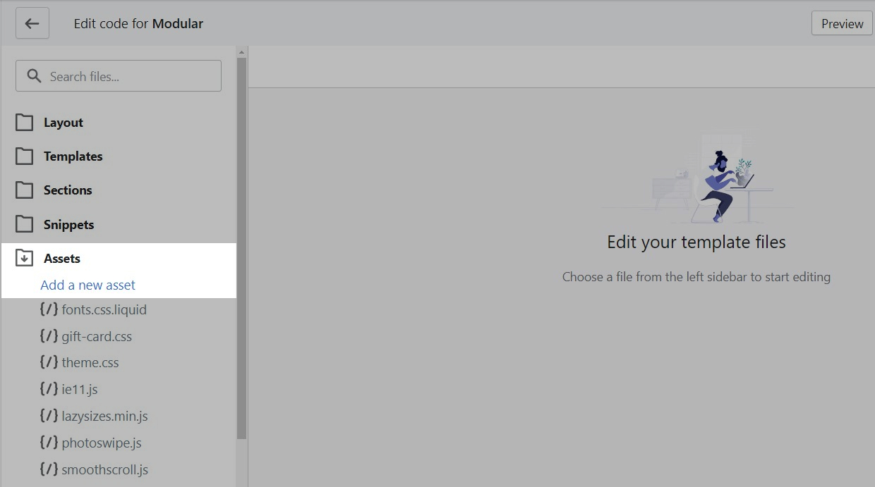
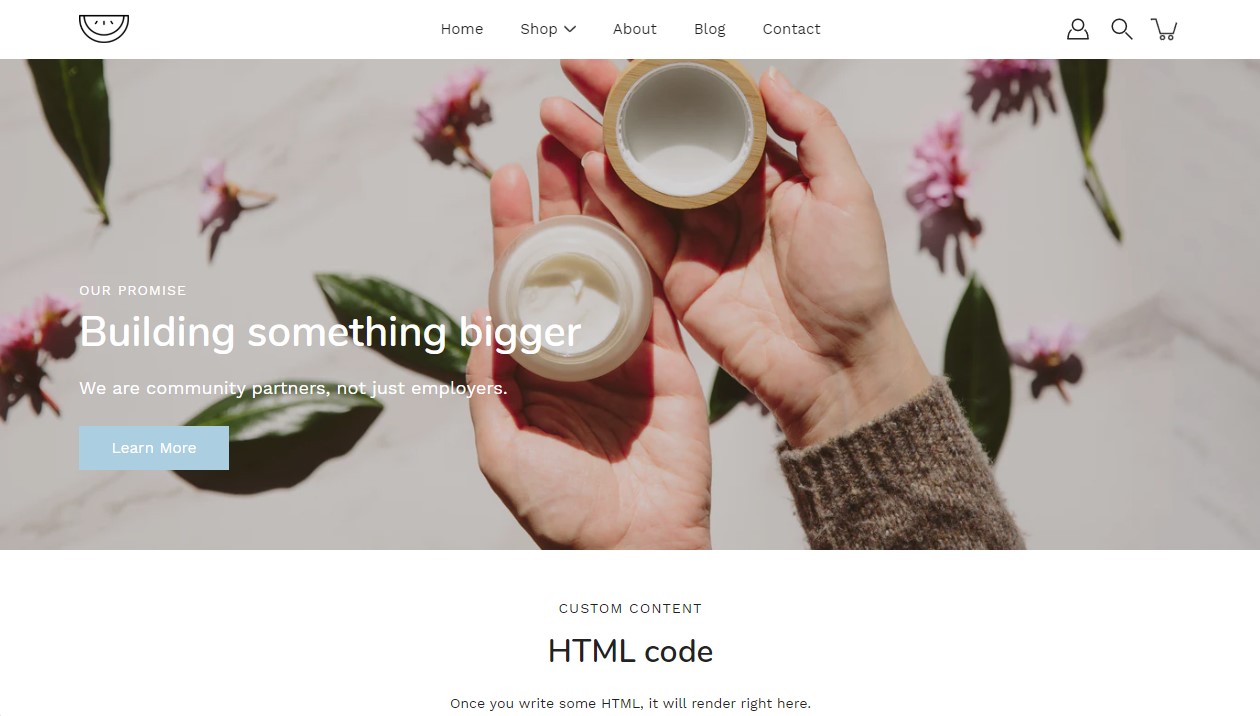
Custom HTML
Add custom HTML to embed elements into your store pages.
Perfect for sponsor brands and embed code
The custom HTML input field size is set by Shopify. We recommend that you only paste custom HTML into the section.
Always write your custom HTML in a formattable environment.
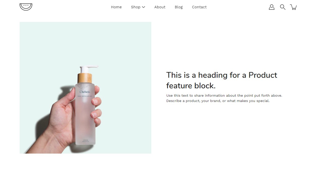
Product features
The 'Product Feature' section creates a split view of text and images.
Set the text alignment and image aspect ratio.
Add blocks by clicking on the small arrow next to the section then clicking 'Add block'.
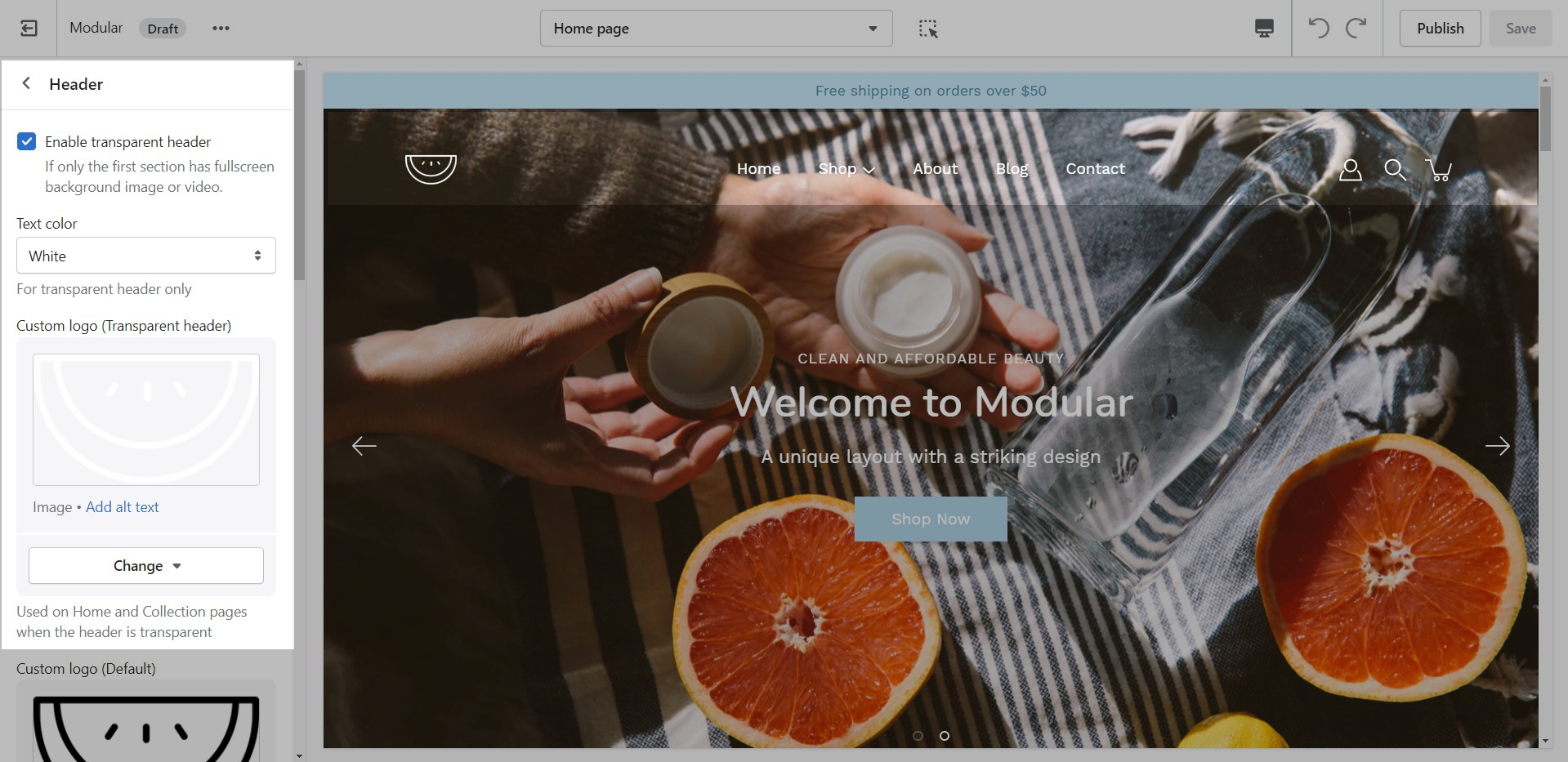
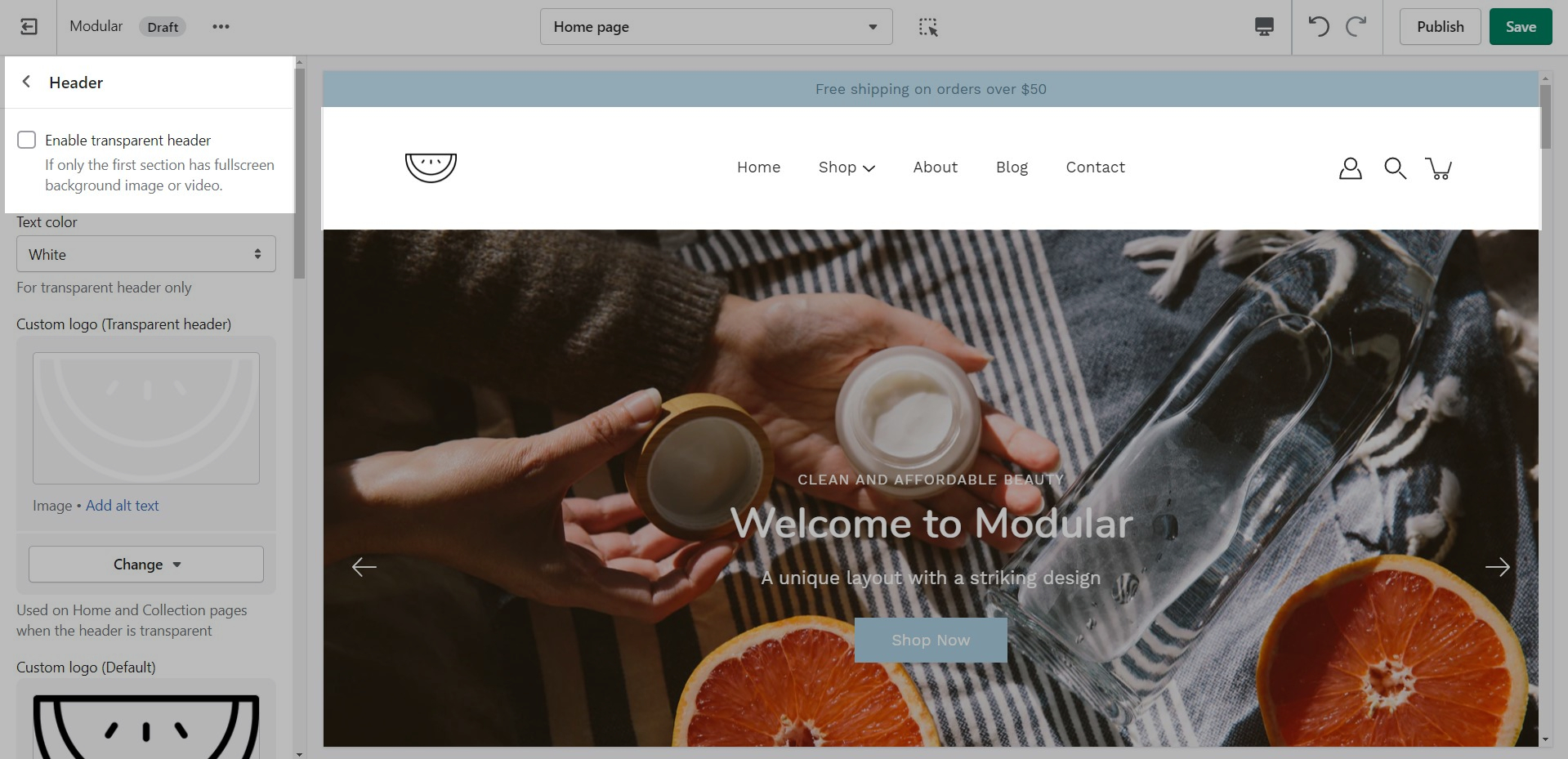
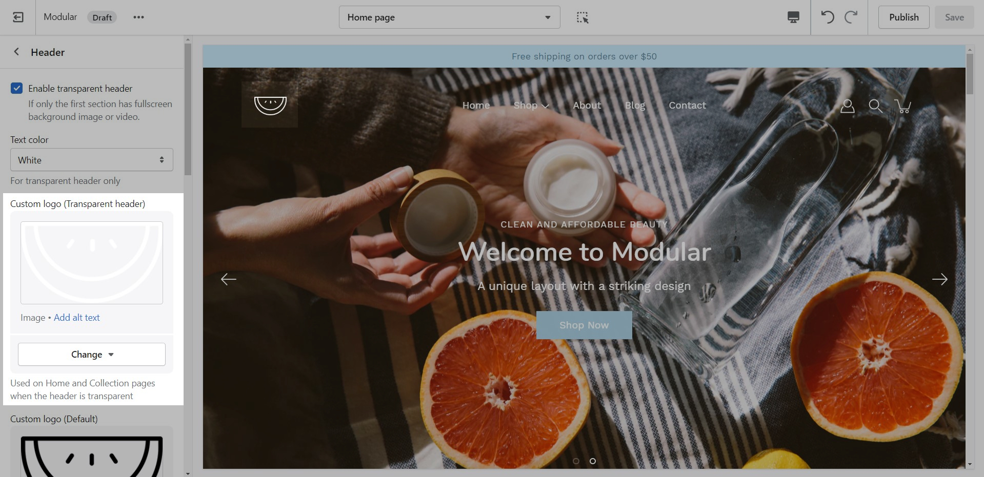
Transparent header
Change the opacity to blend the header with a background image (or video)
Where you can use the Transparent header.
Modular can display a transparent header on the homepage, collection pages, and any customized pages that include a fullwidth background image (or video) section.
When using a transparent header, you may include a second logo to provide contrast with your main homepage asset.
How to enable the Transparent header.
To enable the Transparent header you will need to first open the Header section settings. From here, simply check the 'Enable transparent header' checkbox and save the changes.
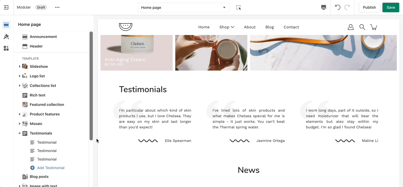
Testimonials
Add testimonial blocks to showcase qotes you've gotten from your customers or business partners.
Set the general settings for the section.Set the individual contents for each block.
Add blocks by clicking on the small arrow next to the section then clicking 'Add block'.
The Testimonials section can't be edited by customers. New Testimonials can't be submitted by customers.
Theme Settings
Under each section settings (as well as under all sections inside the Theme Editor) you will find a button to the Theme Settings. These are a number of global settings grouped together for ease of use.
Some section settings are also placed under the Theme Settings so if you're looking for a setting you feel are not finding, it might be under this little tab:
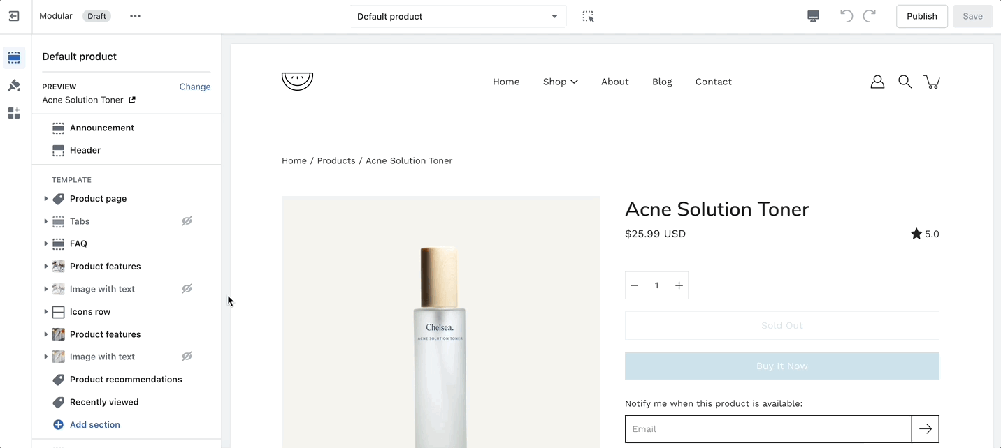
Product Pages
Settings and layout options for Product pages
The new Product page template in our Modular theme is built from the ground up with the new features introduced in Online Store 2.0 in mind. The use of JSON templates allows for dynamic sections to be used to truly customize your product pages to your style.
Accessing the Product pages can be done by opening your Theme Editor and clicking on Products. This will show all of the available product pages in the specific theme copy you are editing.
More product page templates can be created from the same menu.
A big part of the settings can be accessed from the section blocks. They can also be moved around if you're looking to customize the look. You can move blocks the same way can sections. Each block has six small dots that you can click and hold to drag and drop them between one another.
Image with text
'Image with text' uses a solid color block to make the text stand out over the image. Use this more striking design to grab your customer's attention.
Set up the general settings for the image slideshow in the section, text and button link for the section.
Add blocks by clicking on the small arrow next to the section then clicking 'Add block'.
Announcement bar section
Announcement Bar settings and layout
Click on the Announcement bar section to reveal the section settings.
These settings will allow you to:
Enable the Announcement bar on desktop and mobile separately.
Change the text of the announcement itself.
Add a link to your Announcement bar. If the 'Link' field is left empty, no link is applied.
Change the background and text colors of your Announcement bar section.
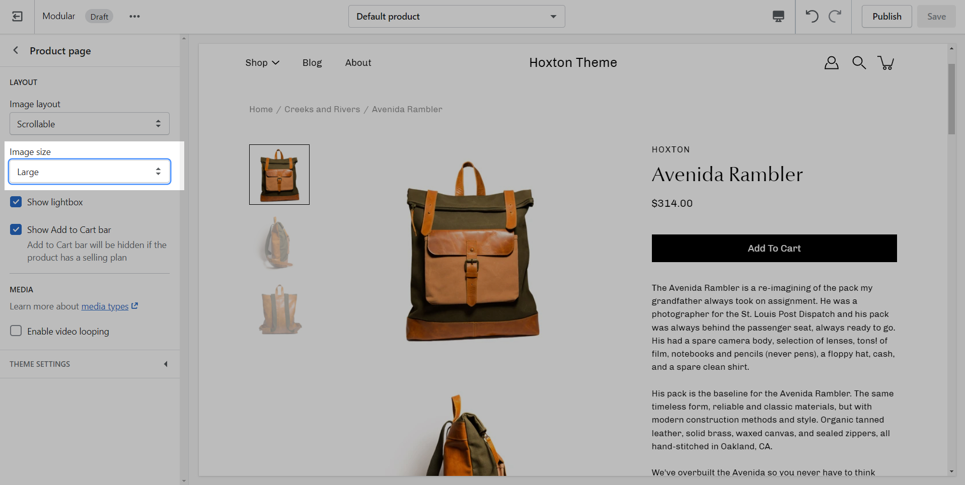
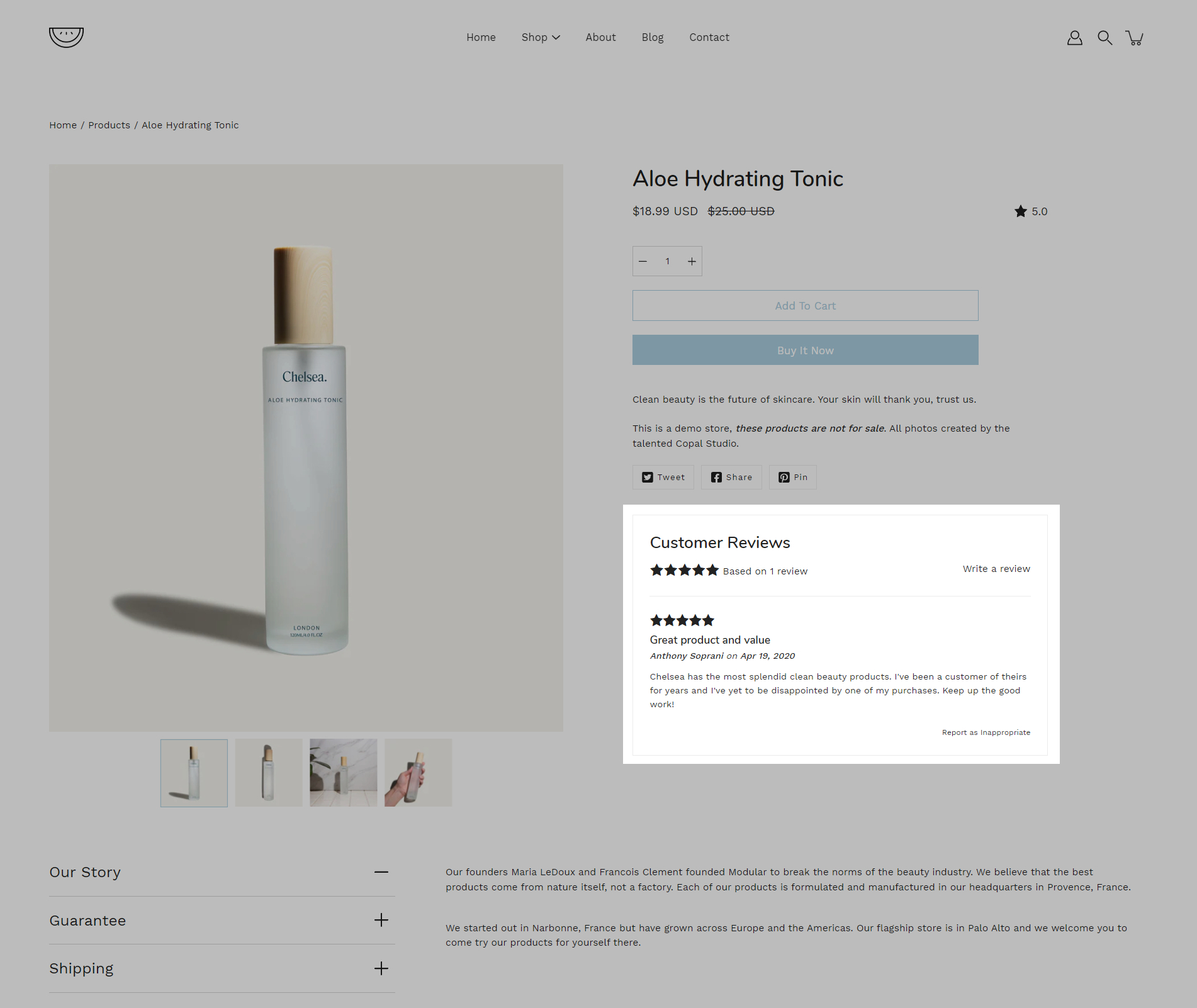
Product Images
We recommend using images at a ratio of one to one and sizes around 1024 by 1024 pixels or smaller images of about 600 by 600 pixels.
Using higher resolution images will make them sharper but slow down your load times
Modular also provides options to specify the image size on product pages.
The setting provides an option to have large, small, or medium images on the product page.
Typography
Headings
Typography allows you to set a different font for general elements across your store. We kick things off with arguably the most important bits of text, your headings, and body text:
You can choose from predetermined font stacks, this is all coming from the Shopify core code and is NOT theme specific.
If you're having issues with any of the fonts, it's recommended that you reach out to Shopify support.
It's also possible to use fonts outside of the predetermined Shopify font stack. To learn more about this process you can check out our Custom Fonts post:
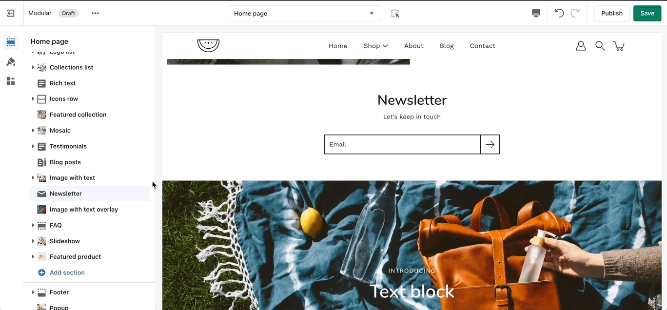
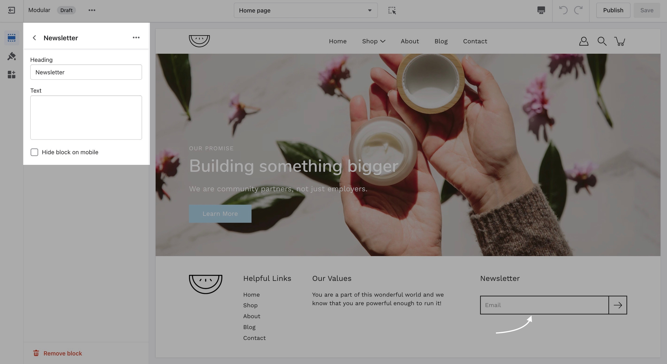
Create a quick and easy subscription form for your customers.
Set the colors, heading, and subheading for this section.
The newsletter section will only create a new 'Customer' in your store with the qualities of a 'Subscriber' (agreed to receive marketing emails).
For further customization, automated emails, or mailing lists, we highly recommend using a third-party mailing app.
Pre-Order
Replace the 'Add to Cart' button with a 'Pre-Order' button
Modular uses product tags for creating Pre-order products. When you define a Pre-order tag, you can easily convert the 'Add to Cart' button to a 'Pre-Order' button.
How to setup
Setting up a Pre-order tag is very simple and can be done right in your Shopify Admin.
Icons row
The 'Icons Row' section can be used to present short bursts of information to your customers. Use them in combination with predefined icons or with your own images.
Adjust the icon's alignment and color of this section.
Set the icon (or image) for each block. Change the text and heading under each icon.
Add blocks by clicking on the small arrow next to the section then clicking 'Add block'.
Checkout
A very important note to make is that these settings are purely visual and aesthetic. Modular does not have any options to change the functionality of your Checkout page.
The Checkout page is generated entirely from the Shopify core code so for any issues, at Checkout we highly recommend reaching out to Shopify Support.
The options here are predetermined and similar to most other themes.
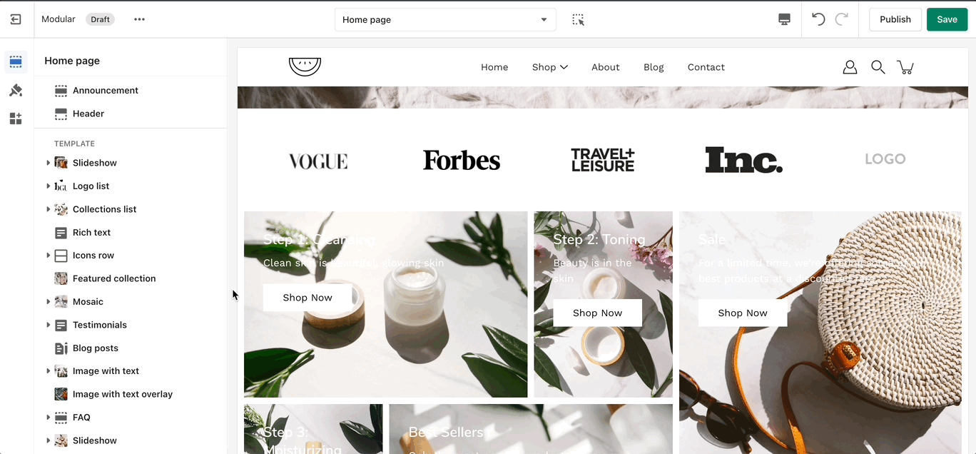
Logo list
'Logo List' creates a carousel view that you can use to showcase your brand or partnered brand logos.
Set a background color for the entire section.
Set the individual logo images, size, and link.
Use PNG images with transparent background for the best result!
Add blocks by clicking on the small arrow next to the section then clicking 'Add block'.
Social media
Social links
Social links are mainly displayed in the footer. They open in a new tab to keep customers from bouncing off of your page.
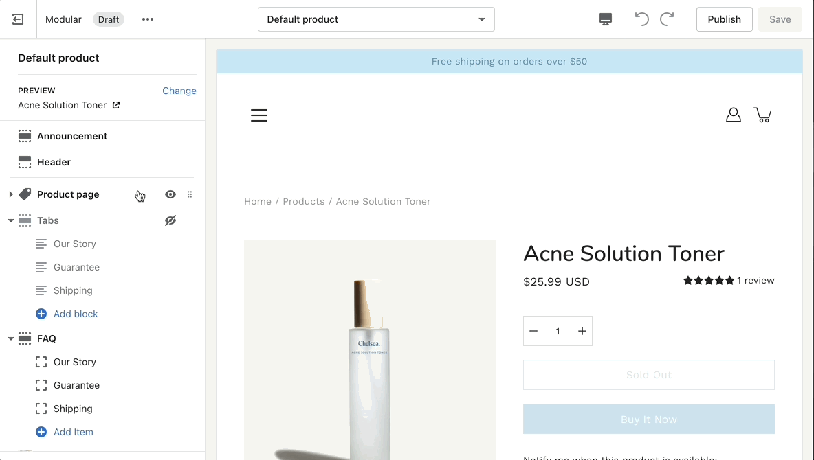
Tabs
Add our custom Tabs section to your store pages to give more information for your products.
Add the heading and text for each individual block.On product pages you can also use dynamic sources.
Add blocks by clicking on the small arrow next to the section then clicking 'Add block'.
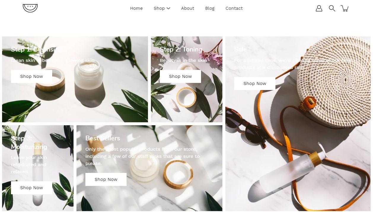
Mosaic
The 'Mosaic' is a unique feature of Modular. The blocks are automatically resizable.
There are different types of blocks with different settings. Control the content of each block individually.
Add blocks by clicking on the small arrow next to the section then clicking 'Add block'.
Logo
The logo block allows you to add an image (logo) and set its size. The image can be linked through a dynamic source to be shown differently on some pages (product pages, collection pages)
There is also the option to show or hide this block from your mobile view.
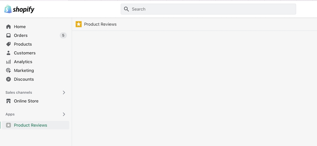
Product ratings
Display options for Product Reviews app in Modular
Modular has built-in support for Shopify's Product Reviews app. Star ratings can be shown throughout the theme.
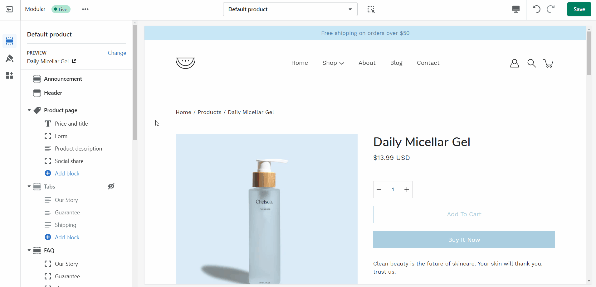
Product Detail page
Star and average rating value next to product name:
Individual reviews and forms to add a new review can be shown below the product description:
Mega Menu
Setting up a Mega Menu for your header
A Mega Menu is a stylized submenu that allows you to also add an image and highlight a portion of your navigation. It can be used to put more links together and group them in a form of subcategories.
The Mega Menu feature in our Modular theme is automated, meaning that there aren't settings in the Theme Editor to enable or disable it. Instead, you'll need to create a navigation menu (link list) from your Shopify Admin that has third-level drop-downs. There is a great article for settings this up by Shopify that goes into amazing detail about the process of creating drop-down menus:
Once you have set up your navigation menu, you need to make sure that the Header section is using it. You can do so by opening your Header section settings and checking which menu is being rendered.
Lastly, the Mega Menu feature will also allow you to add an image to the expanded state. You can also add a link and a title to it if you want to use it as a call to action.
Creating new Product page templates
Creating new JSON templates for your products
Where do we start?
To create a new Product template you need to click on the top drop-down menu and select the Product tab. From here, click on 'Create template' after which give your new template a name, and choose a template to base it on.
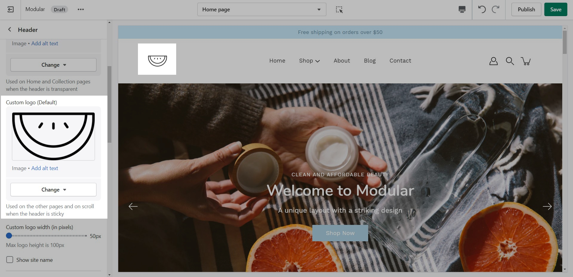
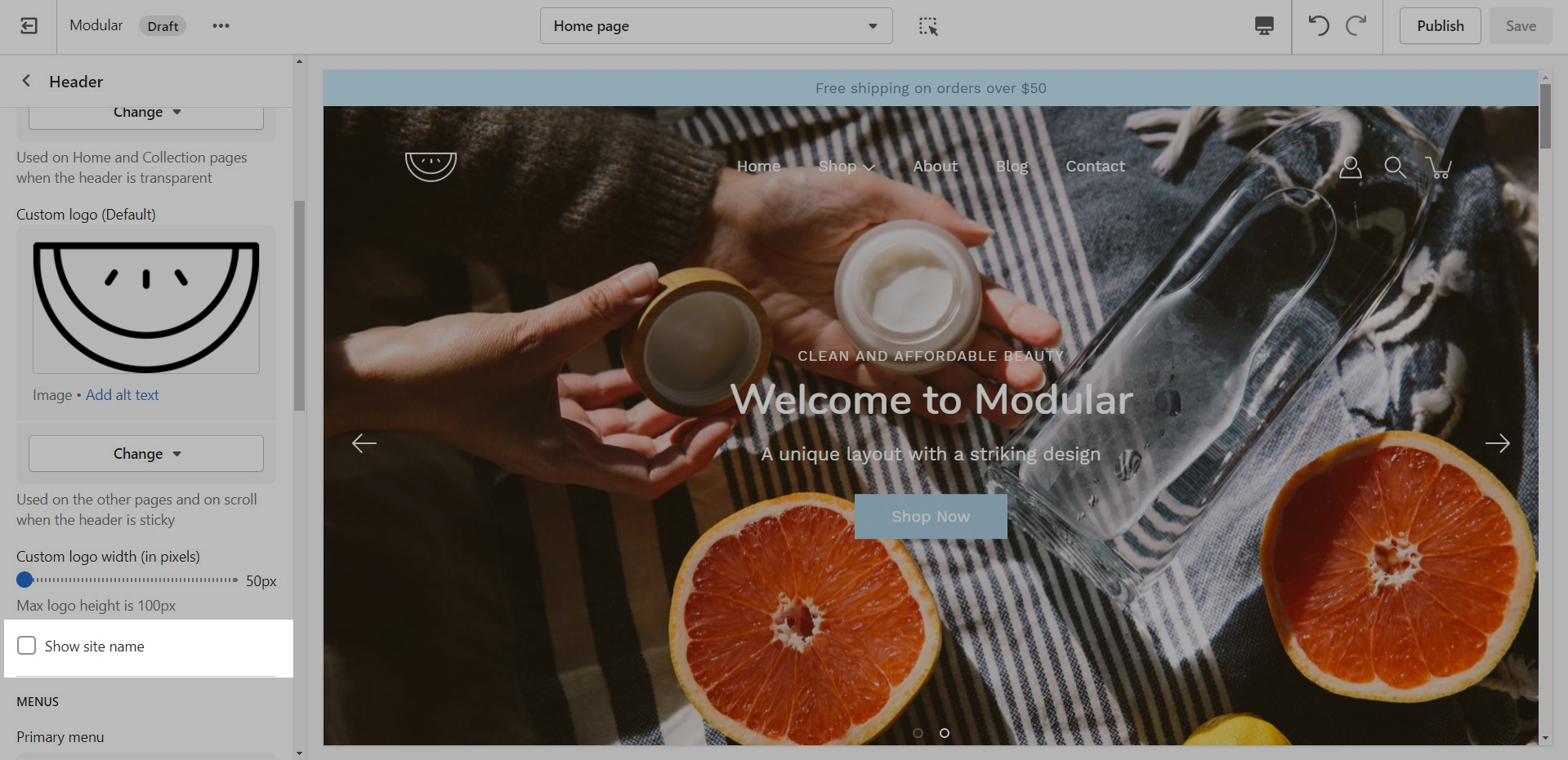
Logo and store name
How to upload a logo for your Header.
You can upload a logo in place of your store name by opening the Header section settings and uploading a Custom logo:
Recommended Image Sizes
Image Size Recommendations in Modular
Here we will cover recommended image sizes you can use within various Modular sections. These include the slideshow section, collection banners, blog post featured images, logo, product images, and product feature section images.
Logo Images
We recommend using logo images at a width of around 440px.
The maximum logo height applied is 100px therefore it is ideal to have a logo with a height around this size or lower.
Blog Images
Modular provides an option to adjust image aspect ratios for the blog page.
Aspect Ratio
Product Feature Images
We recommend using square images around 600 by 600 pixels.
Aspect Ratio
Customizing the Collection List page
In Modular you have the option to select between two states of the collections list gird. You can either have all collections shown (in alphabetical order) or only have a few selected collections (in your own order).
To switch between them, you can use the radio buttons labeled 'Select collections to show':
All Collections
The 'All' setting will show all collections in alphabetical order
Colors
General
Set the most widely used colors for your store here. We start with background colors (for sections and badges), text colors, and an accent (Error) color.
Downloading the latest version
Links and helpful tips on updating your theme
A helpful article by Shopify on updating themes:
Steps for updating your theme.
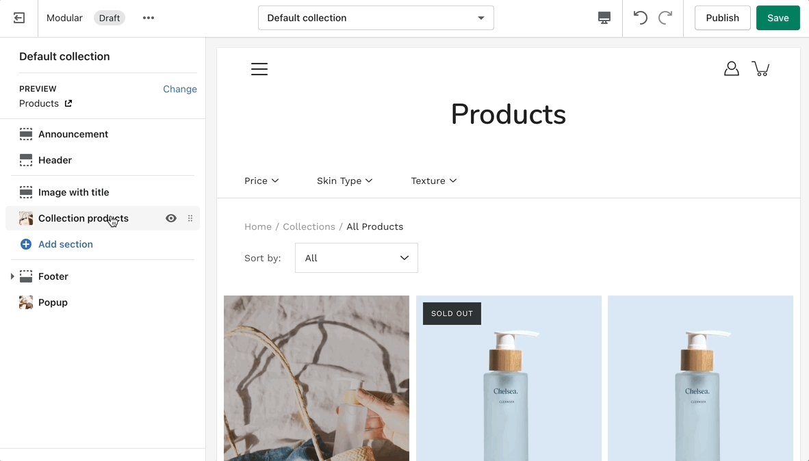
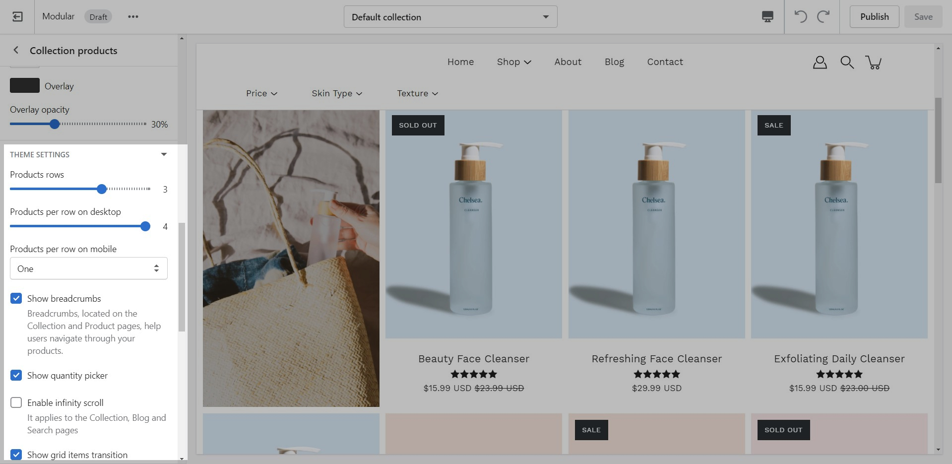
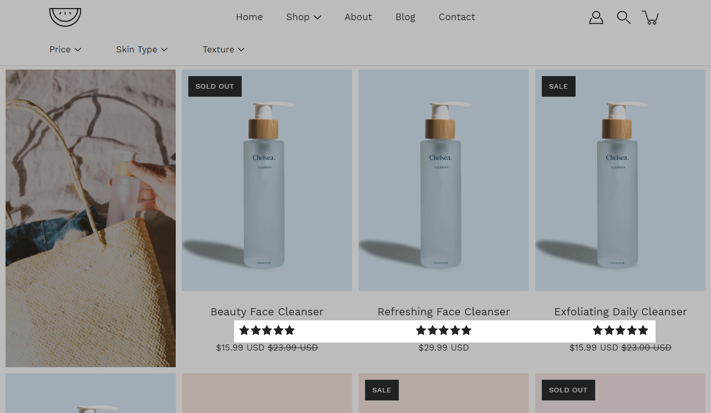
Collection Pages
Collection and Product grid settings and configuration options
The new Collection page template introduces infinite customization options that you never knew you needed!
Click on Collection products to view settings for Collection pages:
Theme Settings
Expand the Theme Settings panel to view additional settings related to the product grid:
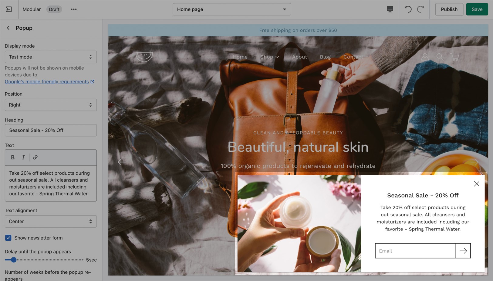
Popup section
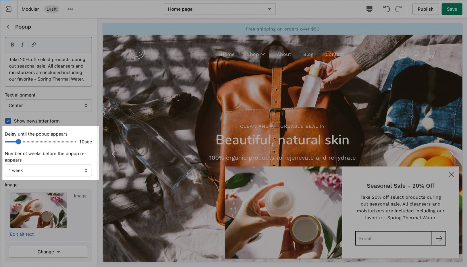
The popup section in Modular can be used as a newsletter popup or as a sales promotion tool to display custom messages and promo codes based on where the customer arrives from, is viewing, and how they are interacting with your site.
Popup Behaviour
Popups can appear based on time and reappear after a certain period. Some of the popup options include:
How to remove the Shopify credit
Remove Powered by Shopify credit in Footer
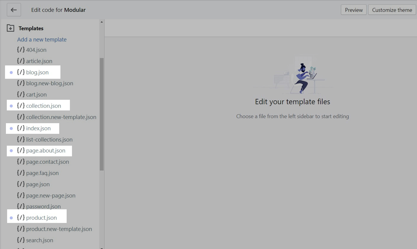
Accessing the Theme Code.
Click on the ellipses (three dots) icon at the top of the Theme Editor to view the theme actions and choose Edit code:
Cart
The Cart Popover
In Modular, the cart popover is an AJAX cart solution. We build a dynamically generated cart without refreshing the page which allows for the flow to remain constant and uninterrupted.
This extends to the functionality of the 'Add to cart' button to also update the Shopify cart object without having to refresh the page.
A lot of apps might not work with AJAX carts so if you are experiencing trouble integrating app code into the cart consider changing the 'Cart type' to a 'Page'.
The new experience
Modular is built to use Shopify's Online Store 2.0 (OS2) which allows you to use all of Modular's 20+ sections everywhere including the Homepage, Product pages, Collections, Pages, Blogs, Cart page, Search page, and more. Endless flexibility options for your store.
Shopify's Online Store 2.0 also includes Collection filtering tools, unique content using Metafields (dynamic source), easy to create custom templates, improved storefront performance. Modular uses all the features included in Shopify's new modern platform.
Getting started with Online Store 2.0.
Shopify's platform change completely remodels how you can use your store. Start with learning the features and changes Shopify has introduced:
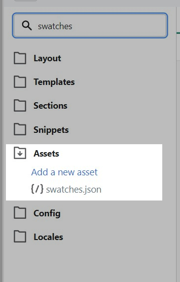
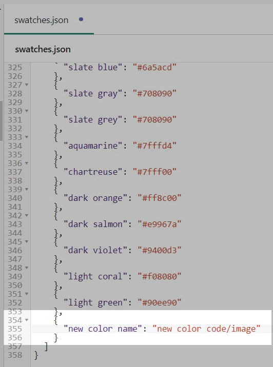
How to add Custom Color Swatches
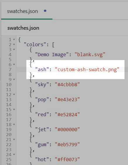
Color swatches in our Modular theme are saved inside the 'swatches.json' file. You can find this file by going into your Online Store > Themes and clicking on Actions > Edit code.
This file holds references to custom color names assigned to color codes. These color codes are then used to set the custom color swatches.
You can take this a step further and also use images to give your swatches a specific texture. To do this, all you need to do is upload a small 'png' image into the same Assets folder and replace the color code assigned to the swatch you're looking to change with the exact file name.
If you don't find your custom color variant as part of the ones that come preloaded without theme you can add it manually to this file and assign a color code or a custom image to it just as we did above.
Appearance
Accent line, Mobile menu and Animations
A few distinctive styles can be created using Modular and they all begin with the main Appearance variables.
Here you can find an option to toggle different animations if you want that extra bump in speed. You can also set a few button features.
Text
A text block does as a text block sounds. You can add a short message with a heading to give information about your brand or current promotions.
Checking your theme version
How to check the current version of your Modular theme copy
To check the version of your current copy of the Modular theme, click on the ellipses (three dots) icon at the top of the Theme Editor to view theme actions including the version number:
Search
Header search and Overlay
Set the type of results you want to return in your Search query. The available options are products, blogs, and pages (a mix of all).
Favicon
Favicon image
The Favicon is a small icon you see in the browser tab next to the page title. This is a good place where you can add your logo to build your brand consistency.
Breadcrumbs
Breadcrumbs, located on the Collection and Product pages, help users navigate through your products.
They are generated automatically depending on the path your customers take through the store.
Newsletter
A Newsletter block comes with an automatic newsletter subscription box. There are also settings to add a heading and text.
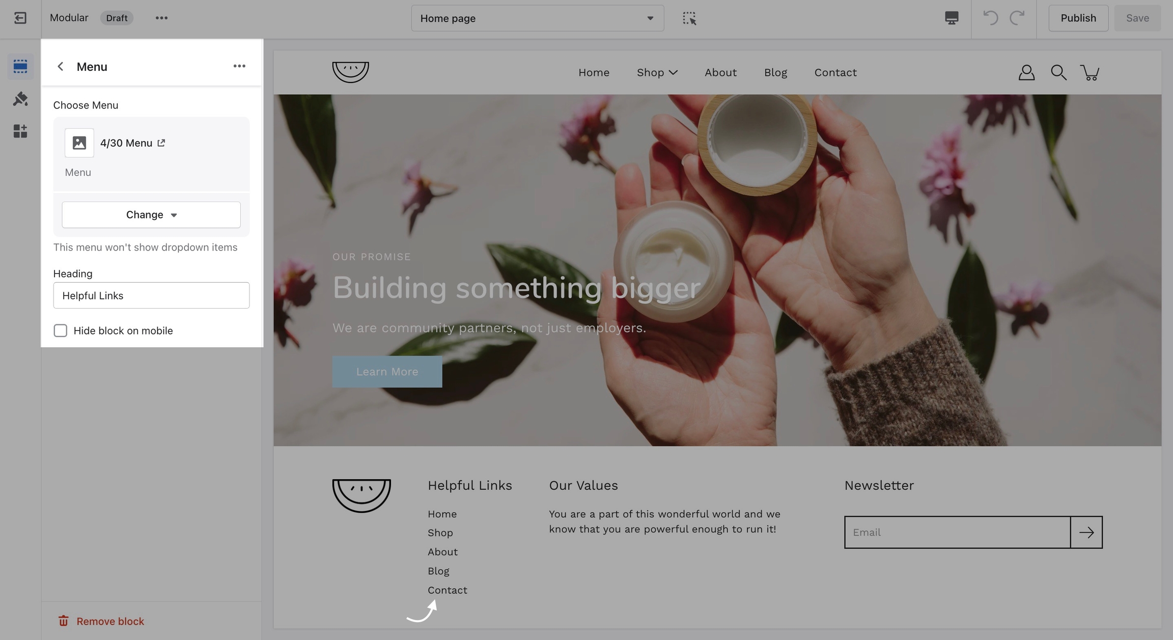
Menu
The Menu block allows you to add a navigation menu. You have the option to add a heading as a title for the block.
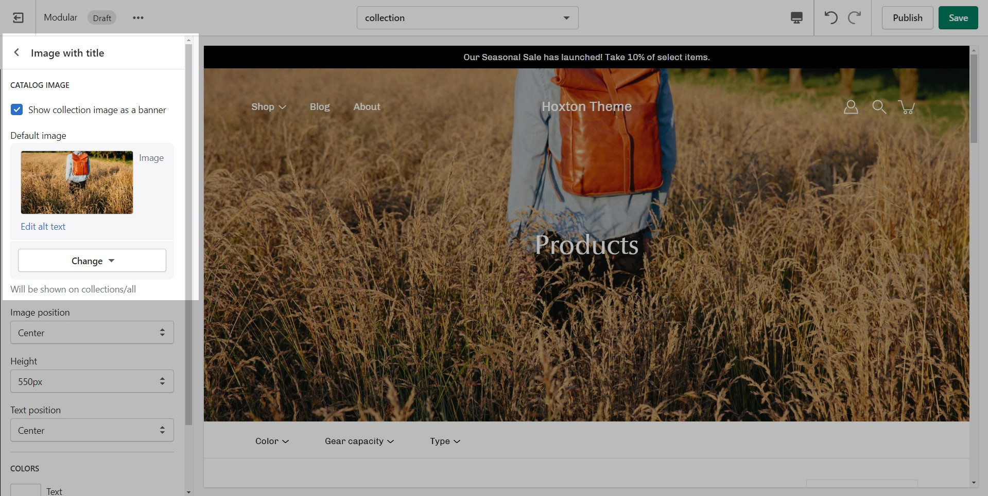
Catalog Banner Images
This is the page with the "/collections/all" URL that lists all of the visible products in the store. By default, products on the catalog page are shown in alphabetic order.
Modular provides an option to specify this image within the Image with Title section settings.
We recommend using image sizes around 1400px in width.
Modular provides you with options to specify the banner height. These include: Full Screen, Image Height, 750px, 650px, 550px.
These options are applied the same as with the slideshow section images definitions discussed above.
Popup Images
For our Popup section, we recommend using an image with at least 600 pixels in its lower dimension. The default aspect ratio here is 8 by 7.
In pixels that should translate to 690 by 600 pixels or 1380 by 1200 pixels if you're looking to create a retina image.
The key across all image sections is to keep the focal point of the image in the center. For example, if you're adding text or graphics on top of the image they can easily be cropped out of view.
A retina image is an image twice as big as its block or recommended size. This ensures that the final image is sharp even if rendered on an unusually bigger device.
There are also triple retina images which are three times the recommended size.
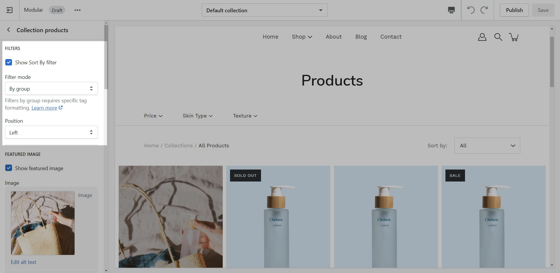
Collection page and Product Grid sections
Stars can be shown above product name and price:
The option to enable this can be found in the Collection pages section under the Theme Settings Tab.
How to setup
Modular includes quick and easy settings in the Theme Editor to display ratings. The main requirement is that you have the Shopify Reviews app installed:
If you don't have the app installed, use this link to download it.
Theme Editor Settings
For the Product Detail page, you can easily add the rating value, star, and the number of ratings from the Price and title block under the 'Product page' section:
There are checkboxes for the following:
Show star rating - Adds a star icon next to the rating number.
Show rating count - Displays the number of reviews for the current product.
You can also adjust the aspect ratio of the image.
If you have any questions that were not answered above, please refer to the FAQ section below. If you don't find your question in the FAQ section, please feel free to contact our support: [email protected]
Frequently Asked Questions about our Mega Menu
Can I have more than four columns?
The Mega Menu columns resize automatically depending on how many second-level links there are. Setting up more than four columns is possible but they will break into a new line. This is done automatically to prevent your store from getting too cramped.
Can I have more than one Mega Menu?
Yes, you can set up more than just a single Mega Menu by creating multiple submenus with third-level links. However, if you're using the Mega Menu image, it will be repeated across all Mega Menus.
Where do the new templates go?
After the new template is created, you will find it under the same Product tab in the drop-down menu. You will be able to set up each product page individually and create truly unique pages using this method.
How do we apply them to the live store?
Finally, after your product page is ready and customized all that's left to do is assign it to the product it was meant for. You can do this by going into your admin panel and clicking on Products. After you locate the product you're looking for, simply scroll down to the 'Theme template' tab and select the appropriate page template.
When creating new JSON templates, you need to have at least one template to use as a base. The new Shopify Theme Editor is powerful and can create new templates without you ever needing to go into the theme code.
The name you choose is up to you
Note: You can only select the templates of your live theme. Make sure to publish your copy of Modular so that you can assign the new product page template.
How to upload a logo for your Transparent header.
A separateoption is available to help provide better contrast when transparency is used. This is an optional but helpful feature.
How to hide your store name.
Hiding your store name can also be done from the Header section settings. All you need to do is scroll past the logo options and uncheck the 'Show site name' checkbox:
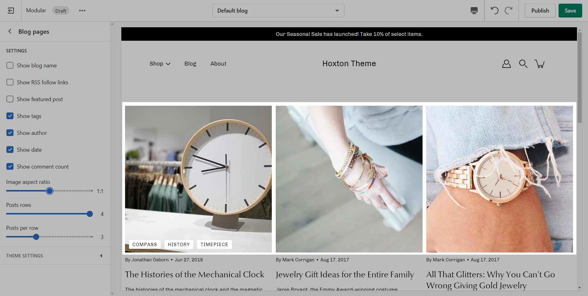
Aspect Ratio 1 to 1
This is the standard setting that works well with square-shaped images. We recommend this square ratio because the images will be cropped square on the blog overview page and they'll display in their uploaded ratio on the individual blog post page.
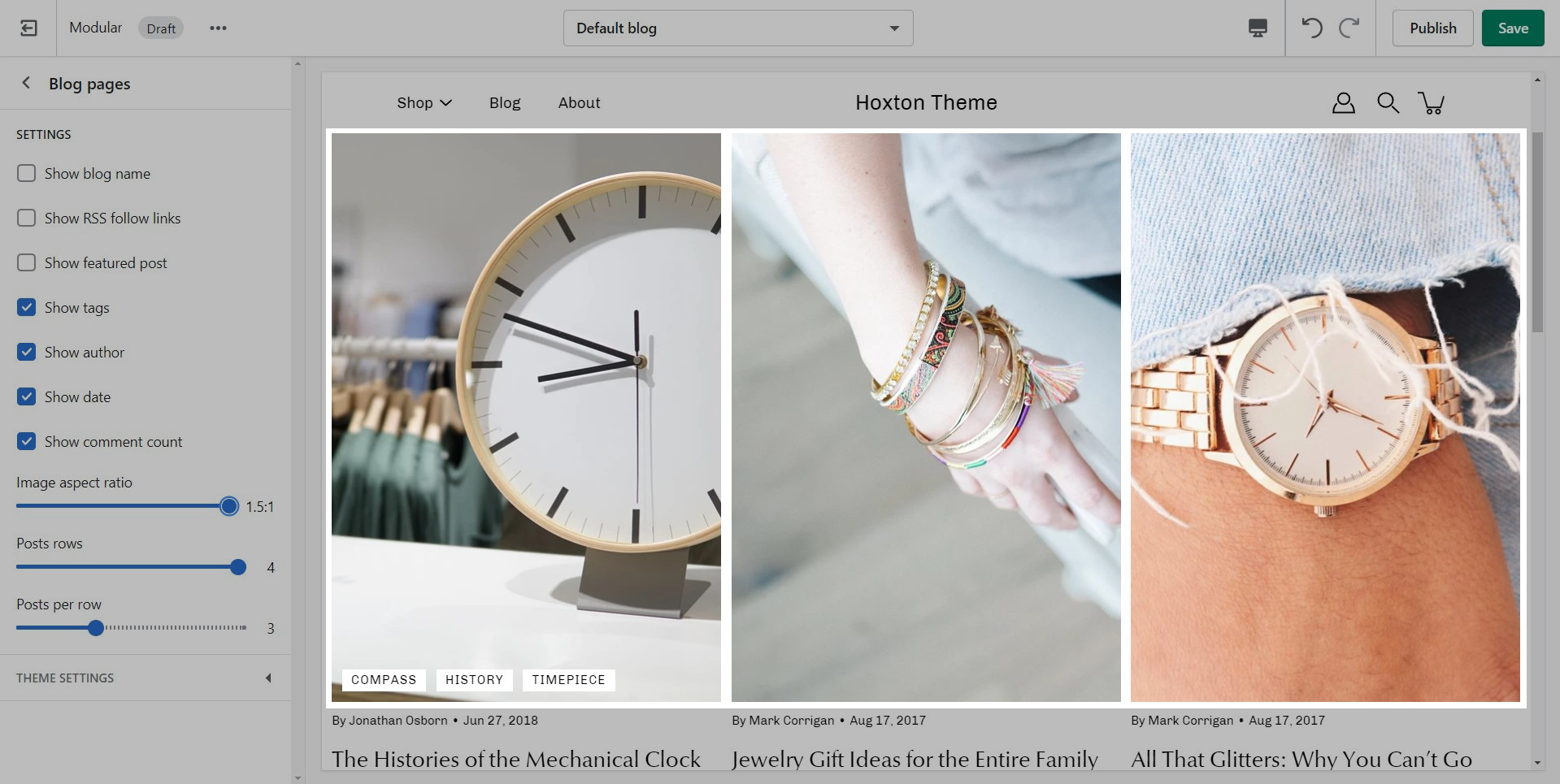
Aspect Ratio 1.5 to 1
This ratio will result in taller images or portrait images.
Aspect Ratio 0.5 to 1
This ratio can be used to display wider images. We recommend it for landscape images.
Aspect Ratio 1 to 1
This is the standard (and recommended) setting that works well with square-shaped images.
Aspect Ratio 0.5 to 1
This ratio will display wider images.
Aspect Ratio 1.5 to 1
This ratio will display images in a portrait format.
Selected Collections
The 'Selected' option will show all collections that you've added as blocks for the section. To add blocks to this section, you need to click on the small arrow next to the 'Collections list' section and click on 'Add Collection':
You can also set a replacement image for each individual block:
Buttons and Products
There are two main button types in Modular. Almost all sections that use buttons present the option to choose which one to use. Here is where you can set a color for these two styles.
On the topic of colors, here is a great contrast checker that you should almost always use to make sure your colors give out a readable layout.
For the best overall design and flow, we recommend using two or three main colors. Use high-contrast colors to highlight accents or badges.
Be mindful to use a color that is high in contrast with the text color set in the previous to make text easier to read.
Create a backup of your existing theme. This will be used to copy settings and to keep the live theme running without interruption.
Visit the Shopify Theme Store and login in. For paid themes, it is important to log in to the account that you used to buy the theme. This will prevent you from being asked to buy the theme again.
Download the latest version of Modular - Click here.
Click on 'Add latest theme version':
When you download the latest version of Modular, the new theme will be added to the drafts section of your store and is completely separate from the live theme running in your store.
Your current live theme is not affected by downloading the latest version of Modular.
The new theme is in 'Draft' mode which allows you to set up and configure it, while your store continues to operate with the current theme.
Tip: You must be logged into the account that purchased the original theme.
If you see 'Try theme' or 'Buy theme' as the option, log out and log in again with the account that purchased the theme. Be sure that the main button has 'Add latest theme version'.
Product Grid
Use the Product Grid options to customize how many products per row are displayed on desktop and mobile. You can also configure how many products per page are shown before pagination is displayed.
Show immediately
Show after up to 60 seconds after page load
Never reappear
Appear after 1, 2, or 3 weeks
Timing is key
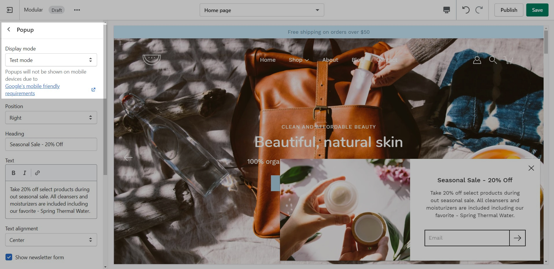
Test mode
After a user has closed down the popup it will not reappear again until a certain amount of time. This is also true for you as an admin. Test mode allows for the popup to be rendered on any page after reload no matter how many times it's closed.
Popups are great, but they can be intrusive
Popups are a great way to enage with your audience
Popups will not be shown on mobile devices due to .
Hiding the copyright information.
Open the 'footer.liquid' file from the Sections folder.
Use CTRL + F (or Command + F) to find the 'copyright' divider.
Place an opening ({% comment %}) comment tag before the divider and a closing ({% endcomment %}) comment tag after the divider.
Save the changes.
Cart icon style and Tax text
The 'Cart' icon can not show the number of items in the cart but the 'Circle' icon can.
Terms and conditions and Free shipping message
You can change the label for this checkbox but please note that enabling this option will disable the 'Buy it Now' buttons.
A good question is why not add this to the checkout page but the scope of a theme stops at the cart page? As third-party theme developers, we do not have access to the Shopify core code and our theme does not have access to the Checkout page template.
The reason for this is that their main function is to skip the cart page. If your customers must agree with the terms of your store, skipping the cart shouldn't be done.
The new custom color swatch will require you to add a bit of code. We recommend adding this code near the bottom of the file, right after the last swatch closing bracket:
Use the search bar to find the 'swatches.json' file inside of the Assets folder.
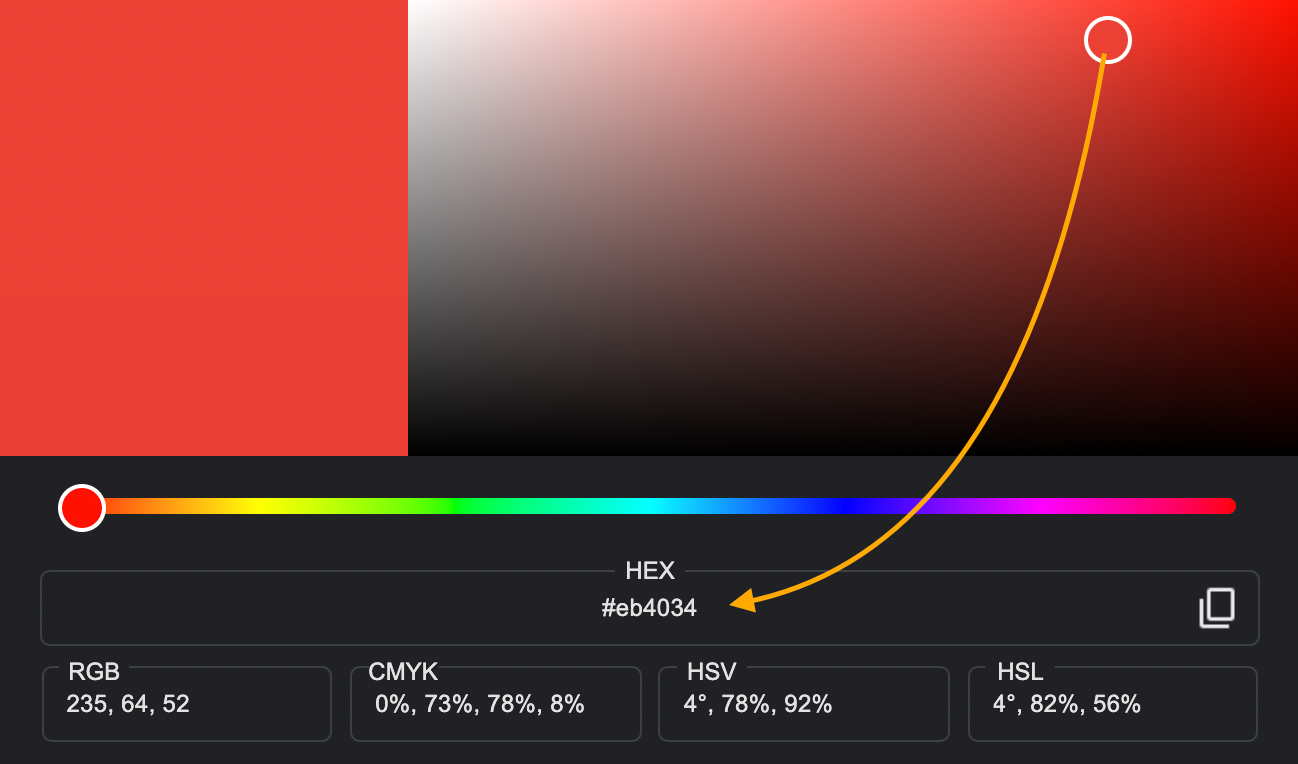
You can edit the existing color codes to change the shade of the color by using any HTML-supported color code method you'd like (HEX, RGB, HSL, and so on).
,
{
  "new color name": "new color code/image"
}
Make sure that the comma from the code snippet starts right after the closing curly bracket of the previous color swatch.
Pagination and Slideshow
Pagination is a must in Modular. Product loops in Shopify are limited to 50 products so pagination is the way to get around this.
The main thing to note about our 'Infinity Scroll' feature is that if it's disabled, pages with multiple items will be 'paginated' into smaller pages.
New templates need to be created on the published theme. They will not appear as a template option for assignments if created in a draft theme.
This is a Shopify platform restriction. Always make new templates on the live/published theme.
Note: The newsletter blocks in Modular can only create a new Customer in your Shopify admin with the qualities of a Subscriber (agreed to receive marketing emails).
If you want to create more custom and more detailed mailing lists we highly recommend using third-party apps to manage them.
Note: The navigation menu here is different from the Header. It can not show dropdown items.
Only first-level links will be displayed.
Updating your theme
Information about updating to the newest version of the Modular theme
Updating from a previous version of Modular.
Modular 3.0.0 has built-in integration of Online Store 2.0 features. This is a major change. We recommend that you download the new theme and build a fresh version of your store using the new tools included in the platform. There is no simple migration from earlier versions. This applies to all themes that have been built for Online Store 2.0.
Migrating settings is not recommend. Due to the many performance improvements including with Online Store 2.0, legacy settings files will slow down your store load times. A fresh theme build is recommended for Online Store 2.0. Consult a Shopify Expert if you require assistance with moving your store from an earlier version to Online Store 2.0.
Future releases based on Online Store 2.0 will be easier to migrate settings.
Updating from Modular 3.0.0
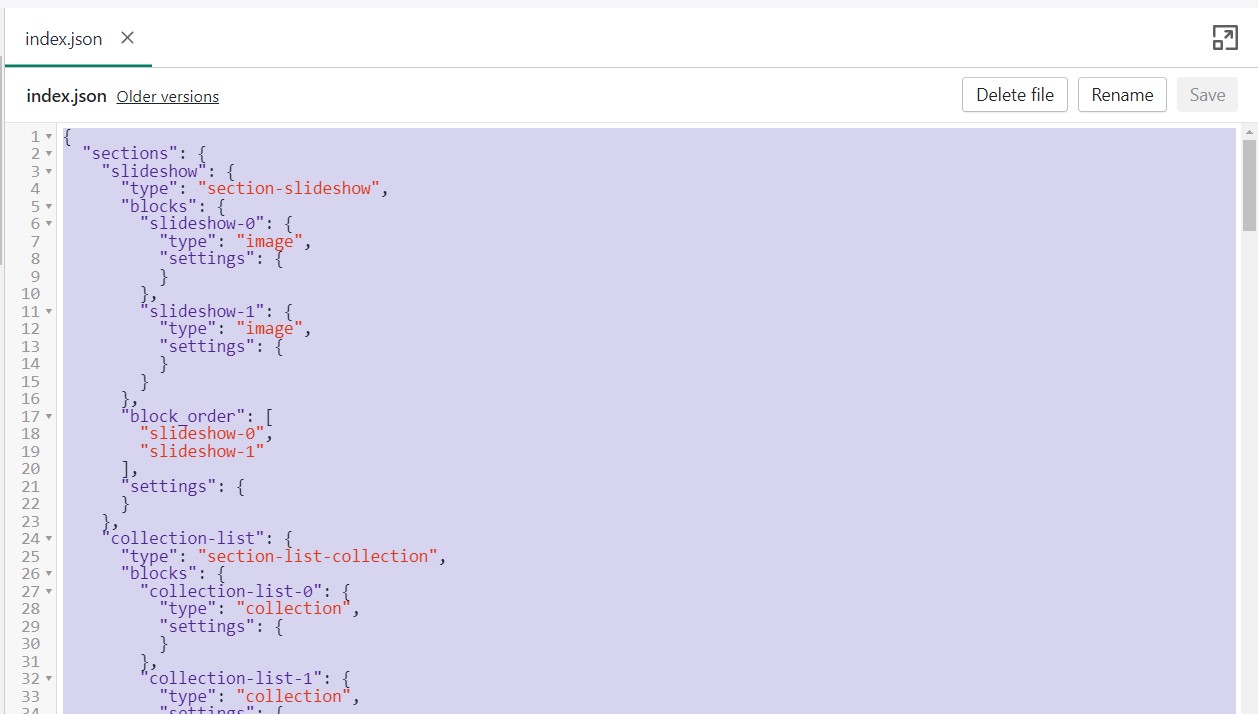
Coming from Modular 3.0.0 (or 3.0.1) you are using the new structure of JSON templates. There might be a chance for you to transfer over some of the settings in your edited page templates.
To start, you will need to first download a fresh copy of our latest version of Modular from the .
Next, you can open the code editor of your current copy by going into your Online Store > Themes and clicking on Actions > Edit code.
Here, you should find the edited page templates with a small grey dot as an indication that they are changed.
What you can do here is to open up the edited page templates, we'll use index.json for our example, and copy the content to paste in the new theme.
The last step is to open the code editor for the new copy, and open up the same file, in our case index.json, and paste in all of the code.
Lastly, all that's left is to save the changes. If no build errors pop up, you have successfully transferred all of the settings that are still compatible with the new version.
Please note that it's possible not all settings will be compatible in which case you could run into a build error or just have missing sections.
If you run into a lot of build errors, then the best thing to do would be to manually redo all sections from the Theme Editor for the template.
Sharing a preview link
What is a preview link?
When working with an unpublished theme (also known as a draft), you can send out a preview link that allows anyone who has the link to preview your work/store. Shared preview links expire after a certain number of days and are randomly generated by Shopify.
This is a great tool for getting feedback from anyone who needs to view your site before it's live or to view a concept version of your existing site
How do you share it?
In the Theme Editor, click on the ellipses (three dots) icon at the top of the Theme Editor to view theme actions.
Choose Preview.
When the new preview window appears, choose the green Share Preview button at the bottom of your browser.
Slideshow Section Images
The Slideshow section allows you to specify desktop and mobile images as well as specify the slide height.
Image width
Desktop: We recommend using images 1920px in width.
Mobile: We recommend using images 1080px in width.
Remember: Mobile devices are tall. You need to use an image that has a bigger height than it does width in order to fill the vertical aspect ratio.
image height
Modular provides an option to specify various slide height sizes: Full Screen Height, Image Height, 750px, 650px, 550px,450px.
Static sizes: If you want to use a static slide height (750px, 650px, 550px, or 450px), make sure your image height is around that size.
For example, if you'd like to use a slide image height of 750px, you'll want to save your image around this same size. This will prevent image cropping both towards the top and bottom. This applies to the other slide height sizes (650px, 550px, and 450px).
Full-screen height: This option will fit the images to the entire height of the browser window. This option is recommended for images with medium height sizes and not for images with large height sizes, as these will be cropped at the bottom of the image.
Image height: Setting this option will have the images displayed in the original height as uploaded. This option is quite useful if you want to have the full image displayed as there will be no cropping of the images.
For the best result on mobile view, we recommend using images that have a taller, or square, aspect ratio. Anything from 600px by 600px to 1200px by 600px (that's height to width) would fit the mobile aspect ratio the best.
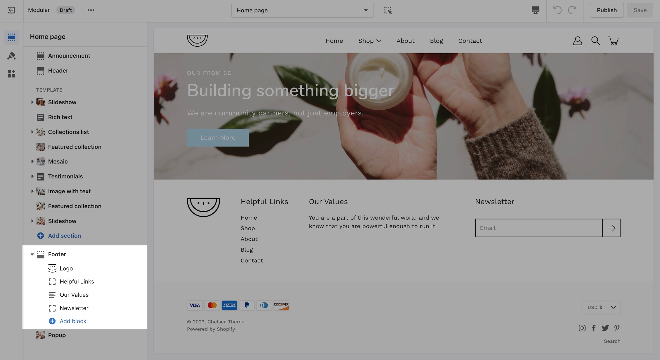
Blocks and settings
The Footer in Modular has a lot of customizable elements in the form of section blocks. You can add in blocks by clicking the small arrow icon next to the Footer section then clicking the 'Add block' buttons:
While there are a good number of different blocks, you can only use five blocks here. Be sure to use the ones you need the most.
Footer Section Settings
Other than the individual blocks, the Footer section also has a number of settings itself. You can set the background and text color for this section individually.
There is also the option to show payment icons, currency and language selectors, as well as a short menu in the Bottom bar.
How to make CSS customizations
Adding your own custom styles and CSS overrides to the theme
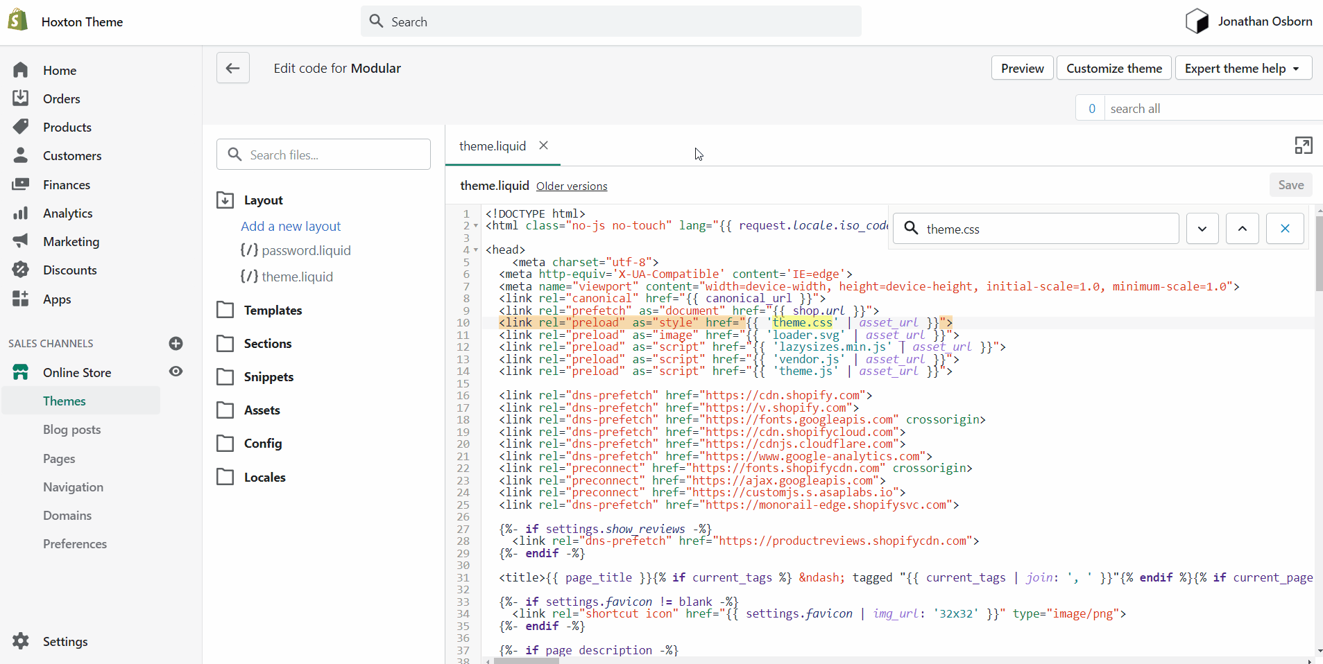
For developers and to make minor CSS style modifications, use the Code Editor and add your custom CSS overrides at the bottom of theme.css located in the Assets folder:
How to open the code editor
Click on the ellipses (three dots) icon at the top of the Theme Editor to view theme actions, and choose Edit code:
Alternatives and "theme.dev.css"
On some versions of Modular, "theme.css" is minified and you won't be able to easily change the styles. This is where the "theme.dev.css" file comes in handy.
To activate it, you need to access the "theme.liquid" file and replace the instances of "theme.css" on lines 9 and 44 with "theme.dev.css".
Pages
Modular includes ready-to-use page templates for your store including:
About
Contact
FAQ
Default page
These templates make it easy for you to quickly add content and build out pages that add value to your customer experience and company branding.
How to use page templates
Creating a page
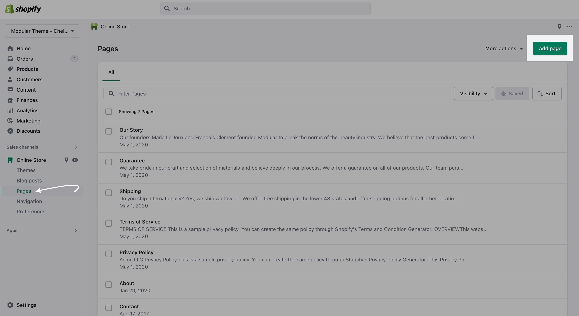
Pages are created in your Shopify Admin under Pages. Choose Add page to create a new page:
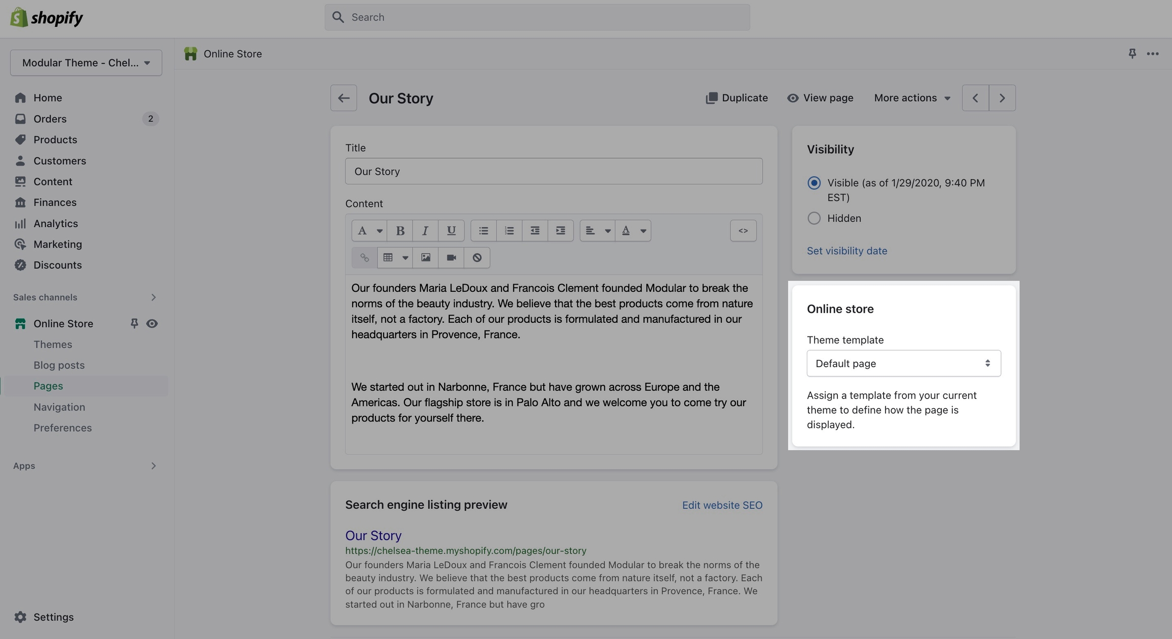
Give your page a title (required), the content is optional. Next, choose a Theme template to be used, also known as Page template:
Customizing pages
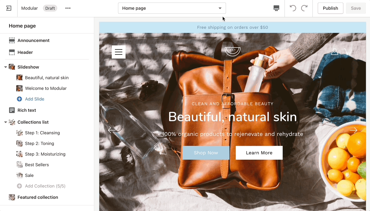
Using the Theme Editor, you can customize the template that's been assigned to your page:
You can start customizing the page with the pre-defined sections included in Modular. You can hide, reorder, remove sections that are included, and also add any new selection from Modular's list of over 25+ sections.
Learn more about using sections and blocks in Modular:
Creating a new page template
From the top drop-down menu select Pages and click on Create template. Give your new template a name and a template to base it on. This will make it so that there are one or two sections predefined but they can be removed or hidden later.
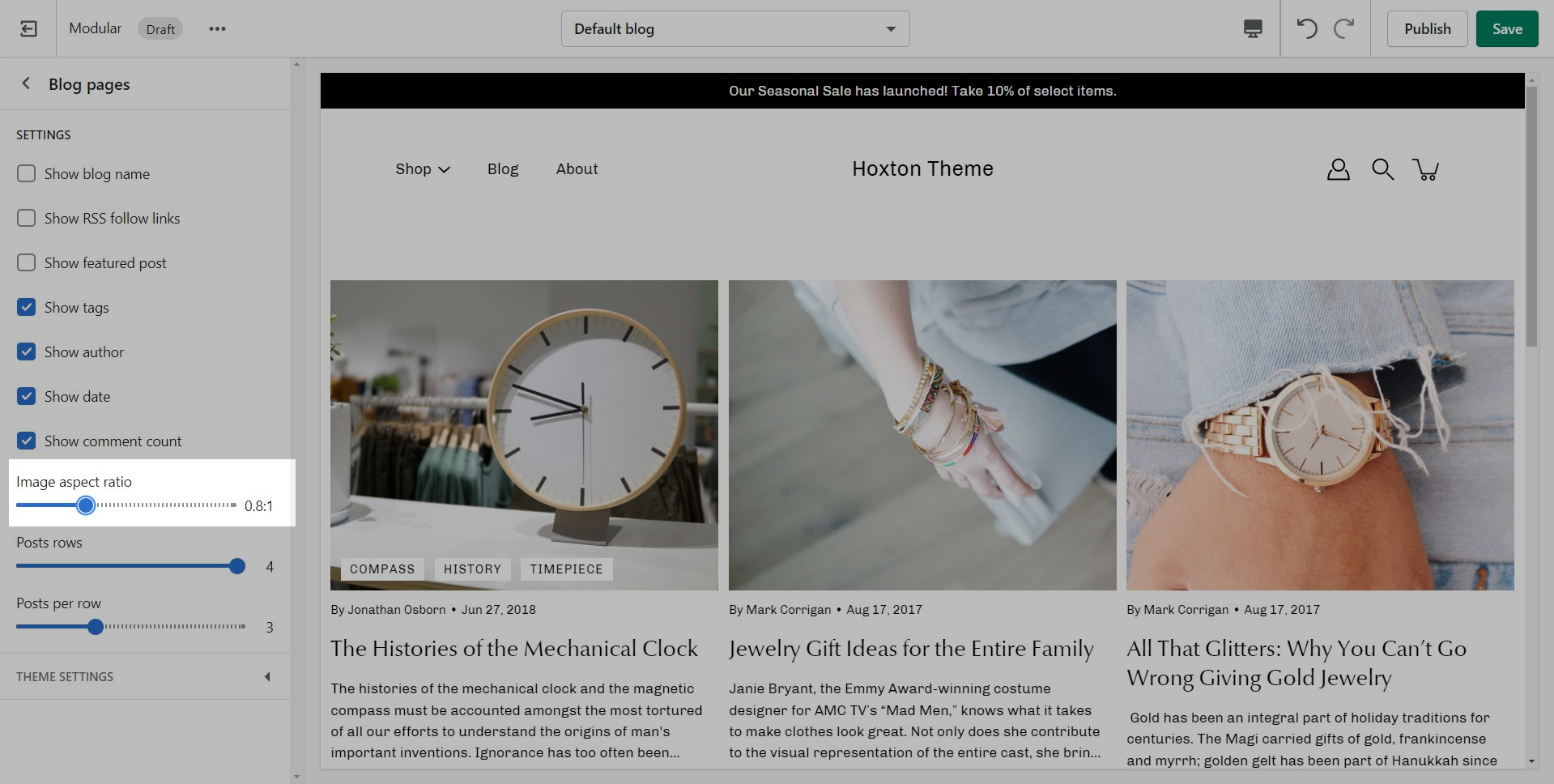
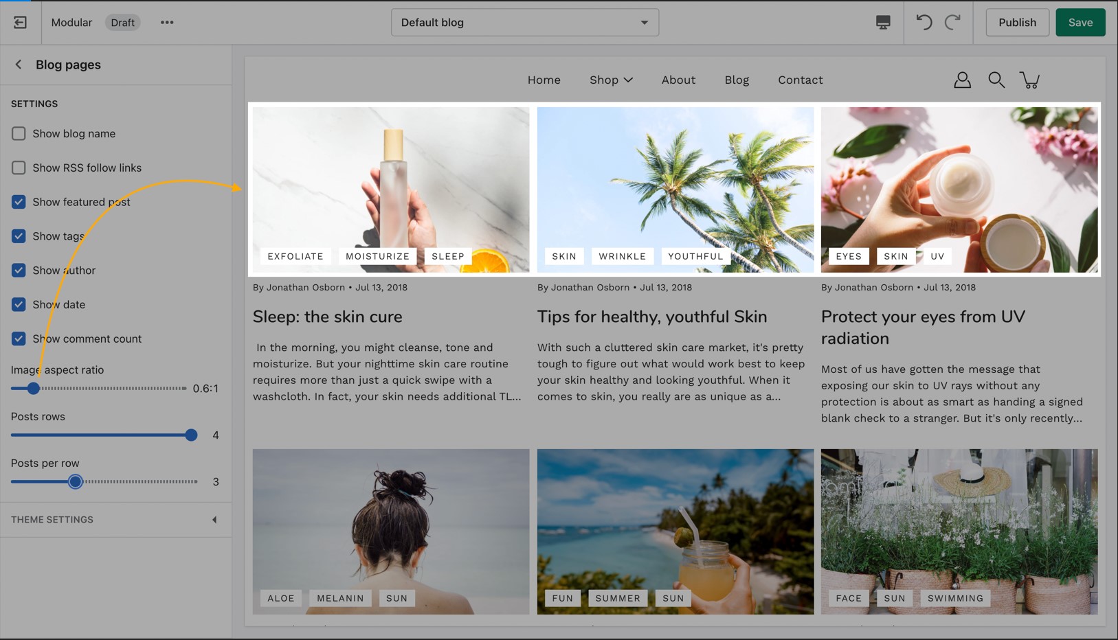
Blog Pages
Blog pages are meant to be a simple assortment of articles but who's to say you shouldn't customize them?
Layout and settings
The blog pages section holds a handful of settings but they can be quite important. These settings can be accessed by first navigating to the blog page you're looking to edit.
Accessing blog pages can be done from the top drop-down menu
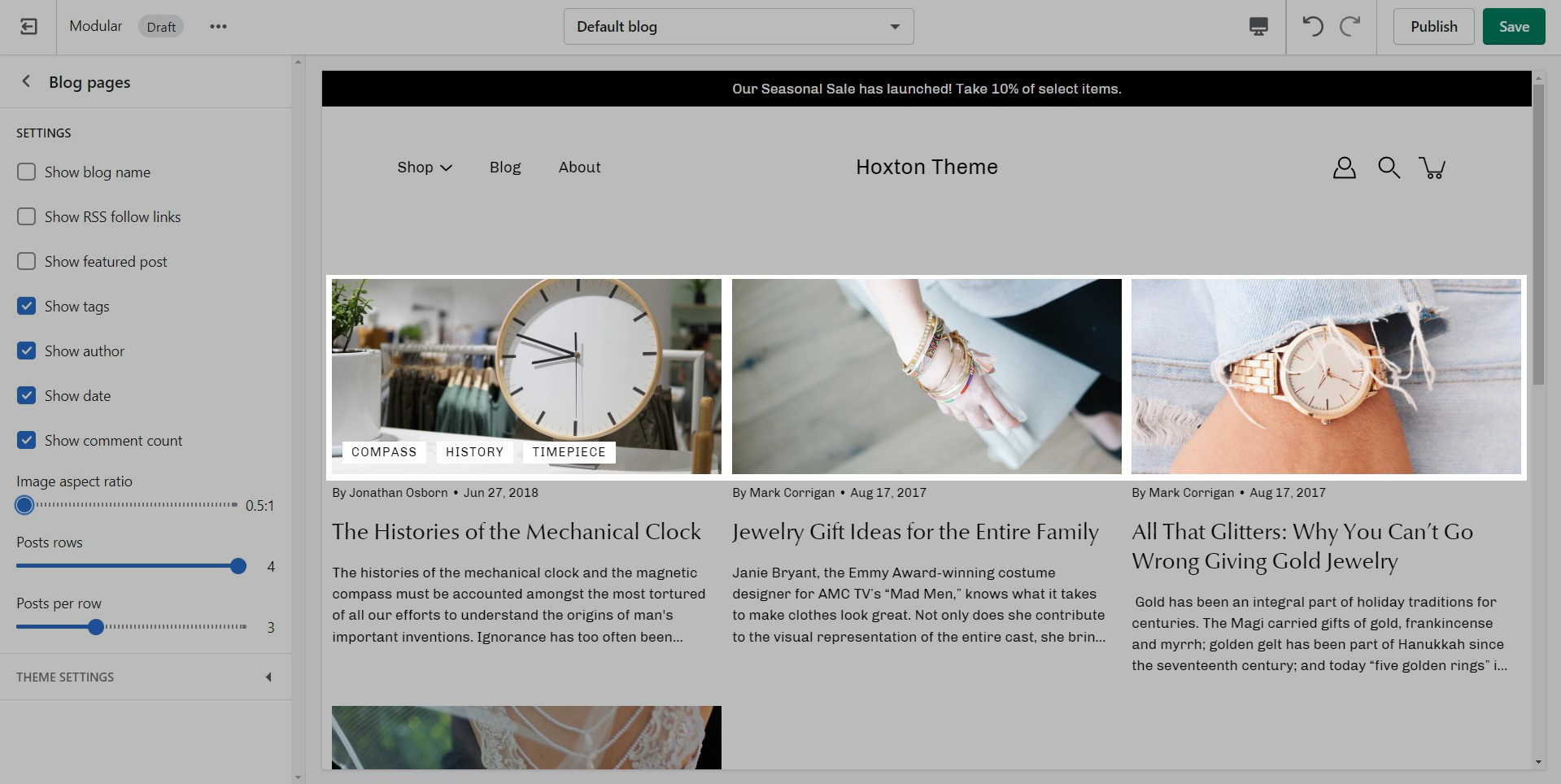
Modular displays a rich grid of all your blog post articles. Click on Blog pages to configure the layout of your blog index page.
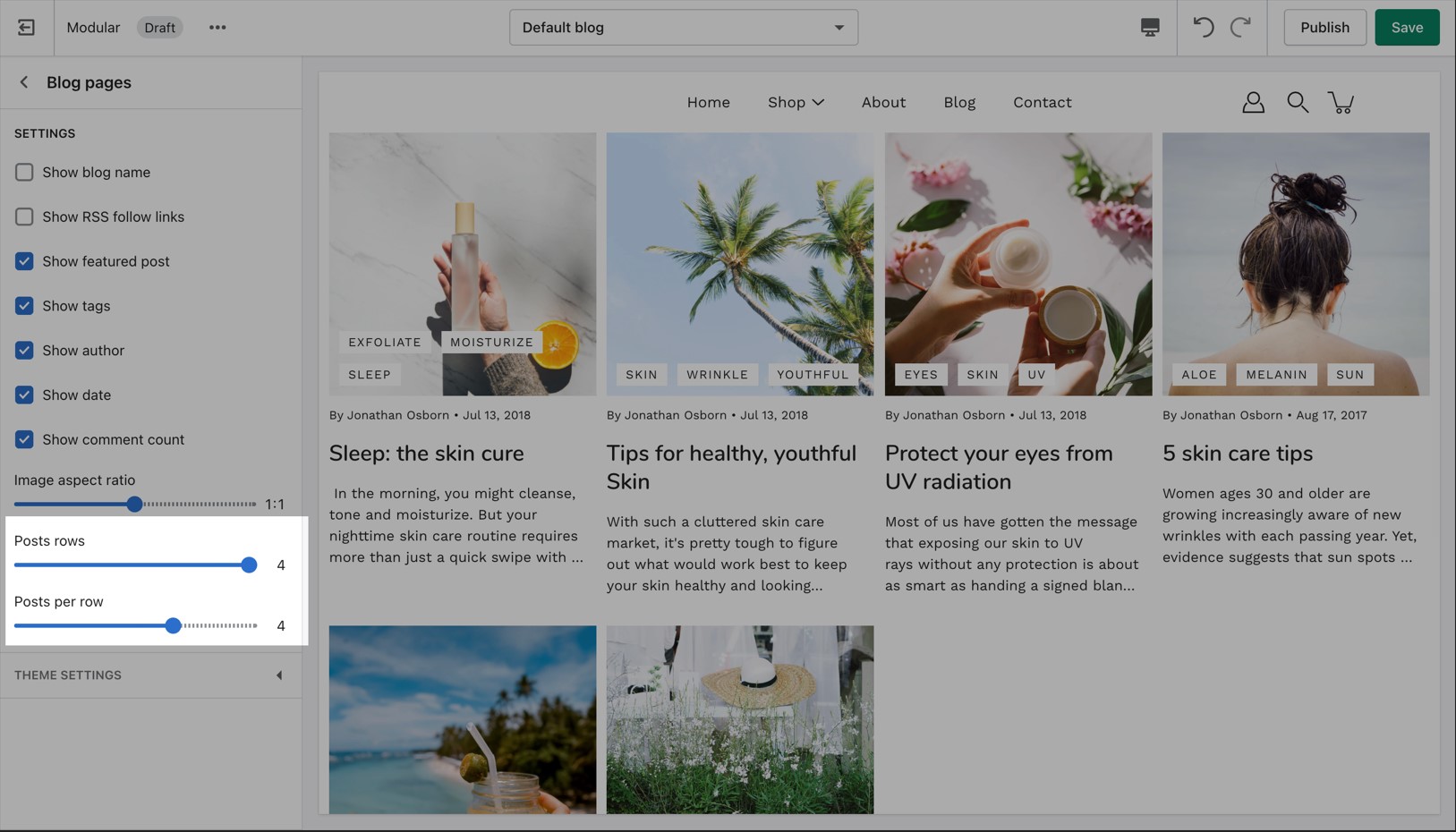
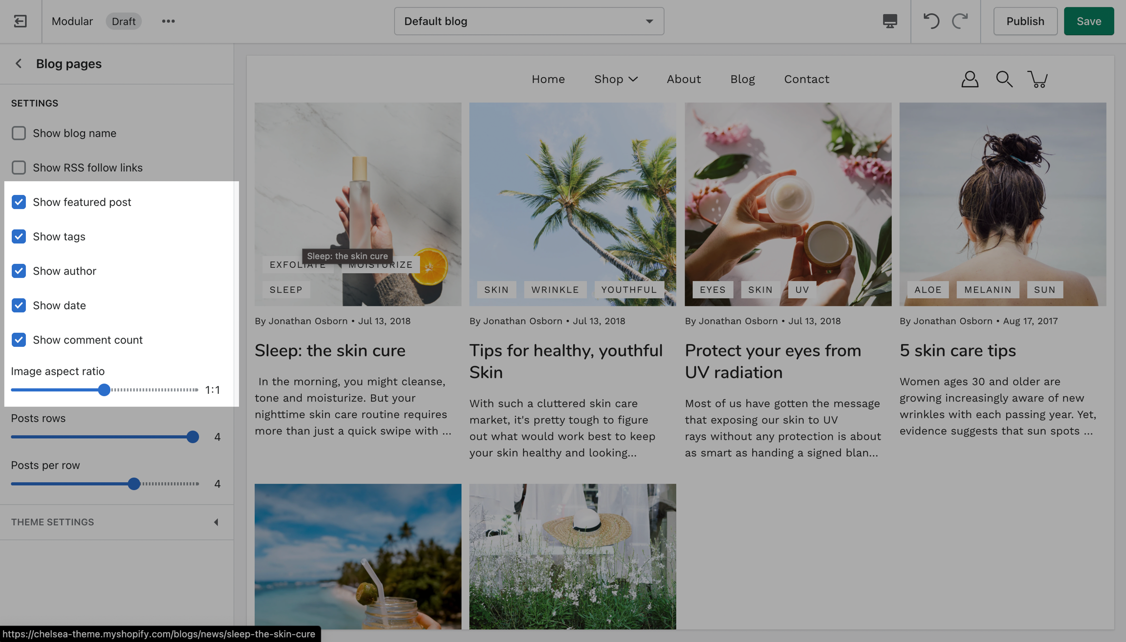
Blog layout
Controls to customize the layout of your blog index page:
TIP - Use Show tags to display the navigation tabs which allows readers to filter though your articles
Articles
Adjust image aspect ratio with the range slider and toggle article attributes:
Adjust the aspect ratio for wide to tall style images:
How to set up custom filtering options
Filtering menus for your collection pages
Modular has three filtering methods to choose from. They can be found under the Collection products section settings.
Default
The default method is a new feature introduced with Online Store 2.0. This feature is automatically generated based on your product information such as variant price, availability, product type, brand, and vendor.
Filter by tag
Filtering by tag method simply takes all of the unique tags applied to each product of the collection and lists them inside the filters menu.
This is the most simple method of all and as such, the fastest. If your priority is speed, we definitely recommend giving this method a try.
Filter by group
The filter by group method has been a staple in our theme for years and we are happy to include this in this version too. While this method is similar to the filter by tag method, as they both use product tags, it is a lot more advanced.
Setting this method up requires the use of product tags with a specific pattern. For each of your products, you need to specify tags that consist of a combination between the group name and the option name.
The group and option need to be separated with an underscore but they can contain spaces if they need to.
Creating more Collection page templates
Creating new JSON templates for your collections
When creating new JSON templates, you need to have at least one template to use as a base. The new Shopify Theme Editor is powerful and can create new templates without you ever needing to go into the theme code.
Where do we start?
To create a new Collection page template you need to click on the top drop-down menu and select the Collections tab. From here, click on 'Create template' after which give your new template a name, and choose a template to base it on.
Where do the new templates go?
After the new template is created, you will find it under the same Collections tab in the drop-down menu. You will be able to set up each collection page template individually and create truly unique pages using this method.
How do we apply them to the live store?
Finally, after your collection page template is ready and customized all that's left to do is assign it to the collection it was meant for. You can do this by going into your admin panel and clicking on Products > Collections. After you locate the collection you're looking for, simply scroll down to the 'Theme template' tab and select the appropriate page template.
Badges
Add badges or 'stickers' to your individual products
Badges, small yet powerful symbols, convey a wealth of information in a concise and visually captivating manner.
How to create custom badges
Contacting support
Theme Support.
To reach us with questions or additional assistance with using Modular, our support staff is here to help you by email. To better support all our customers, we handle all our support via email. This helps us manage support across multiple time zones in a timely manner.
Reach us via our contact form:
How to add Custom Fonts
Uploading your Font Files
In order to use your own custom fonts, you will first need to upload the font files. To do this, you'll need to head on over to your Online Store > Themes and click on Actions > Edit code.
From here, open the Assets folder and upload your font files into it:
Note: Because these settings keep the height static across all devices, the width will change. Your images may be cut off from the side so make sure that the focal point is in the center.
Note: It's important to use equal-sized images in terms of height for this option to maintain consistency in the slide height as the slideshow advances.
Click the Copy link button to copy the address to your clipboard.
Send us that link, pasted from your clipboard.
Creating a new definition
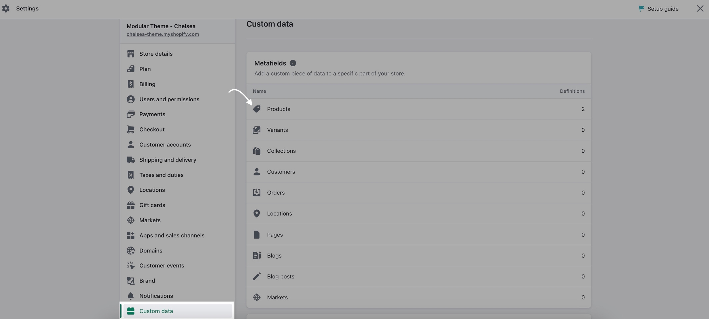
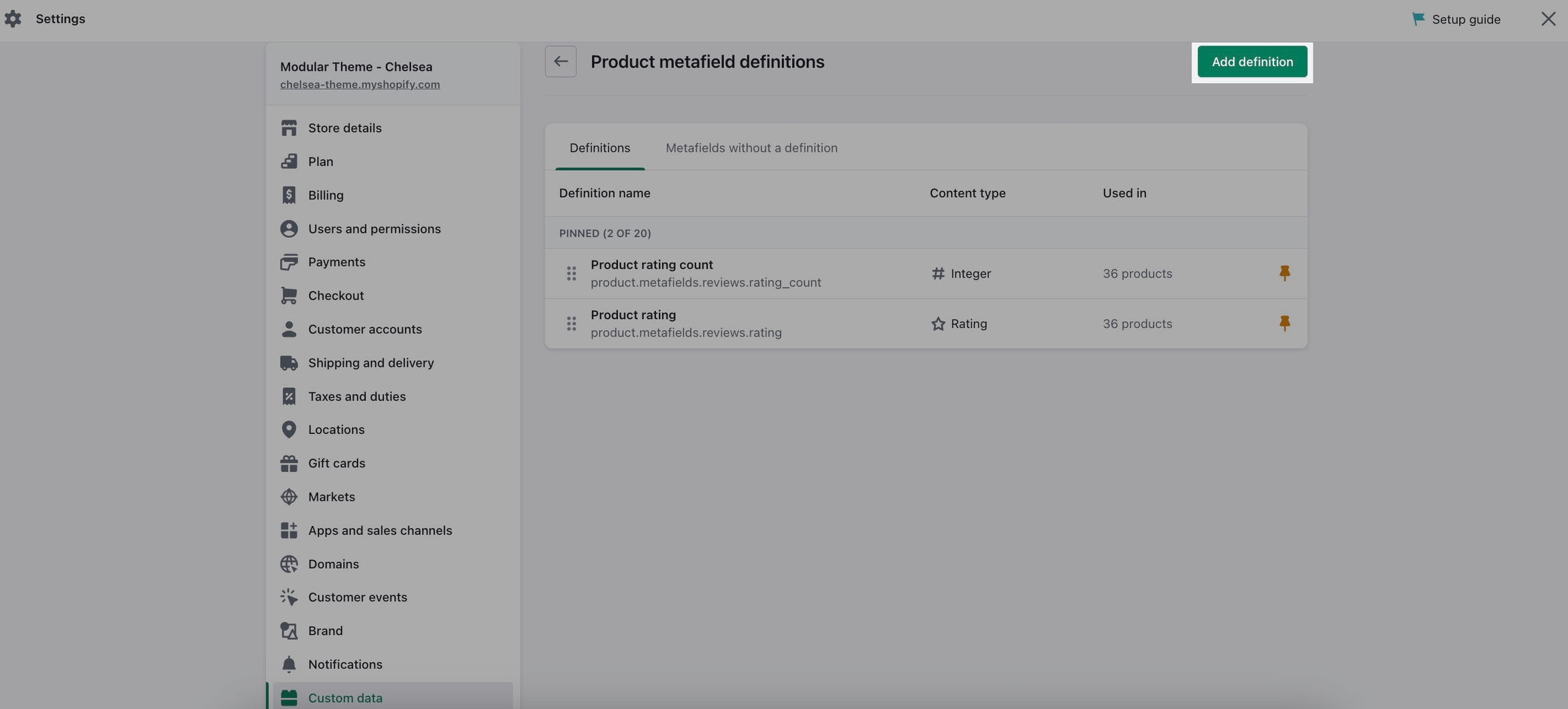
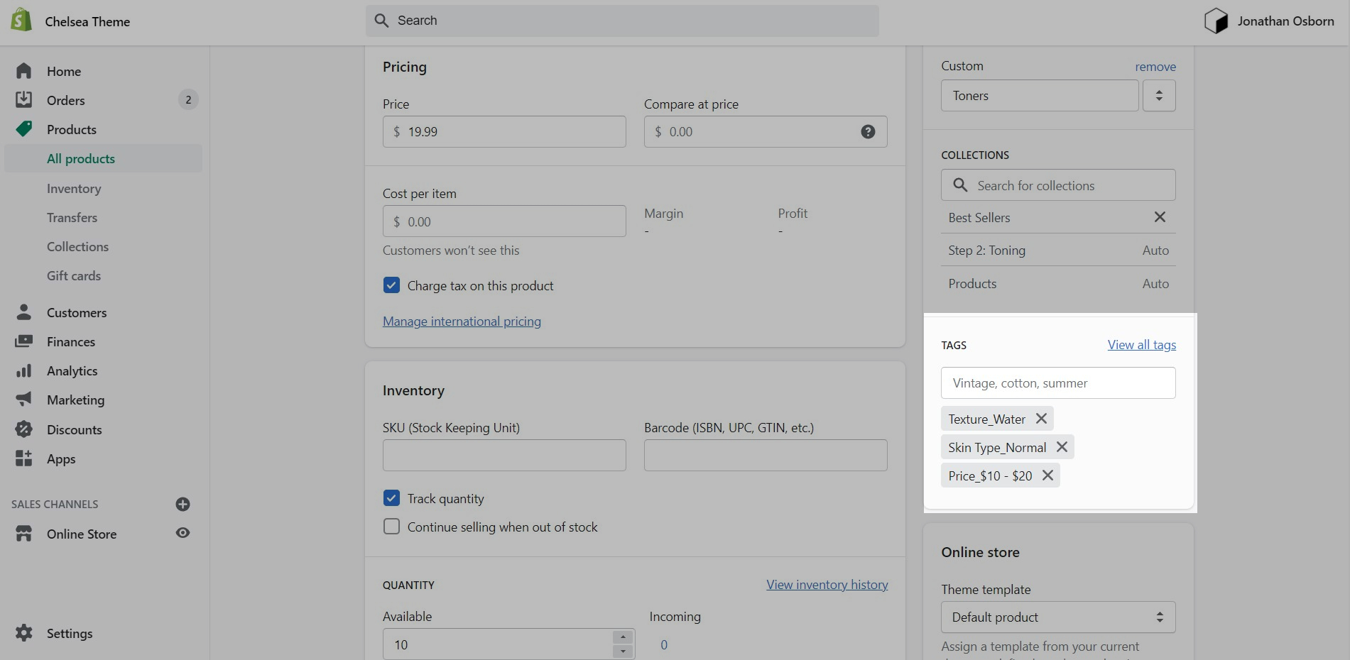
Custom badges are easy to create and all done in your Shopify admin. The first step is to define a custom metafield that Modular can recognize.
Start in your Shopify Admin -> Settings and choose Custom data from the left panel and then click on Products(click on the images to zoom):
Click the Add definition button to begin. Choose a name, we'll use 'badge'. Next, we will use a custom namespace. This is required for custom badges.
A crucial step here is to change the default namespace (usually called 'custom') to theme
Add a description and choose Select content type. Choose Text, then select Single line text (it's the default choice):
Product setup
The next and final step is to edit any of your products in the Shopify Admin -> Products and update the new badge metafield.
Scroll to the bottom of the product setup page:
Save your product and preview it on your Collection pages:
Don't forget to Save your new product metafield.
Shopify Support.
Shopify provides 24/7 support to all its customers. Shopify Support covers any platform questions or issues. For example, if you need assistance with using the Shopify Admin tools like product setup or your store settings. Shopify Support also handles all Checkout support.
For all app-related issues or questions, Shopify's policy requires app developers to be responsible for ensuring compatibility with themes in the Theme Store. It's best if you reach out to each individual app developer when requiring assistance with their app, functionality, or conflicts.
We can only support the code we write which is the code of the Modular theme. Integrations with apps are handled by app developers directly. Each app developer has their own support system in place and can help you with issues regarding their app.
Shopify Experts.
For any custom code requests or theme customizations, we recommend that you reach out to a Shopify Expert. Shopify Experts are advanced developers that provide many custom solutions for your store and also quick task-based solutions. They can provide full support for their work.
Presidio Creative does not provide any custom coding services.
Some Shopify Experts with Modular experience include:
Pixelsupply has experience working with Shopify and accepts small contracts
Blackbelt has Modular experience and a great portfolio
is a large and experienced Shopify agency that does Modular work
is great, they also do plenty of Modular work.
- Theme developers that are available for custom work and projects
We respond to requests in the order they are received, typically within 48 business hours (excluding weekends and holidays).
For checkout page issues, contact Shopify Support directly.
The checkout page and theme are separate systems. Checkout is a function of Shopify and can’t be controlled by the theme.
Defining the new Font Families
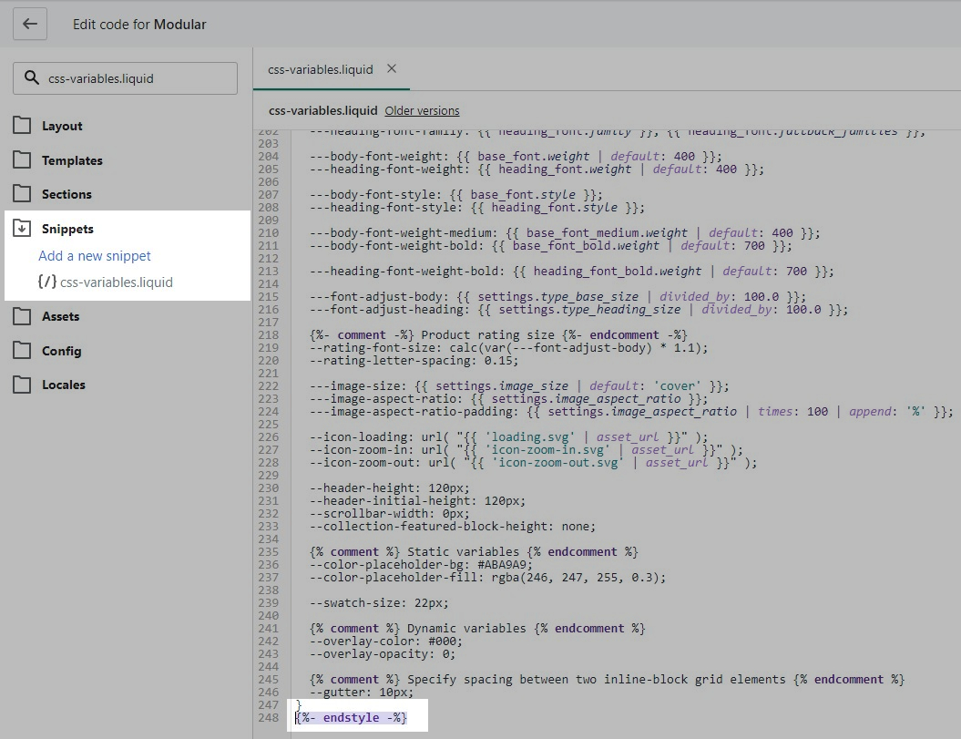
Now that we have the assets sorted out we can head on over to the 'css-variables.liquid' file. It's located inside the Snippets folder.
Here you need to scroll all the way to the bottom and add a bit of code before the closing style tag (' {%- endstyle -%} '):
This is the place where you need to add this code snippet:
In this code snippet, you need to replace all references of 'Gotham' with your own font name and font files names.
Assigning your Custom Fonts
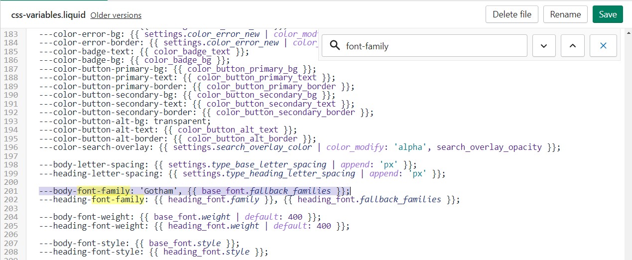
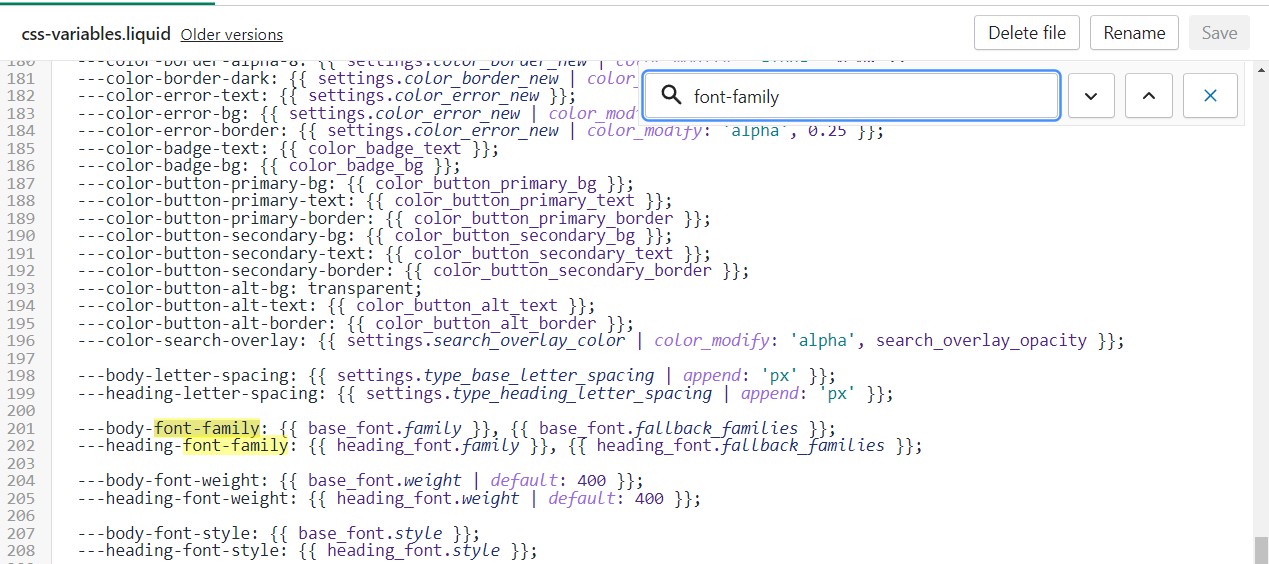
Finally, all we need to do is assign the new fonts to be used. There are two global font variables that control the fonts for the headings and body text.
You can easily find all of them by using CTRL + F (or Command + F) and searching for 'font-family':
Click to expand the image if it's hard to read
All you need to do here is to replace the first value assigned to the variables you're looking to change, we'll continue to use 'Gotham' in our example to keep it consistent but this is also a place where you input your custom font name:
Click to expand the image if it's hard to read
That's it, you're all set and ready to go. Don't forget to Save the changes.
Note: There is no option to remove the 'Powered by Shopify' text in the section settings.
To remove it, please check out our next post.
This file is not minified and holds the exact same code but in a much more user-friendly layout. While you can certainly change the styles in it, these changes won't take effect on your live store. The reason for this is that this file is not read by default.
Note: Minified CSS is slightly faster so using "theme.css" is also slightly faster.
Click to view details of individual sections included with Modular:
Additional Theme Settings included with Modular:
Custom Liquid
Recently viewed
Creating new Blog page templates
Creating the new template
Start by opening the Theme Editor and clicking on the Blogs tab in the top drop-down menu. From here, click on 'Create template'.
Name your new blog template something easy to remember
Editing the new template
Find your new template by going into the same Blogs tab in the top drop-down menu and select the template you just created. You are now able to add sections to it without affecting any other blog template.
Assigning the new template to your blog
The last step is to assign the new template to one of your blogs so that it can take the new style you've created. This is done by going into your Online Store > Blog posts and clicking on Manage blogs. Once you've found the blog you're looking to change, simply change the template name from the 'Theme template' tab.


