Loading...
Loading...
Loading...
Loading...
Loading...
Loading...
Loading...
Loading...
Loading...
Loading...
Loading...
Typography allows you to set a different font for general elements across your store. We kick things off with arguably the most important bits of text, your headings, and body text:
You can choose from predetermined font stacks, this is all coming from the Shopify core code and is NOT theme specific.
If you're having issues with any of the fonts, it's recommended that you reach out to Shopify support.
It's also possible to use fonts outside of the predetermined Shopify font stack. To learn more about this process you can check out our Custom Fonts post:
Set the most widely used colors for your store here. We start with background colors (for sections and badges), text colors, and an accent (Error) color.
For the best overall design and flow, we recommend using two or three main colors. Use high-contrast colors to highlight accents or badges.
There are two main button types in Modular. Almost all sections that use buttons present the option to choose which one to use. Here is where you can set a color for these two styles.
Be mindful to use a color that is high in contrast with the text color set in the previous to make text easier to read.
On the topic of colors, here is a great contrast checker that you should almost always use to make sure your colors give out a readable layout.
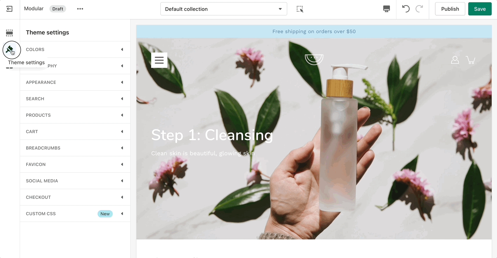
Global theme settings that can affect all pages
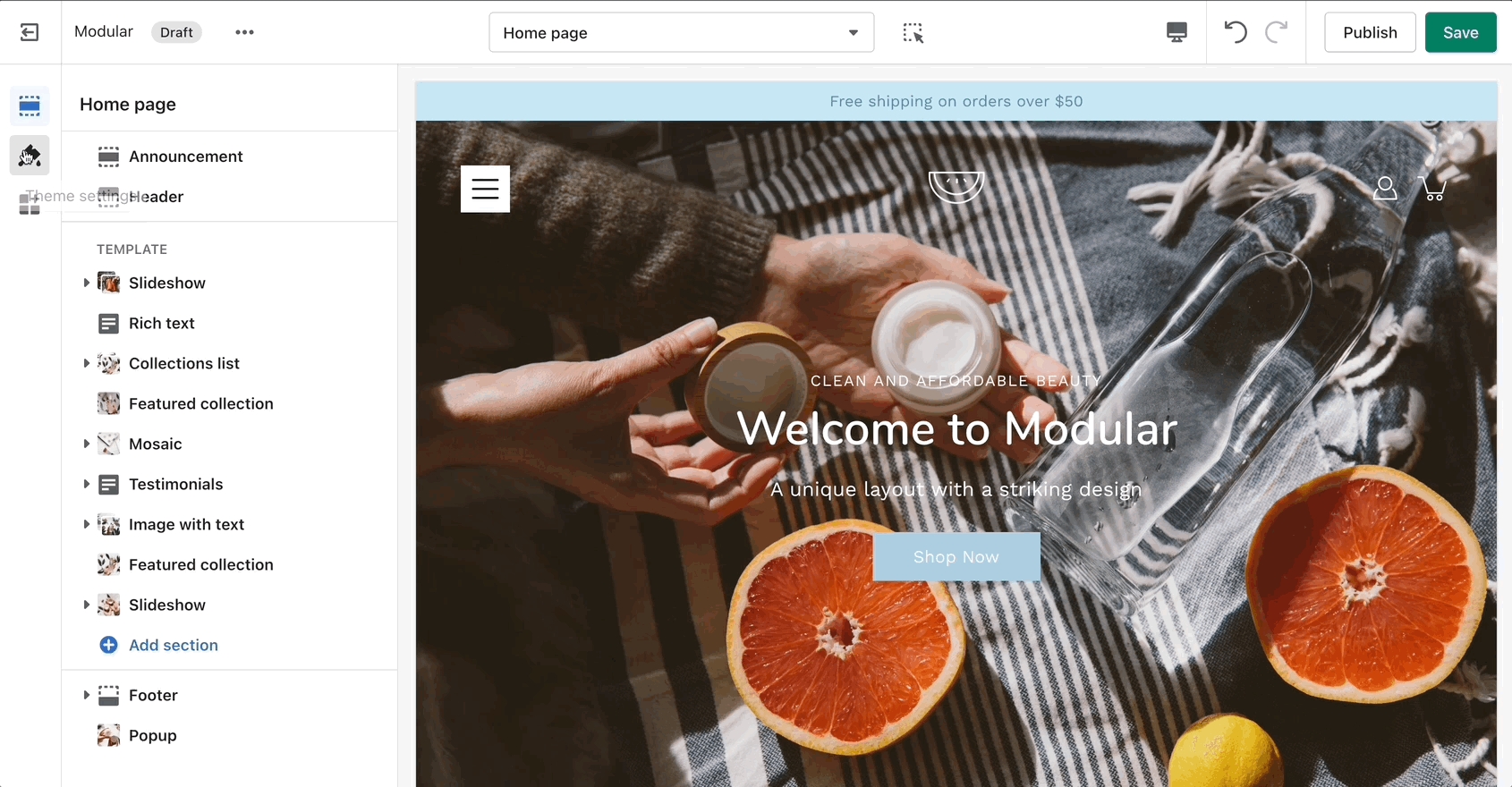
The 'Theme Settings' tab is located under all sections in the Theme Editor. This tab contains a bundle of all global settings in Modular.
Please note that global settings can affect multiple sections and multiple pages.
A few distinctive styles can be created using Modular and they all begin with the main Appearance variables.
Here you can find an option to toggle different animations if you want that extra bump in speed. You can also set a few button features.
Pagination is a must in Modular. Product loops in Shopify are limited to 50 products so pagination is the way to get around this.
The main thing to note about our 'Infinity Scroll' feature is that if it's disabled, pages with multiple items will be 'paginated' into smaller pages.
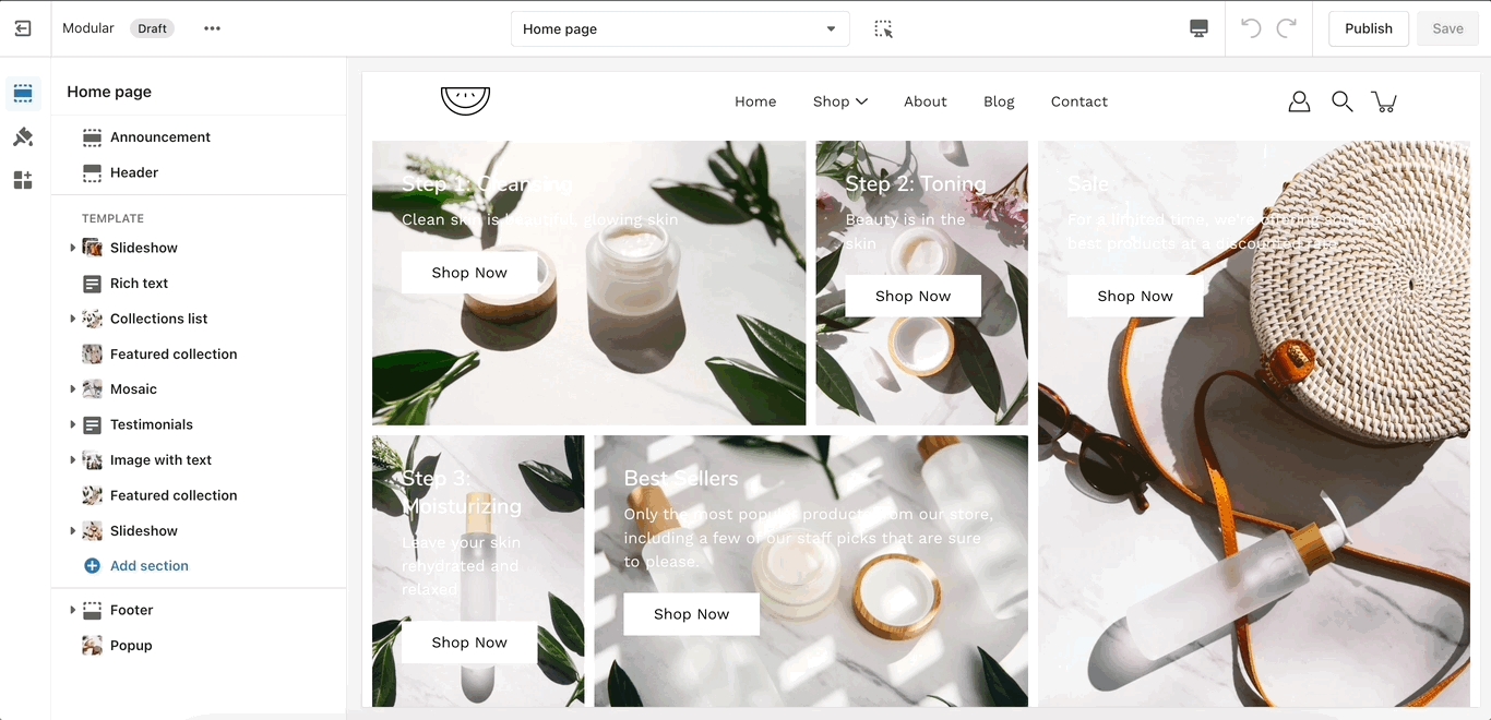
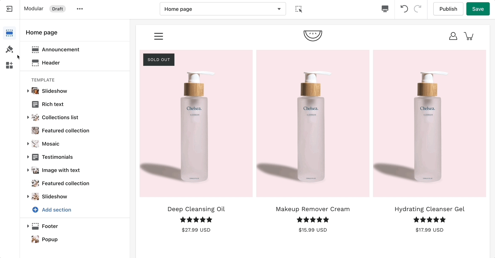
A crucial and very important part of your store are your product and collection pages. There are global settings that affect both in this tab.
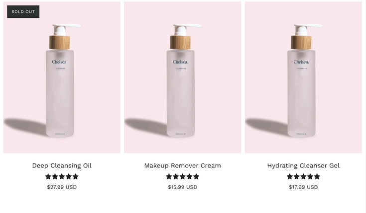
Most notably, you can change the aspect ratio for your product grid to make the blocks wider, taller, or square (1:1)
You can set the image to stretch across the block or to render itself in full inside of it. The latter can result in extra white spaces while the former could cut parts off. The most important thing here is to set the proper aspect ratio.
Another great option tucked away under this tab is the 'products per row'. This is split into two different settings, one for mobile and one for desktop.
Remember, these are global settings so they will affect all pages.
To give an example, your collection page grid is linked to these settings and so is your featured collection section on the home page.
Color Swatches can be toggled here too. This feature can often require additional work to be fully set up. Modular can recognize a few custom color names but not all.
We highly recommend checking out our full-length post on the topic of Color Swatches.
Quick View is a desktop-only feature. It works based on a mouse (and touchpad) event called 'hover'. This event is present on touch-based devices (at this time).
In Modular, the cart popover is an AJAX cart solution. We build a dynamically generated cart without refreshing the page which allows for the flow to remain constant and uninterrupted.
This extends to the functionality of the 'Add to cart' button to also update the Shopify cart object without having to refresh the page.
A lot of apps might not work with AJAX carts so if you are experiencing trouble integrating app code into the cart consider changing the 'Cart type' to a 'Page'.
The 'Cart' icon can not show the number of items in the cart but the 'Circle' icon can.
You can change the label for this checkbox but please note that enabling this option will disable the 'Buy it Now' buttons.
The reason for this is that their main function is to skip the cart page. If your customers must agree with the terms of your store, skipping the cart shouldn't be done.
A good question is why not add this to the checkout page but the scope of a theme stops at the cart page? As third-party theme developers, we do not have access to the Shopify core code and our theme does not have access to the Checkout page template.
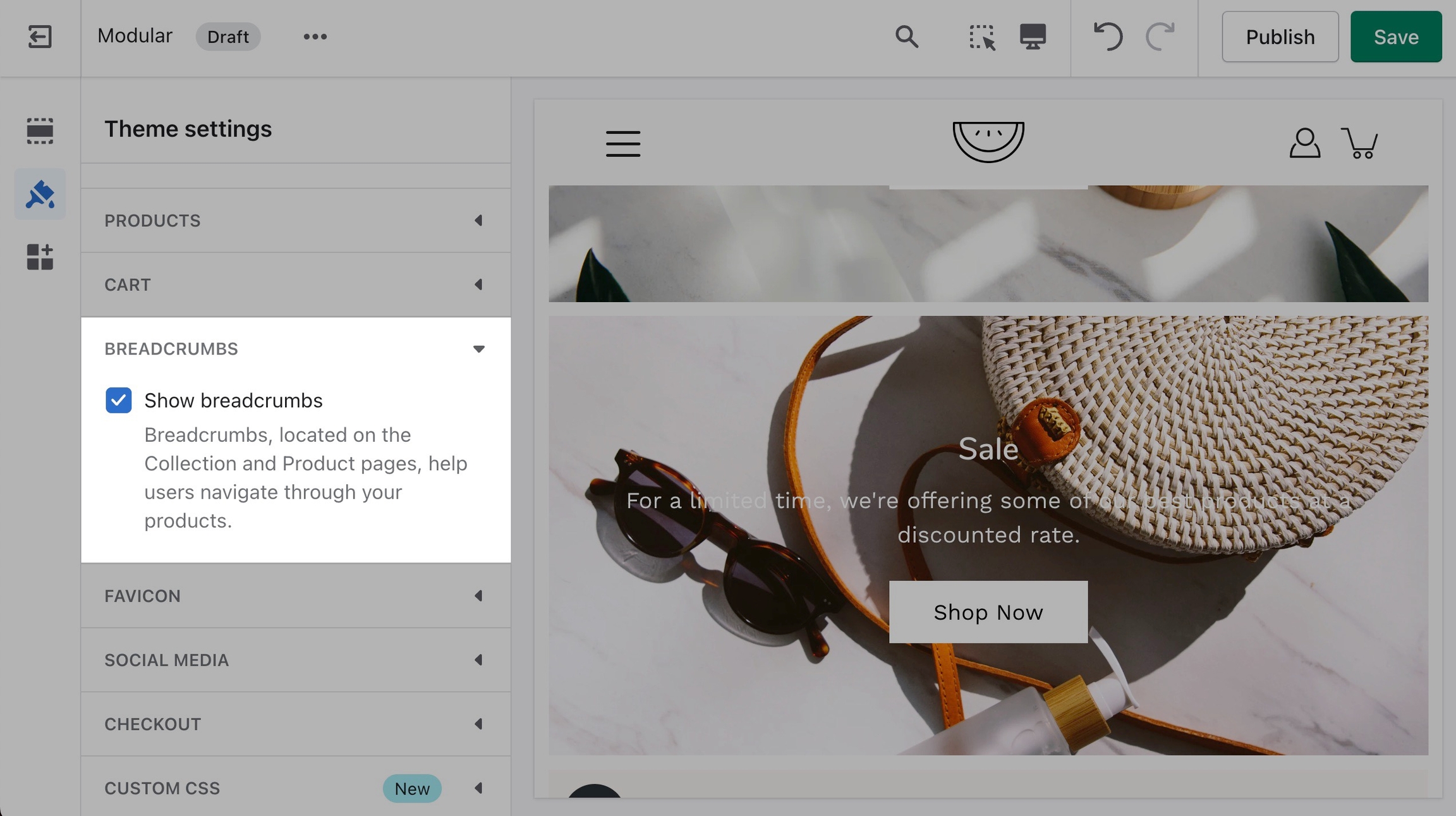
Breadcrumbs, located on the Collection and Product pages, help users navigate through your products.
They are generated automatically depending on the path your customers take through the store.
A very important note to make is that these settings are purely visual and aesthetic. Modular does not have any options to change the functionality of your Checkout page.
The Checkout page is generated entirely from the Shopify core code so for any issues, at Checkout we highly recommend reaching out to Shopify Support.
The options here are predetermined and similar to most other themes.