Loading...
Loading...
Loading...
Loading...
Loading...
Loading...
Loading...
Loading...
Loading...
Loading...
Loading...
Loading...
Loading...
Loading...
Loading...
Loading...
Loading...
Loading...
Loading...
Loading...
Loading...
Loading...
Loading...
Loading...
Loading...
Loading...
Loading...
Loading...
Loading...
Loading...
Loading...
Loading...
Loading...
Loading...
Loading...
Loading...
Loading...
Loading...
Loading...
Loading...
Loading...
Loading...
Loading...
Loading...
Loading...
Loading...
Loading...
Loading...
Loading...
Loading...
Loading...
Loading...
Loading...
Loading...
Loading...
Loading...
Loading...
Loading...
Loading...
Loading...
Loading...
Loading...
Loading...
Loading...
Loading...
Loading...
Loading...
Loading...
Loading...
Loading...
Loading...
Loading...
Loading...
Loading...
Loading...
Loading...
Loading...
Loading...
Loading...
Loading...
Loading...
Loading...
Loading...
Loading...
Loading...
Loading...
Loading...
Loading...
Loading...
Loading...
Loading...
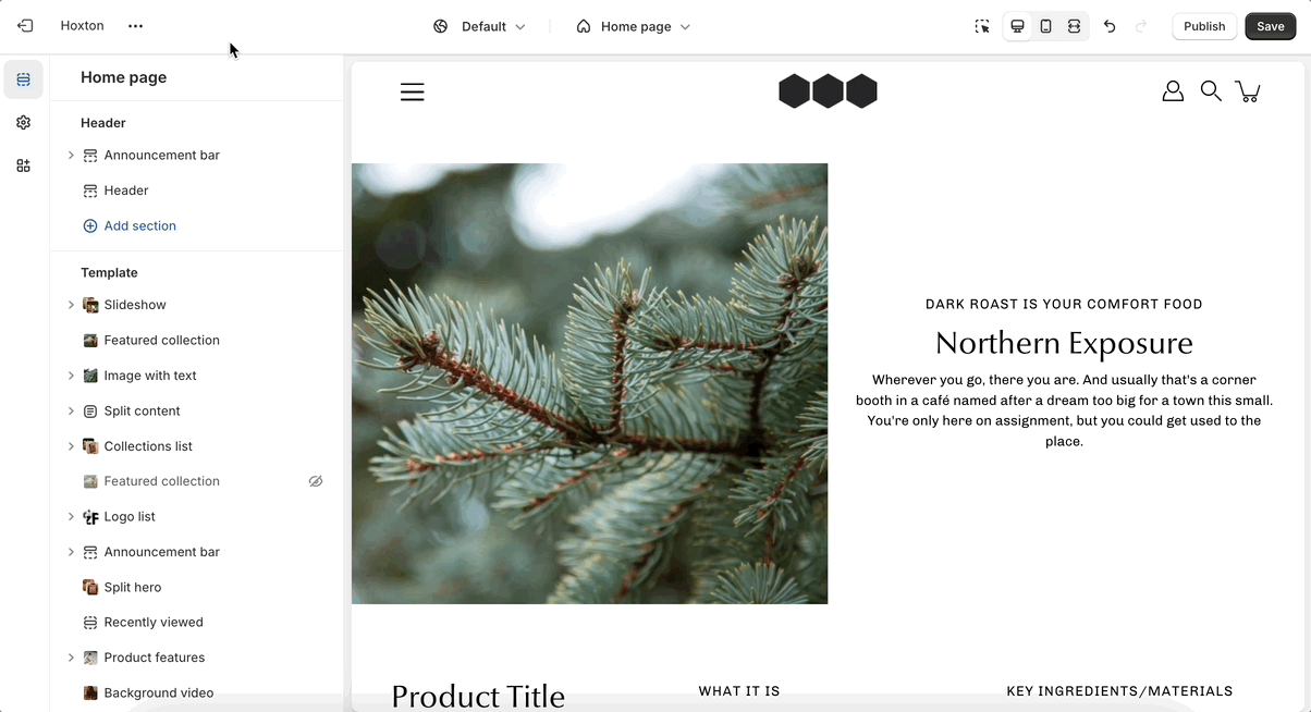
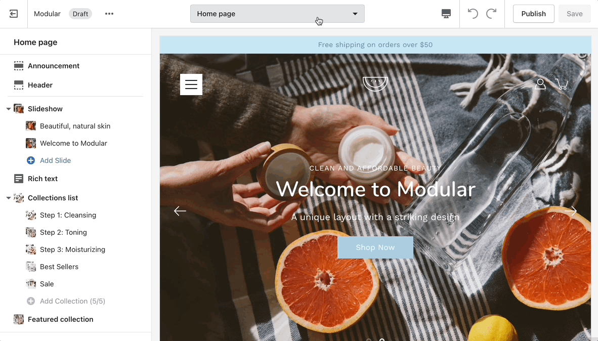
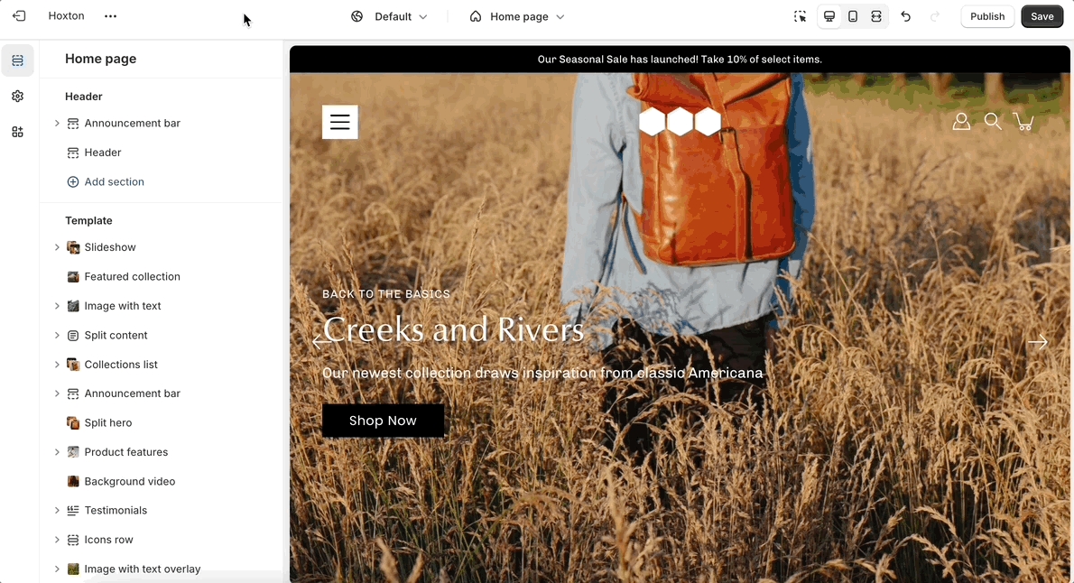
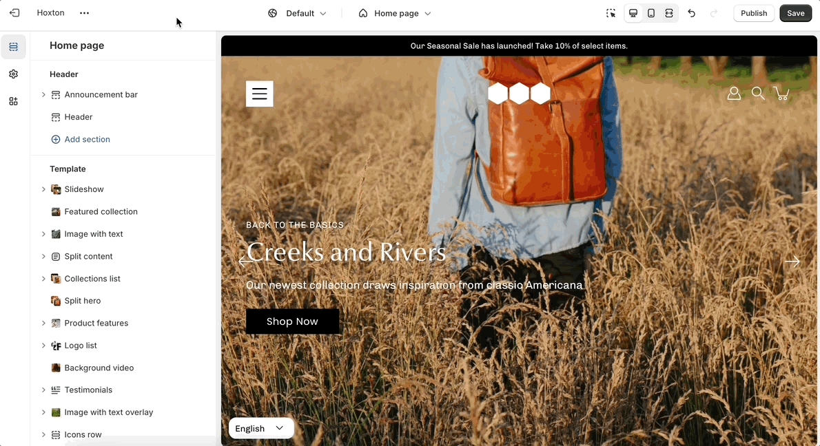
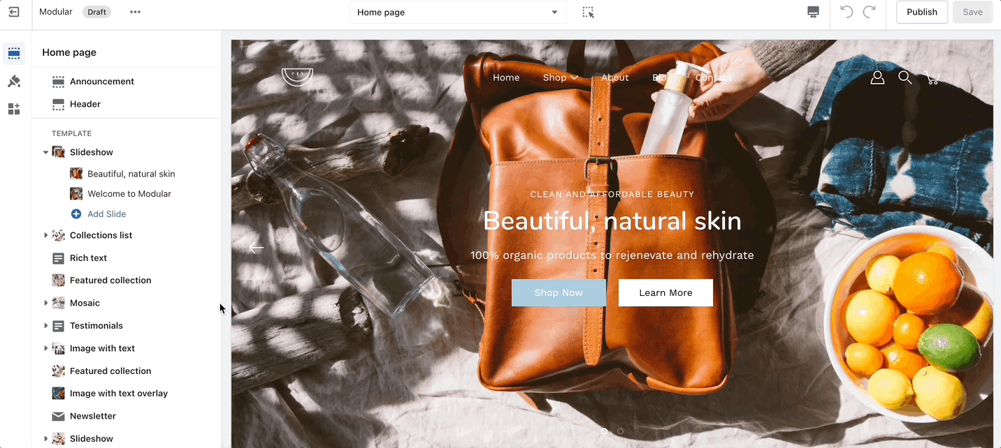
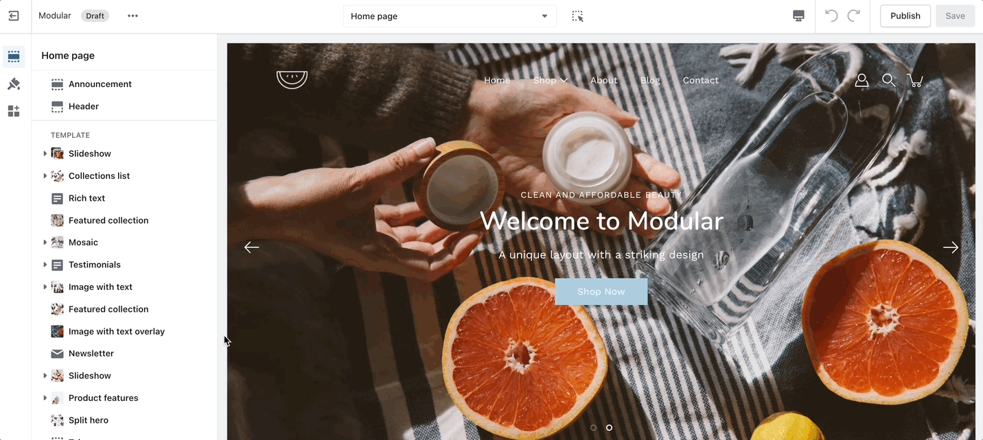
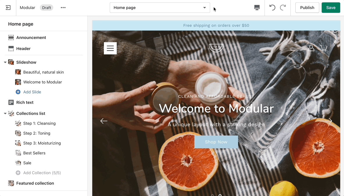
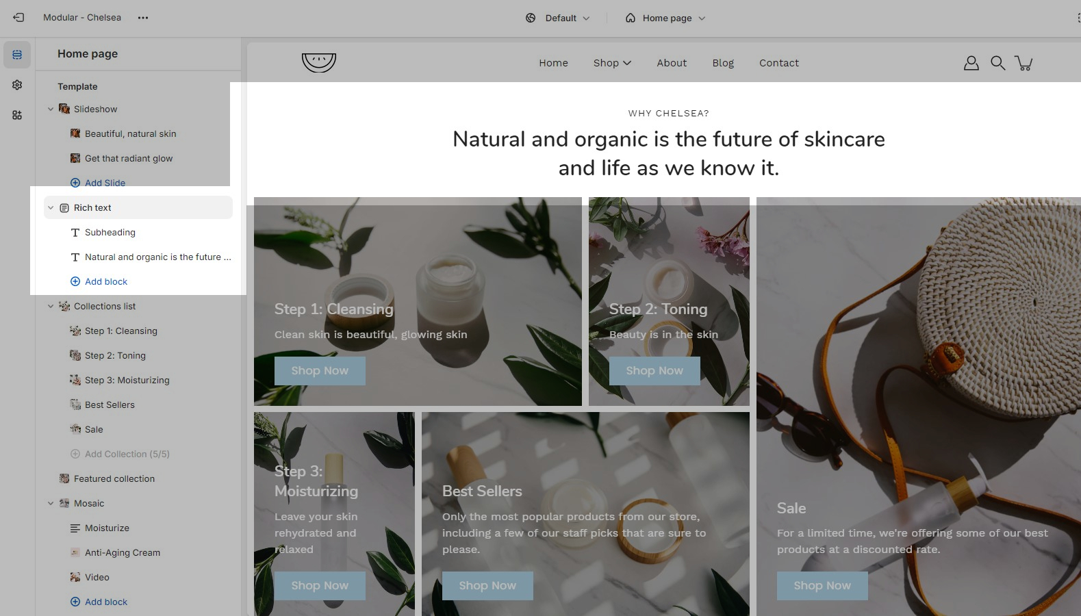
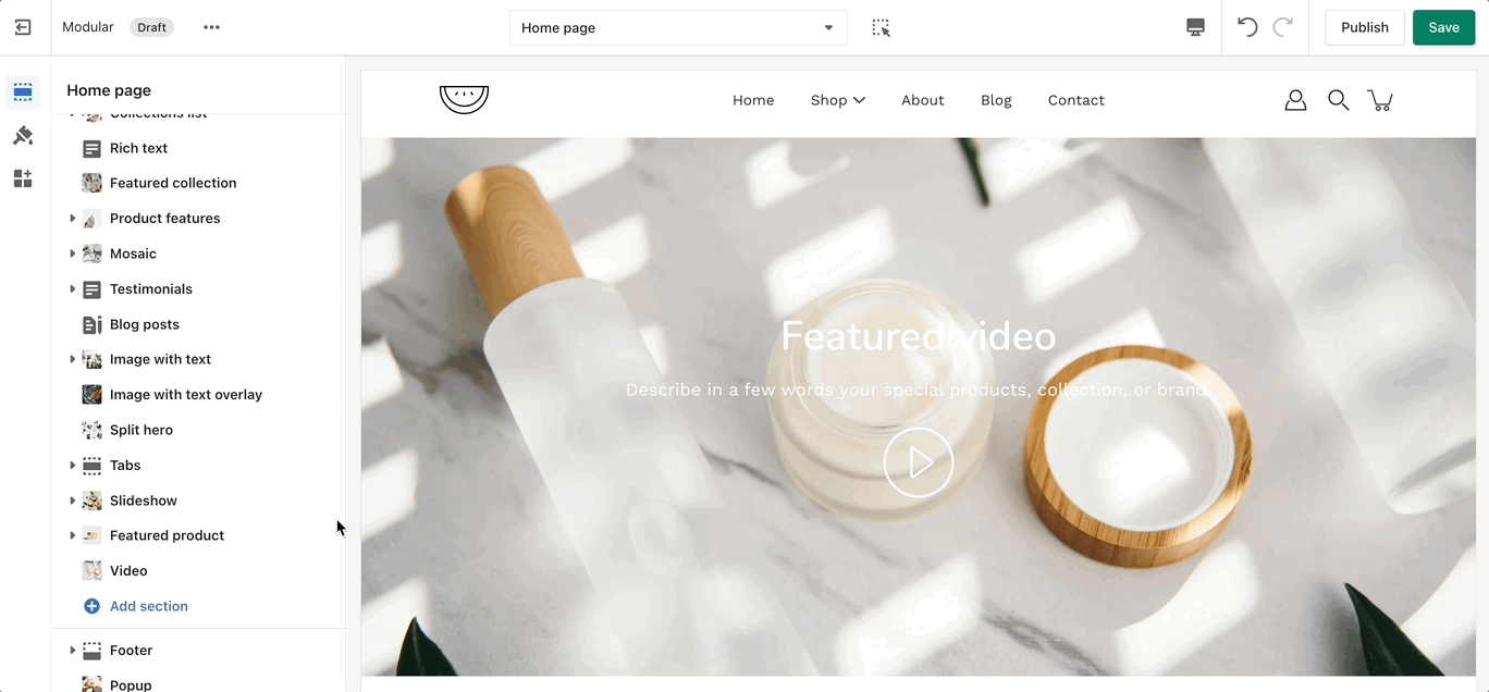
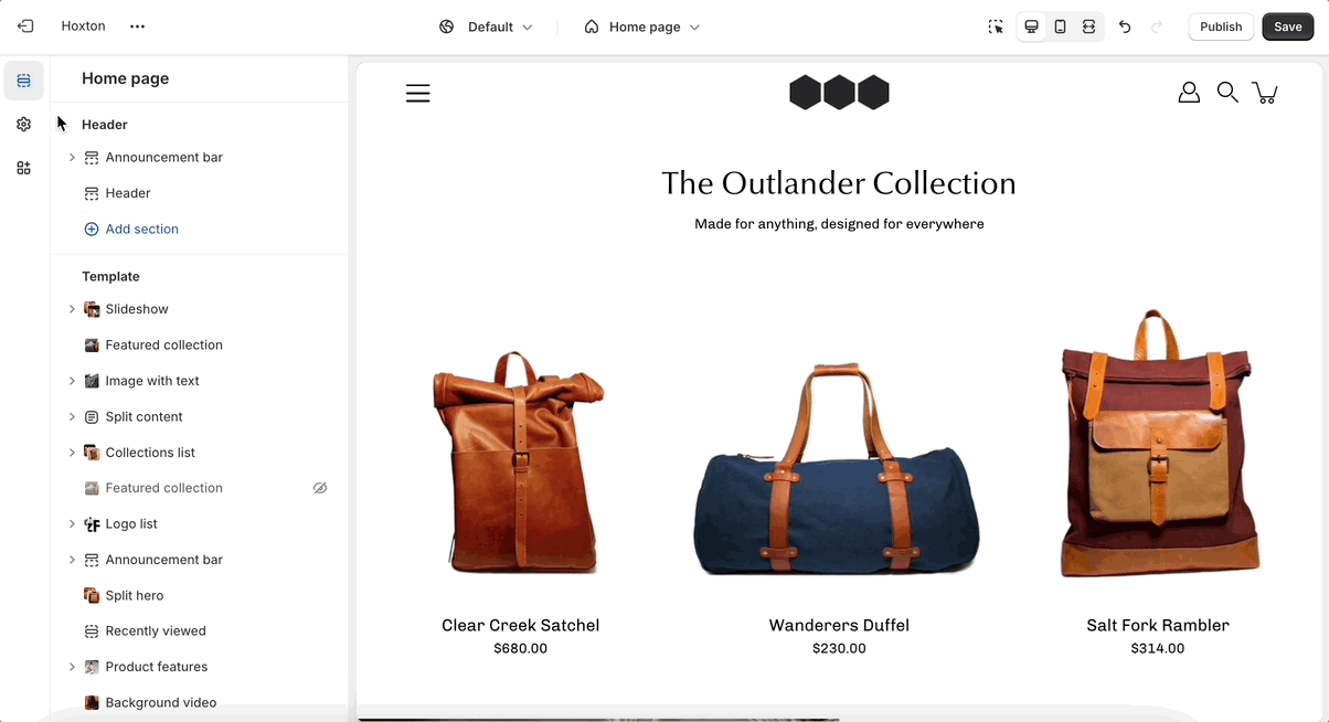
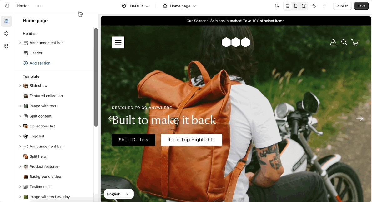
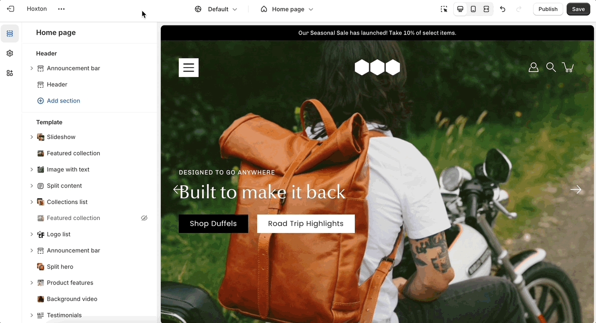
Customize your store using these Modular sections
Modular comes complete with 20+ professional theme sections to help you merchandise your online store. Sections can be added to any page on your store.
Discover the complete range of sections and their settings. Experiment by adding different types of sections and section blocks to the homepage and the other pages within your store.
These sections can be placed on any page including:
Homepage
Product pages
Collection pages and Collection list
Blog index and Blog posts
Shopify pages
404 error page, Search page, Password page
Cart page
Modular is built to display brand imagery in a minimalist, grid-centered design. Filled with modern sections and blocks, Modular features a signature product grid to present collections and products in a statement collage-style layout.
Discover Modular and our theme documentation to help build and design your store with simplicity.
Explore our Shopify demonstration stores running Modular:
Download our Modular theme from the Shopify Theme Store:
If you have questions or need additional assistance with using Modular, our support staff is here to help you by email. Reach out to us through our contact form:
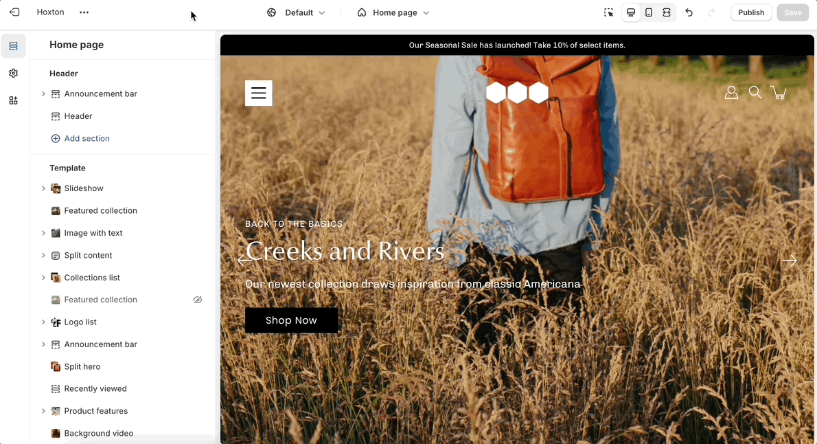
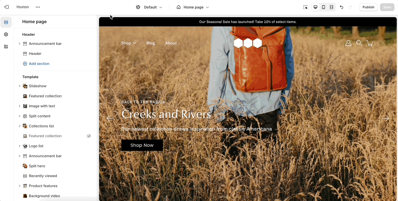
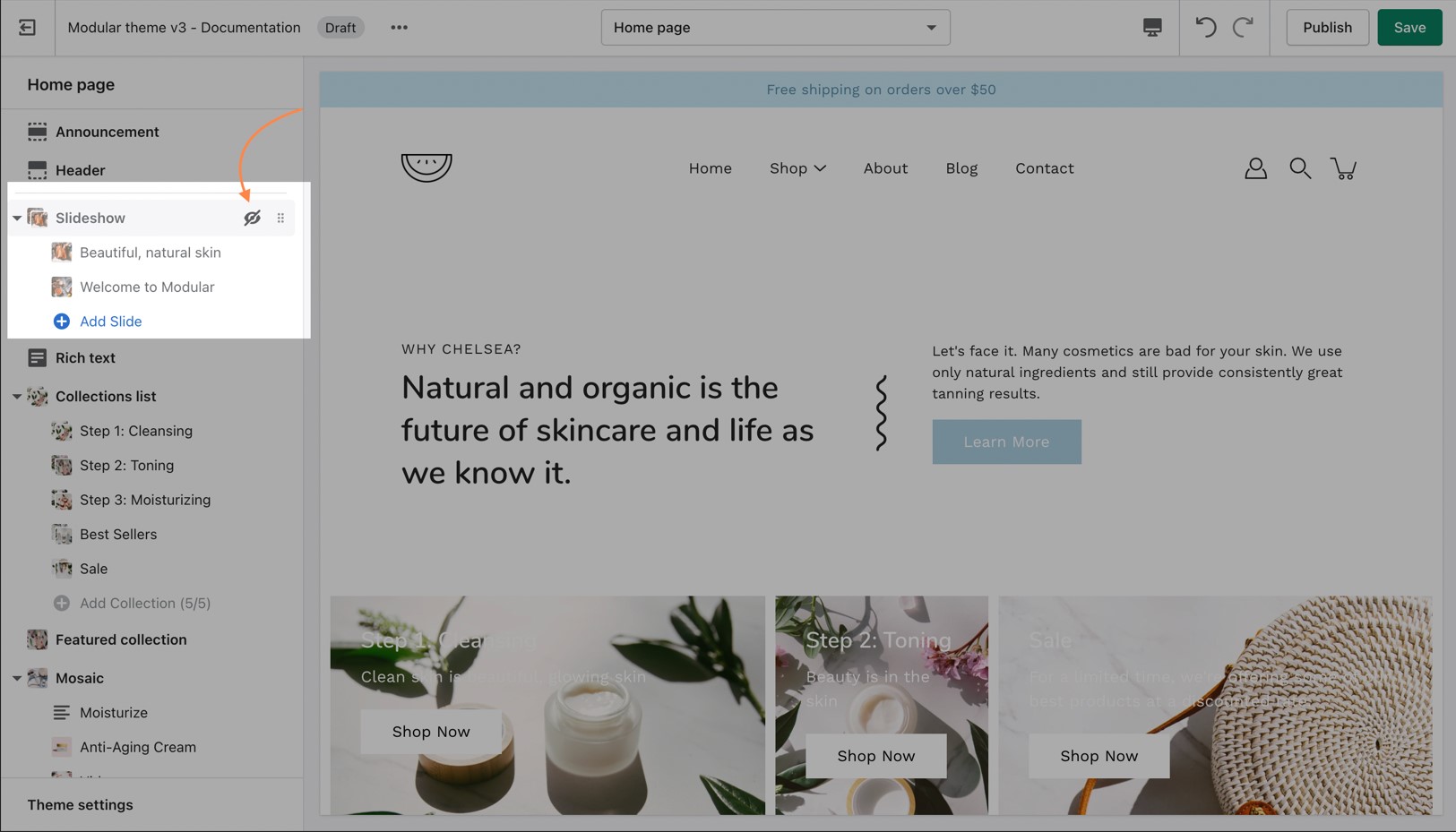
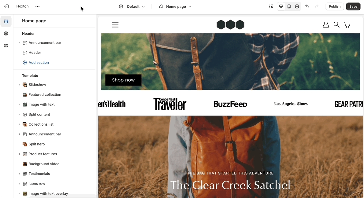
Contacting supportUse the handle icon (stacked dots) which is located next to the eye icon to drag a section and drop it in a new position:
'Announcement bar' is a versatile tool that enables you to share vital messages with your website's visitors efficiently. Use it to advertise sales, new product launches, or free shipping offers.
Layout: Choose between a slider or marquee layout, providing flexibility in how your announcements are displayed.
Background: Personalize the appearance of your announcement bar with customizable background and text colors to match your brand's aesthetic.
Text: Easily create text-based announcements with rich formatting options, allowing you to highlight key information and calls to action.
Mobile optimization: Optimize your announcements for mobile devices, delivering a consistent and engaging user experience across all platforms.
Header: Seamlessly integrate the announcement bar into your website's header, ensuring maximum visibility and accessibility for your visitors.
Targeted deployment: Apply targeting settings to custom code blocks, allowing you to control where and how your custom content is displayed.
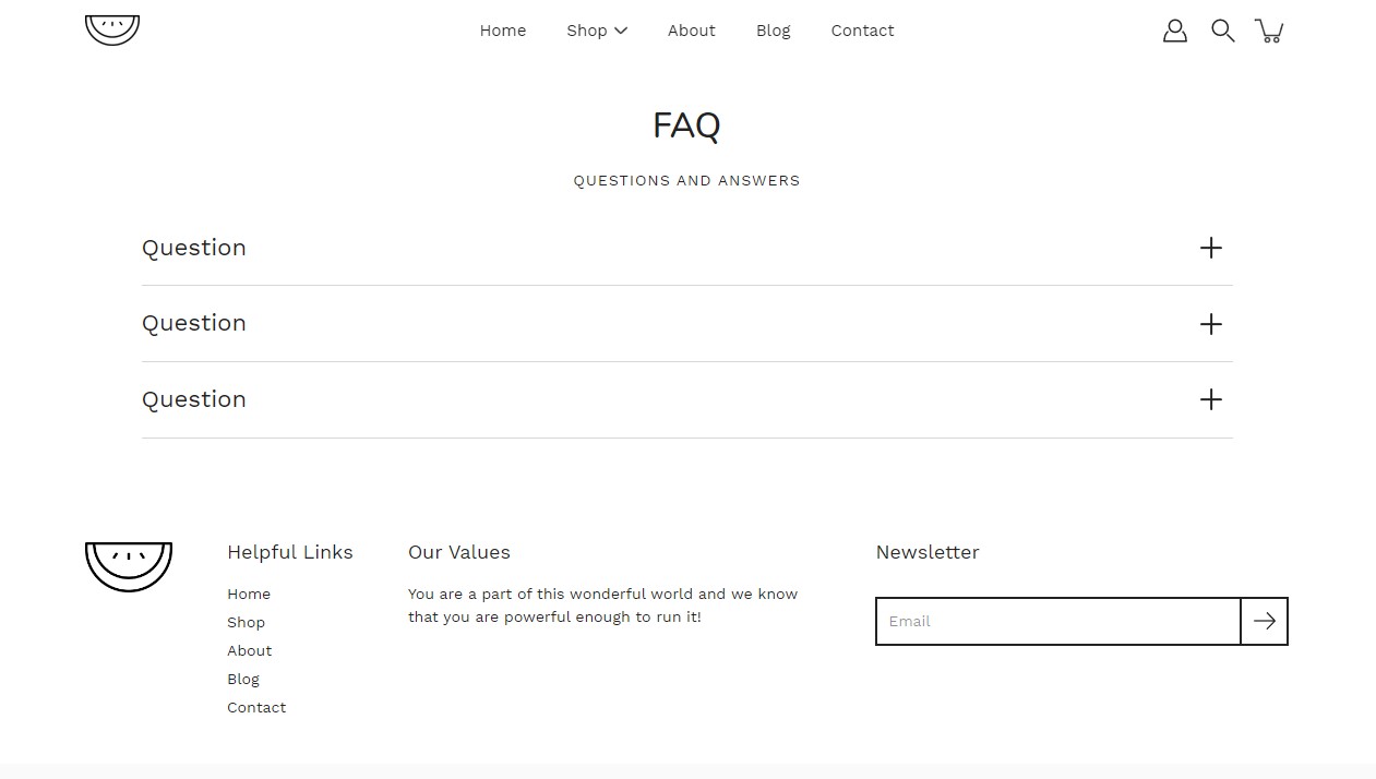
'FAQ' aims to provide clarity and address common queries about your products, services, and policies.
Width options: Choose between a standard width or a narrower layout to suit your preferences.
Section padding: Customize the padding of our FAQ section to ensure optimal spacing and visual appeal.
Questions and Answers: Add blocks to build out your FAQ section.
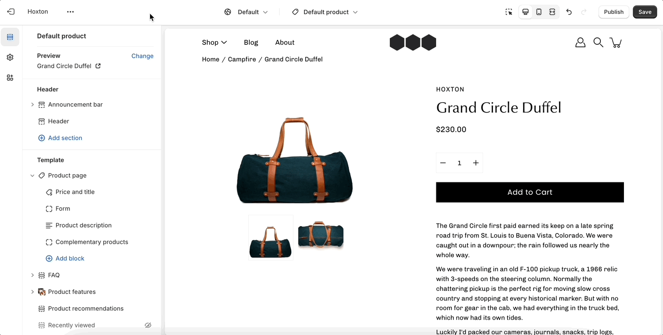
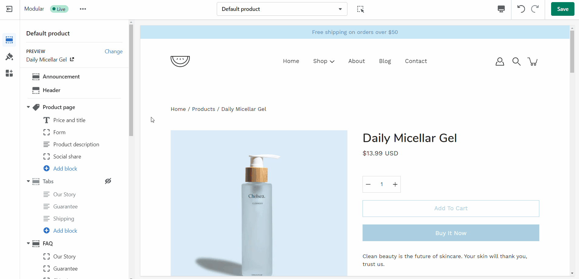
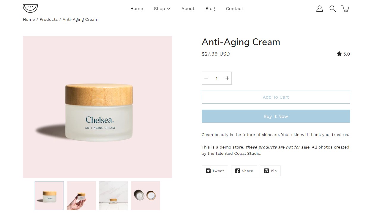
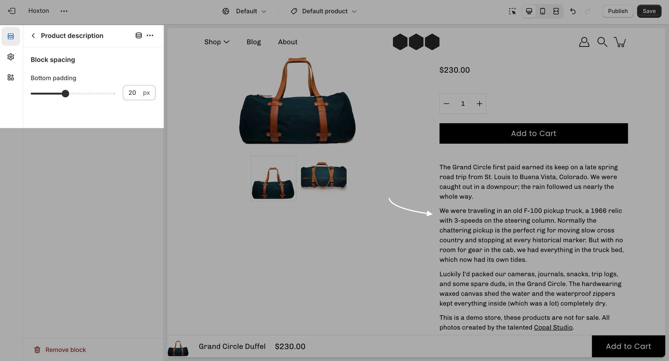
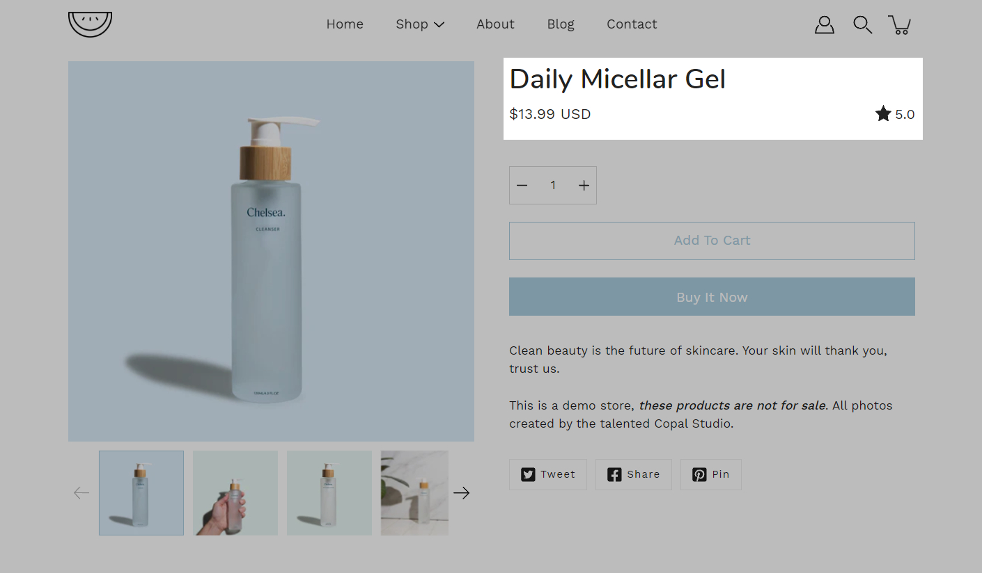
Use the 'Featured product' section to bring a product gallery and form to your store pages.
Product showcase: Draw attention to a specific product that aligns with your marketing strategy or customer preferences.
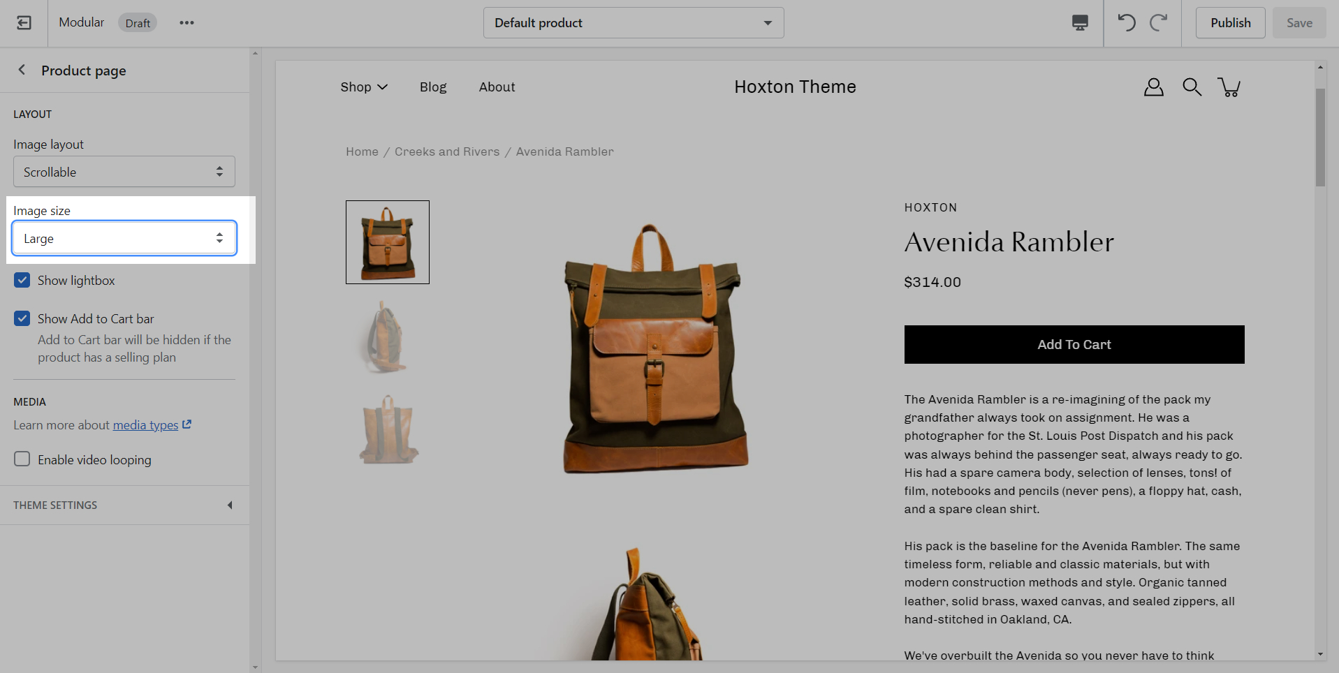
Image layout: Customize your product section by selecting a layout, defining the image width, and deciding on product thumbnail visibility for the carousel layout.
Section settings: Select the product, adjust the image position and size, enable video looping, and set the top and bottom padding.
Blocks: Add and customize various elements within the featured product section, like the product’s price and title, a form for purchasing, a product description, and social sharing options, each with settings for visibility and spacing.
Custom CSS is a new block added by Shopify for all themes. Use it to add your own CSS without the need to access the theme code.
Creating new JSON templates for your products
When creating new JSON templates, you need to have at least one template to use as a base. The new Shopify theme editor is powerful and can create new templates without you ever needing to go into the theme code.
To create a new product template you need to click on the top drop-down menu and select the product tab. From here, click on 'create template' after which give your new template a name, and choose a template to base it on.
After the new template is created, you will find it under the same product tab in the drop-down menu. You will be able to set up each product page individually and create truly unique pages using this method.
Finally, after your product page is ready and customized all that's left to do is assign it to the product it was meant for. You can do this by going into your admin panel and clicking on products. After you locate the product you're looking for, simply scroll down to the 'theme template' tab and select the appropriate page template.
Note: You can only select the templates of your live theme. Make sure to publish your copy of Modular so that you can assign the new product page template.
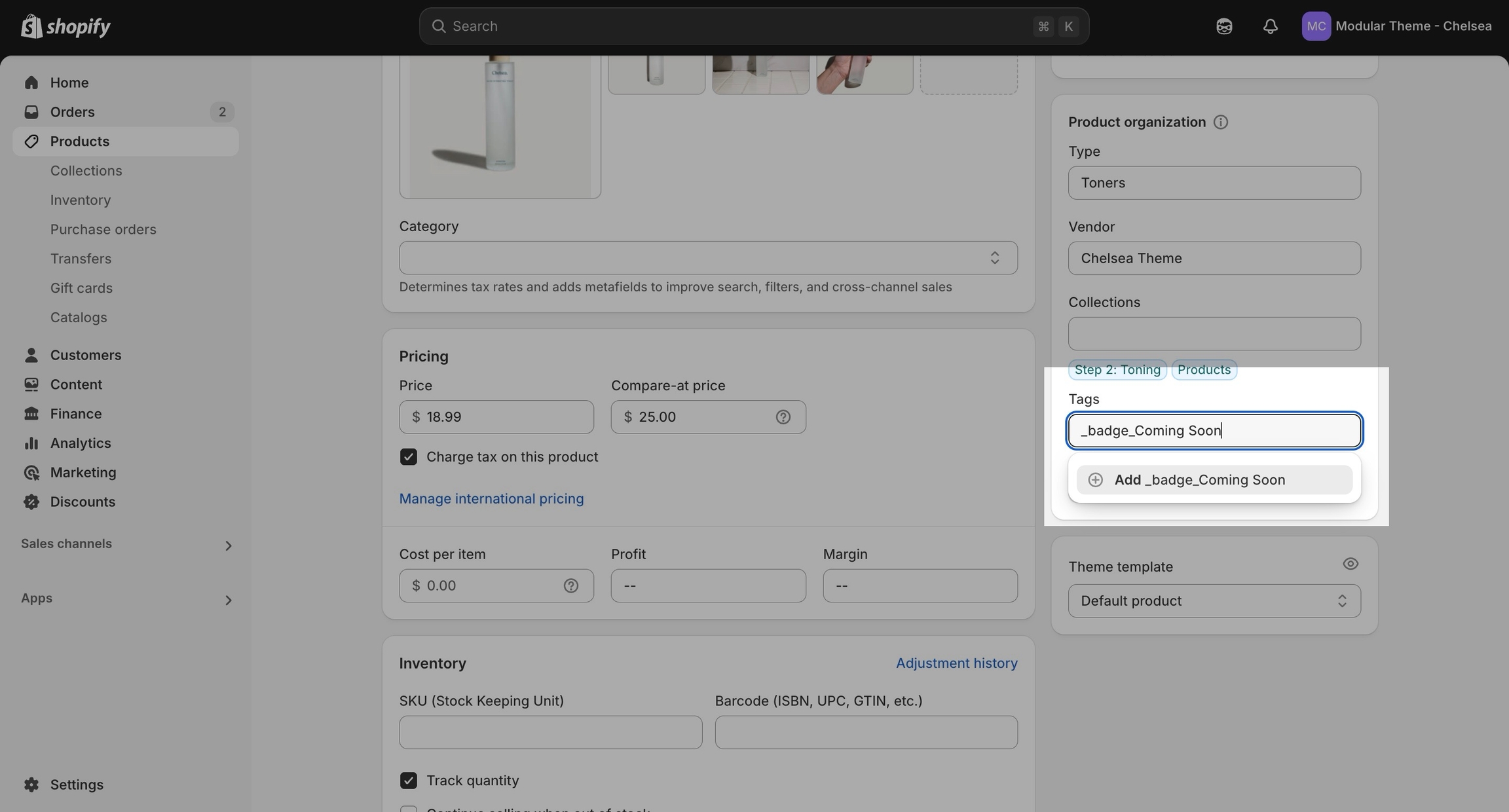
This feature gives you the option to add a small, unique descriptive text below the product title.
To set up a cutline, you need to create a new, custom metafield definition that Modular can recognize.
The most important part is to use this namespace and key: theme.cutline
To start, navigate to your Shopify admin -> Settings and choose Metafields and metaobjects from the left panel. Next, click on Products.
Click the Add definition button to begin. Choose a name, we'll use 'cutline'. Next, we will use a custom namespace. This is required.
A crucial step here is to change the default namespace (usually called 'custom') to theme :
Add a description (this is optional), then Select type. Next, choose Single line text (it's the default option):
Now that our custom metafield has been defined, the final step is to edit any of your products in the Shopify admin -> Products and update the new cutline metafield.
All you need to do is scroll to the bottom of the product setup page and fill them in:
Don't forget to save your product and preview it on any product grid view, such as a collection page.
Don't forget to save your changes.
Advanced customization: For users with coding expertise, leverage the custom code block to integrate advanced functionality or design elements seamlessly.
Modular
Companion
Pattern
Sparkling
Kiln


All new presets: Sparkling, Pattern, Companion, Kiln, and the main Modular preset has gotten a complete style overhaul
Highlights section
Text columns with images section
Jumbo button section
Shop the look section
Social gallery section
Subheadings badge style option
Global ‘Rounded corners’ setting added for images and boxed elements
Product form blocks: Icon block, Accordion block
Add to cart button: Implemented an option to display the product price directly on the ATC button.
Badges added as an option to Hero, Slideshow, Image with text and Text columns with images sections to provide a modern way to highlight product features, brand identity etc.
Grid updated and Width settings added into all sections
Logo section in Footer
Cutline for product grid added. Use the metafield 'theme.cutline' to show a short description under product titles
Overall theme design has been modernized
New color palettes
New typography styles and settings
Important: If upgrading, you will be required to reset your color and typography settings
A11Y improvements
Top/bottom padding settings included in all sections now
Language and Currency selectors updated
Add to cart bar on Product page improved
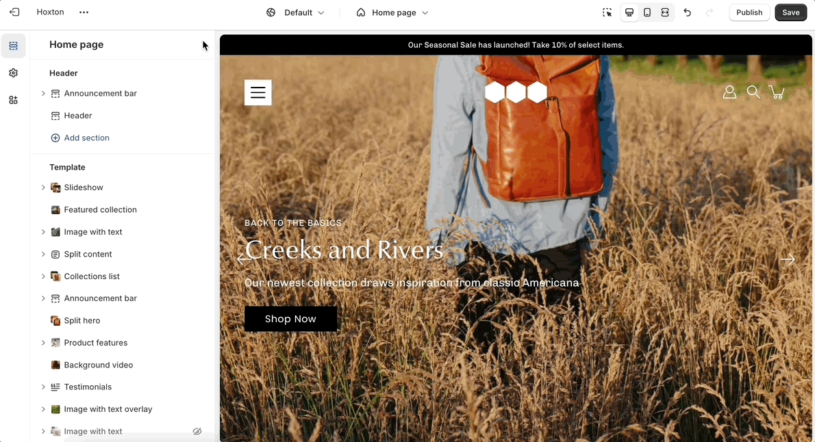
Use the toggle (eye) icon next to the section title to toggle the display of the entire section:
To find the primary settings for each section, click on the section name to view the settings panel. These settings control the elements of the section.
Product card design updated
Icons updated to modern designs
Slider design modernized and updated, fixed scroll setting included
Quick view design updated for both desktop and mobile
Image with text section and Slideshow sections now built with theme blocks
Image with text overlay section renamed to Hero section and is now built with theme blocks
Animations speed increased
Testimonials section design updated and modernized
Additional settings added to Rich text and Split content sections to apply background colors, vertical padding and border radius to the content
New Header style added. Two styles removed: ‘Menu center, logo center’ and ‘Menu right, logo left’
Announcement bar homepage section renamed to Marquee section with additional text and color settings
Image and Icon block added to Marquee section
‘Heading SEO tag’ setting added to all Heading blocks
Complimentary products block on the Product page displays correctly
Improvements made to the Text block in the Mosaic section
Tip - Section blocks have toggle icons as well. Using them, you can hide individual blocks.
Be sure to select the section toggle icon to toggle the display of the entire section.
Wider desktop screens will display the settings panel on the right side of your screen.
Image Size Recommendations in Modular
Here we will cover recommended image sizes you can use within various Modular sections. These include the slideshow section, collection banners, blog post featured images, logo, product images, and product feature section images.
The key across all image sections is to keep the focal point of the image in the center. For example, if you're adding text or graphics on top of the image they can easily be cropped out of view.
We recommend using logo images at a width of around 440px.
The maximum logo height applied is 100px therefore it is ideal to have a logo with a height around this size or lower.
For our Popup section, we recommend using an image with at least 600 pixels in its lower dimension. The default aspect ratio here is 8 by 7.
In pixels that should translate to 690 by 600 pixels or 1380 by 1200 pixels if you're looking to create a retina image.
A retina image is an image twice as big as its block or recommended size. This ensures that the final image is sharp even if rendered on an unusually bigger device.
There are also triple retina images which are three times the recommended size.
Elevate your website's visual appeal and captivate your audience by incorporating a background video section. This dynamic feature allows you to create immersive experiences that captivate visitors, leaving a memorable impact.
Dynamic visuals: Set the tone for your website with a stunning video background that grabs attention and adds an element of dynamism.
Call to action: Add a quick and clear prompt that encourages your visitors to take a specific action, boosting engagement and conversions.
Enhanced visibility: Adjust the opacity and color of the overlay to create contrast and ensure legible text over your video or image background.
Tailored height options: Choose from various height options to create the perfect balance between visual impact and mobile responsiveness.
Flexible styling: Customize the button's text, color, size, and style to align with your brand's aesthetic and messaging.
Under each section settings (as well as under all sections inside the Theme Editor) you will find a button to the Theme Settings. These are a number of global settings grouped together for ease of use.
Some section settings are also placed under the Theme Settings so if you're looking for a setting you feel are not finding, it might be under this little tab:
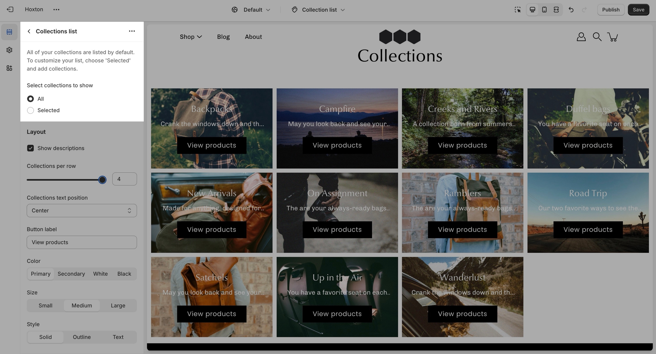
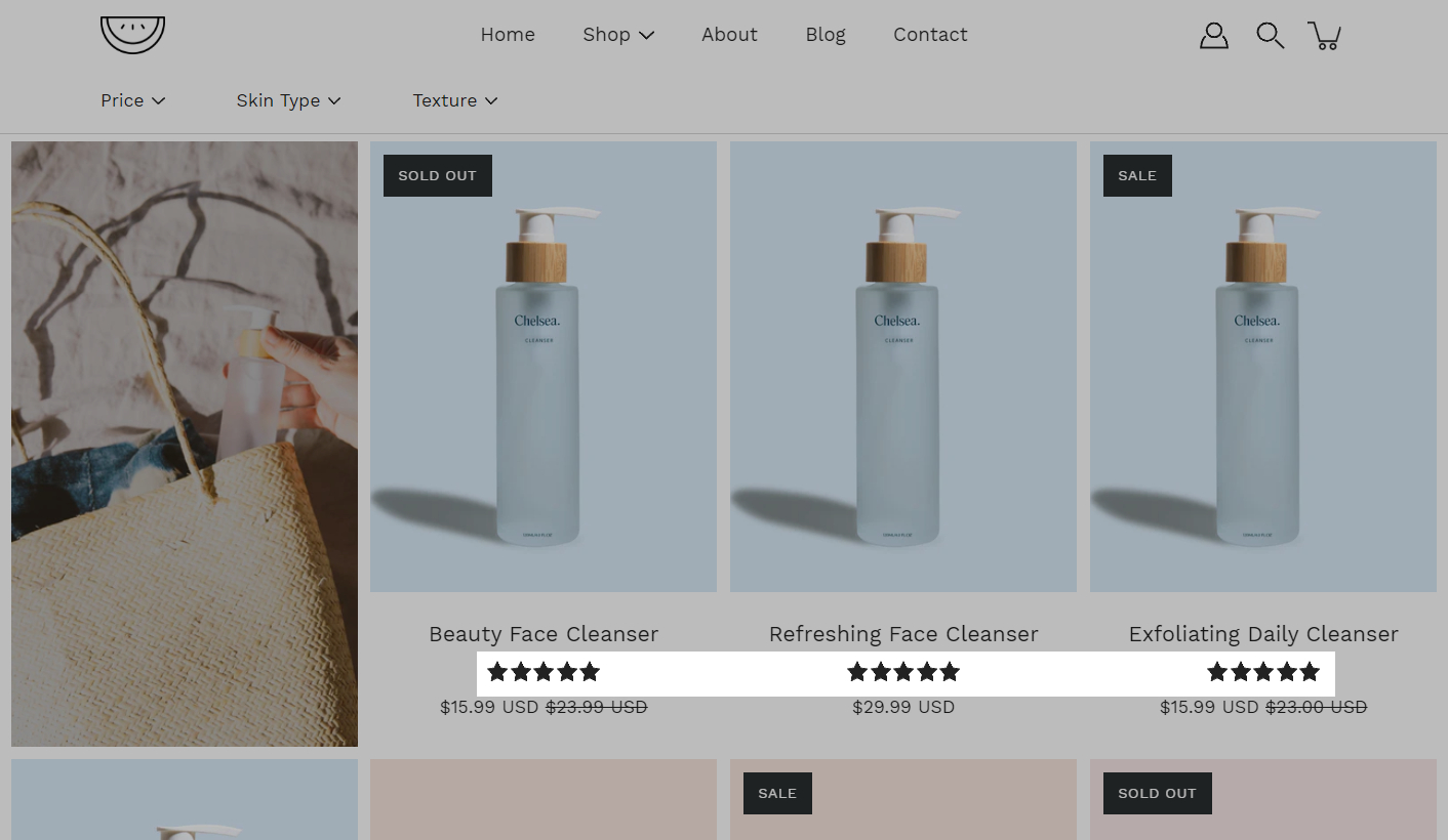
The 'Collection list' section is here to help you add links to collections you want to highlight on your store pages. This is a quick and easy way to run promotions or let your customers know about new collections.
Headings and text: Our customizable headings and text fields allow you to provide context and information about each collection.
Layout: Choose from different block heights and text positions to create a layout that suits your preferences.
Mobile-friendly slider: Enable the slider to navigate through collections effortlessly on your mobile device, ensuring a smooth and intuitive shopping experience wherever you are.
Colors and overlays: Adjust the text color, overlay color, and opacity to match your brand's aesthetic.
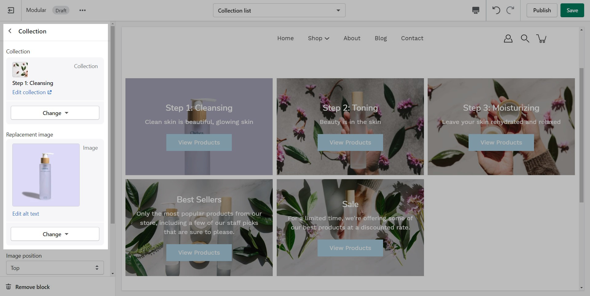
Replacement images: Choose from our selection of replacement images or upload your own to ensure that your collections list section reflects your brand's unique style.
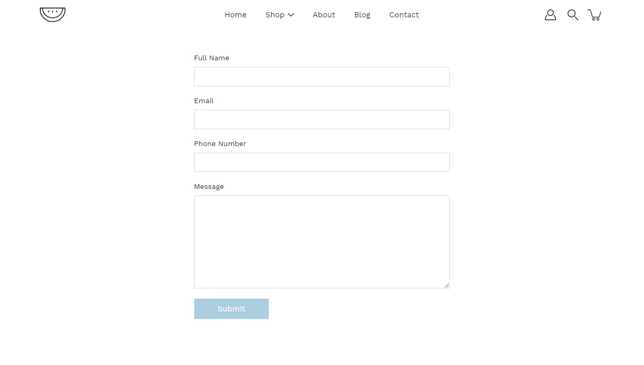
Create a custom contact form on any store page. Drag and drop blocks over each other to create a unique look.
Purpose and usage: Enhance the overall user experience by utilizing the contact form as a vital means of communication, accommodating inquiries, feedback, support requests, and other essential interactions.
Form fields and elements: Optimize data collection by providing an in-depth overview of form fields and elements within the contact form, specifying their purposes, and guiding users on required and optional inputs.
Add spacing to the top and bottom of the contact form for improved layout and aesthetics.
Add blocks to this section to create a personalized contact form.
Customize each block by changing its label.
'Custom code' empowers you to implement advanced customizations using Liquid code snippets and app integrations.
The section is made to allow the addition of custom elements. As such it doesn't have specific settings.
The 'Icons row' section can be used to present short bursts of information to your customers. Use them in combination with predefined icons or with your own images.
Icon selection: Choose from a diverse range of icons to represent various features or concepts on your website.
Custom icon images: You also have the option to upload custom icon images if you don't find the right icon.
Text and content: Accompany each icon with descriptive text and headings to provide context and engage your audience.
Section settings: Customize the layout and appearance of the icons row by setting the alignment, choosing background and text colors, and adjusting the top and bottom padding.
Blocks: Add and configure up to 6 icon items.
Create a quick and easy subscription form for your customers on any page.
Our newsletter section collects your customer's email address and tags them in your customer base as "Email subscribed". You can send these customers updates when integrated with an email marketing app. New subscribers will be seen as new Customers in your Shopify admin tab.
A third-party app from the Shopify App Store will be required to create automated emails and custom mailing lists. The newsletter sign-up forms in all Shopify Themes can only collect the customer's email address and name. Apps help you build newsletters, add mailing lists, and automate sending messages to customers who have signed up.
Shopify email marketing apps can be found here:
You can also search for them using this query:
Create visually appealing and engaging content to captivate your audience.
Build out your rich text section using different blocks. You can also use this section as an intro to other sections. Place the section above another to build a seamless look:
Shop the Look combines imagery and products to help shoppers discover and purchase the items featured in your grouped looks.
Use it to showcase a lifestyle image alongside a selection of products, making it easy for customers to shop the featured collection. Perfect for landing pages, lookbooks, seasonal campaigns, and promotional content.
Products can be displayed next to the image, allowing shoppers to quickly view details and navigate directly to the items featured in the section.
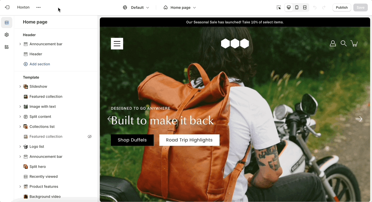
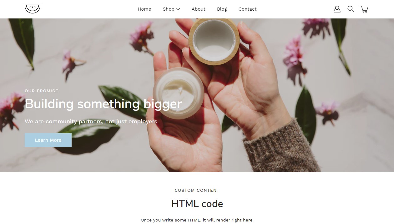
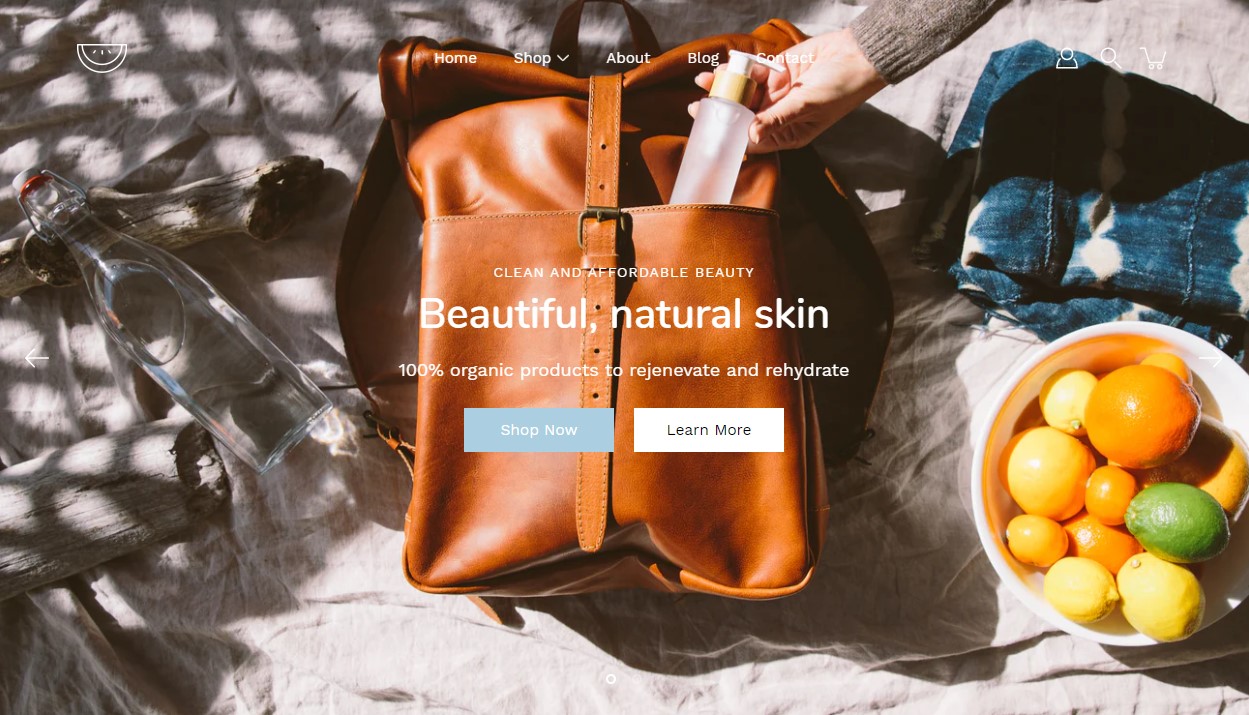
The Hero section is designed to showcase and promote your collections, products or pages. It features a large banner image as the focal point, accompanied by a variety of content blocks. These include standard text blocks for informational content, image blocks that can be layered over the main banner image for added visual interest, and badge blocks displayed at the bottom to highlight key features, promotions, or selling points.
The section features nested blocks which gives greater customizability when designing your banner.
This section gives you the option to highlight links in your store with the image and button blocks. The multiple settings options give the freedom of customizing the section in many ways.
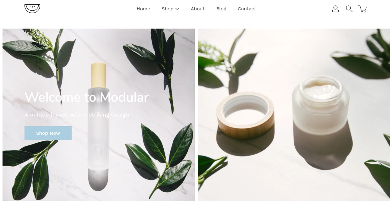
Split hero section, is a powerful tool to create captivating and immersive experiences on your website. This versatile section combines stunning visuals with engaging content, allowing you to showcase your brand, products, or services in a unique and impactful way.
Section height: Choose from various height options to create a visually pleasing layout that suits your content and design preferences.
Image alignment: Position images on the left or right side for balanced and harmonious visual storytelling.
Content alignment: Align text and buttons to complement your images and maintain a cohesive design aesthetic.
Subheading and heading: Craft compelling headlines to grab attention and convey your message effectively.
Social Gallery helps you showcase social media content directly in your store, creating an engaging and authentic shopping experience. Display images and videos from your community, brand ambassadors, or customers to highlight your products in real-world settings.
Use it to feature user-generated content, promote your social presence, and inspire shoppers with authentic product experiences. Perfect for homepages, landing pages, and campaign-focused content.
Gallery items can be linked to products, collections, or pages, making it easy for customers to explore and shop the content that inspires them.
Our split content section allows you to craft visually captivating product pages. This streamlined format emphasizes the unique selling points of your products.
Blocks: Utilize up to four blocks within the section to craft your product presentation. Each block can consist of text and/or image elements, allowing you to create versatile layouts that showcase your products in the best possible light.
Mobile-friendly design: Tailor the display of your content for mobile devices with the option to choose between accordion headers.
Button: Easily incorporate call-to-action buttons within your content blocks to encourage further engagement from your customers.
Display multiple columns with text and image content
Text Columns with Images lets you present key information in a clean, structured layout that combines visual content with supporting text. Each column can include an image alongside headings, text, and optional buttons, making it easy to communicate multiple ideas side by side.
Each column can be linked to relevant products, collections, or pages, helping customers move seamlessly from information to action. Perfect for homepage sections, landing pages, and promotional content.
We recommend using images at a ratio of one to one and sizes around 1024 by 1024 pixels or smaller images of about 600 by 600 pixels.
Using higher resolution images will make them sharper but slow down your load times
Modular also provides options to specify the image size on product pages.
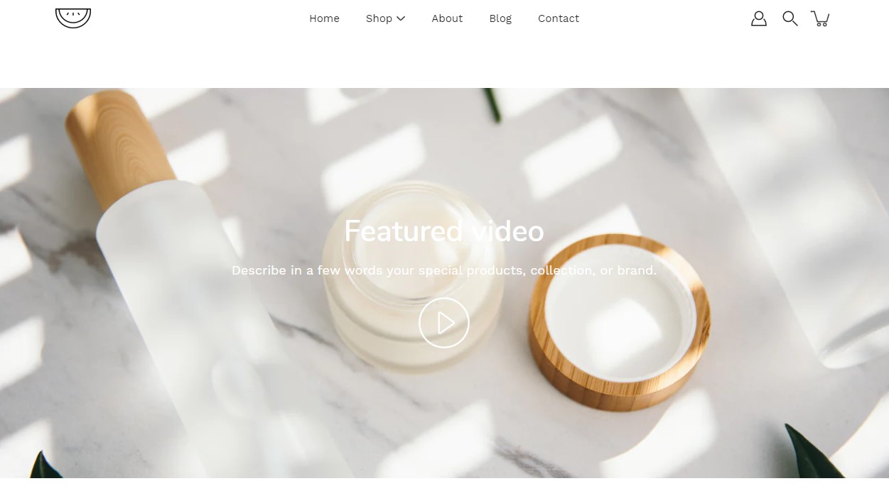
Add a video to your store pages that will autoplay as a background over text.
This is the page with the "/collections/all" URL that lists all of the visible products in the store. By default, products on the catalog page are shown in alphabetic order.
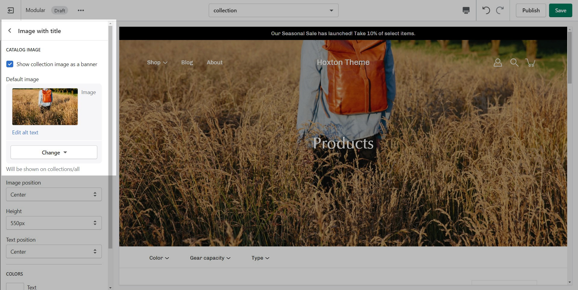
Modular provides an option to specify this image within the Image with Title section settings.
We recommend using image sizes around 1400px in width.
Modular provides you with options to specify the banner height. These include: Full Screen, Image Height, 750px, 650px, 550px.
These options are applied the same as with the slideshow section images definitions discussed above.
Set the most widely used colors for your store here. We start with background colors (for sections and badges), text colors, and an accent (error) color.
For the best overall design and flow, we recommend using two or three main colors. Use high-contrast colors to highlight accents or badges.
Be sure to use a contrast checker and ensure that your pages give out a readable layout.
Set the font and color for the different button styles in your store.
There are two main button types in Modular. Almost all sections that use buttons present the option to choose which one to use. Here is where you can set a color for these two styles.
Be mindful to use a color that is high in contrast with the text color to make text easier to read.
The search options in Modular allow you to toggle the search icon and search suggestions. You can also set and change the color for the overlay that comes over the page when the search bar is sown.
The types of search results are no longer hosted on a theme level.
To set the type of results you want you need to install the free Shopify Search & Discovery app.
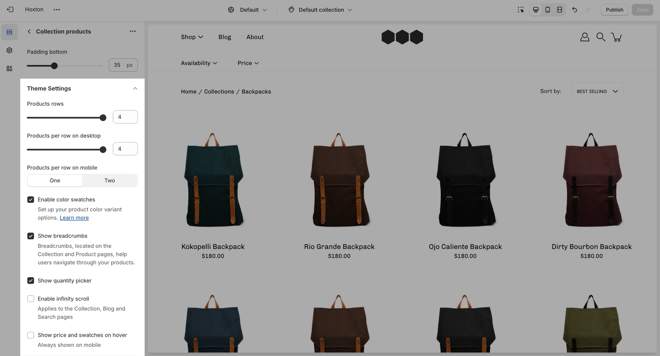
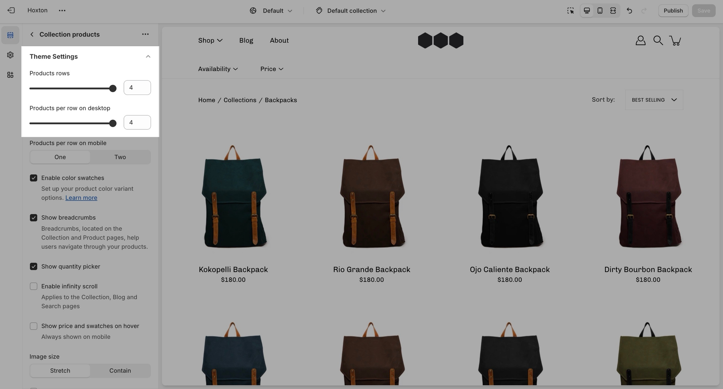
Your product and collection pages are a crucial part of your store. The product grid tab has global settings that affect both of those page types.
Most notably, you can change the aspect ratio for your product grid to make the blocks wider, taller, or square (1:1)
You can set the image to stretch across the block or to render itself in full inside of it. The latter can result in extra white spaces while the former could cut parts off. The most important thing here is to set the proper aspect ratio.
Another great option tucked away under this tab is the 'products per row'. This is split into two different settings, one for mobile and one for desktop.
A recent addition to the Product Grid settings is the "Display price" option, which allows prices to be shown on the Quick Add and Add to Cart buttons.
Remember, these are global settings so they will affect all pages.
To give an example, your collection page grid is linked to these settings and so is your featured collection section on the home page.
Color swatches can be toggled here too. This feature can often require additional work to be fully set up. Modular can recognize a few custom color names but not all.
We highly recommend checking out our full-length post on the topic of color swatches.
How to add custom color swatchesQuick view is a desktop-only feature. It works based on a mouse (and touchpad) event called 'hover'. This event is present on touch-based devices (at this time).
The Subheading Badge Style option transforms subheadings throughout the theme into badge-style labels with a colored background, helping them stand out and draw attention to key content.
Use it to add visual emphasis to section subheadings, highlight important messages, and create a more distinctive design across your store. The badge styling is applied consistently throughout the theme, making it easy to update the look and feel of your content with a single setting.
This option is ideal for merchants looking to create a stronger visual hierarchy and a more modern, attention-grabbing storefront.
This option can be found under the typography tab.
The badge style can be changed by selecting a different button style.
When adding a section to a certain template. The same content will appear on all pages that are also using that template.
You can create additional templates (such as a new page template or collection page template) and then assign them to your pages, products, collections, or blogs. This will allow you to create multiple pages with different content.
Scroll towards the bottom, above Footer and Popups. Choose to Add section:
Navigate to any product page or choose the default product template. Use Add section located above Footer and Popups:
Navigate to any page on your site or choose any template from the top drop-down. Choose to Add section, which is located above Footer and Popups on the left panel:
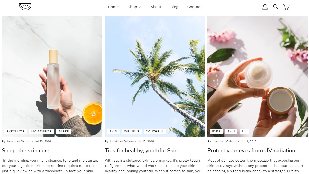
'Blog posts' allows you to share updates, insights, and news with your audience. Use this space to engage your customers with valuable content that keeps them informed and connected to your brand.
Headings and text: Our customizable headings and rich text capabilities ensure that your blog posts section seamlessly integrates with your store's branding and messaging.
Navigation with call-to-action buttons: Customize the button label and style to encourage clicks and guide users to discover additional blog posts and articles.
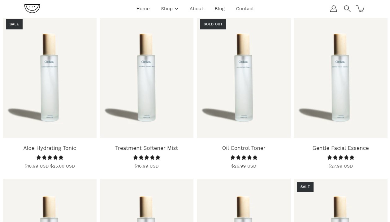
The 'Featured collection' section allows you to highlight a specific collection of products on your store pages. This section generates blocks with links to each product page.
Layout and design: Select the layout that best suits your page’s design. Choose between a single-row carousel or a multi-row grid.
Display essentials: Select the collection you want to present to your customers and add promo blocks to advertise and highlight current promotions or a specific product.
'Image with text' is similar to the Slideshow section but it brings the text outside of the image. Add up to 6 image blocks to create a slideshow of images with text on the side.
Image: Choose captivating images that resonate with your brand and message. Customize separate images for desktop and mobile devices to ensure optimal viewing across different screen sizes.
Position and size: Tailor the image position and size to create a balanced and aesthetically pleasing layout.
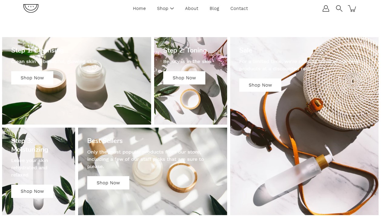
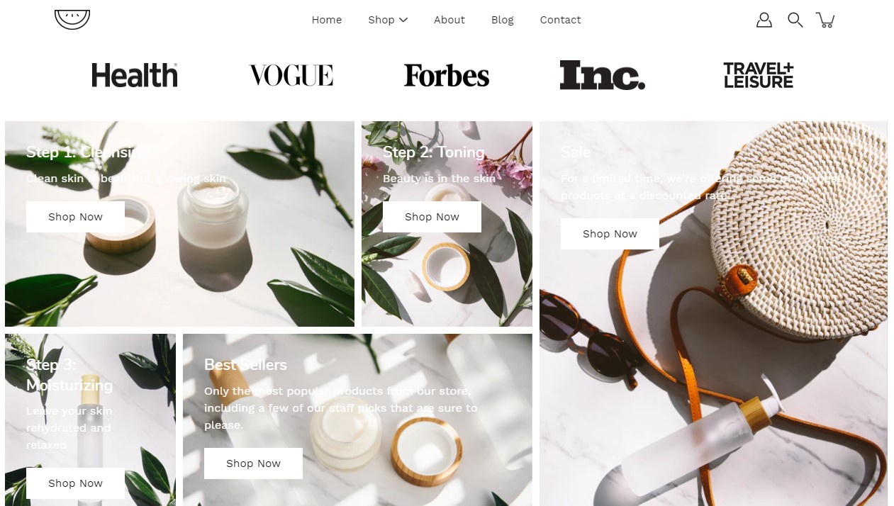
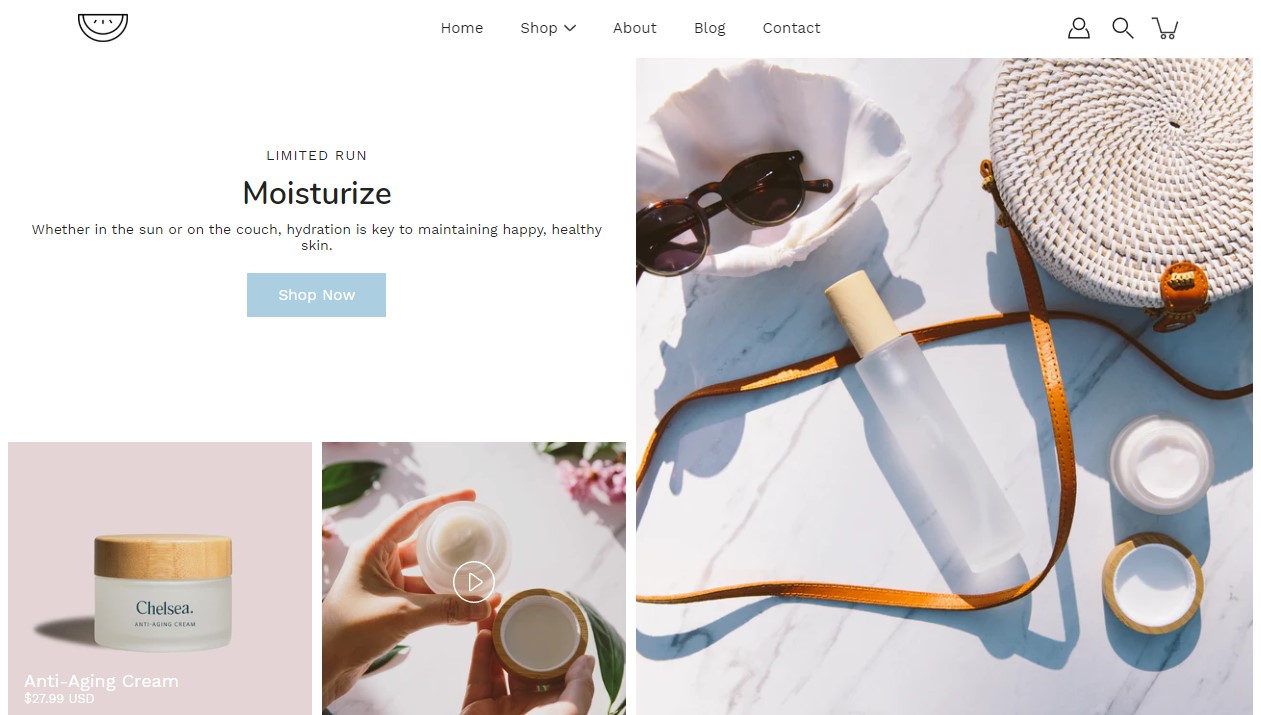
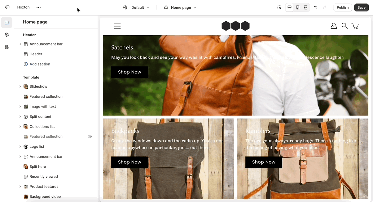
The Mosaic section is one of the signature features of the Modular theme. It creates a visually impactful grid layout that is perfect for storytelling through imagery, allowing users to showcase products, collections, or brand visuals in a collage-style presentation. This section can be customized to include various image sizes and shapes, giving your online store a unique and dynamic look.
Grid Layout: The Mosaic section displays images in a grid or collage format, making it ideal for visually engaging storytelling.
Flexible Customization: Users can easily control the layout by adding or removing images and configuring the size and placement of each image within the grid  .
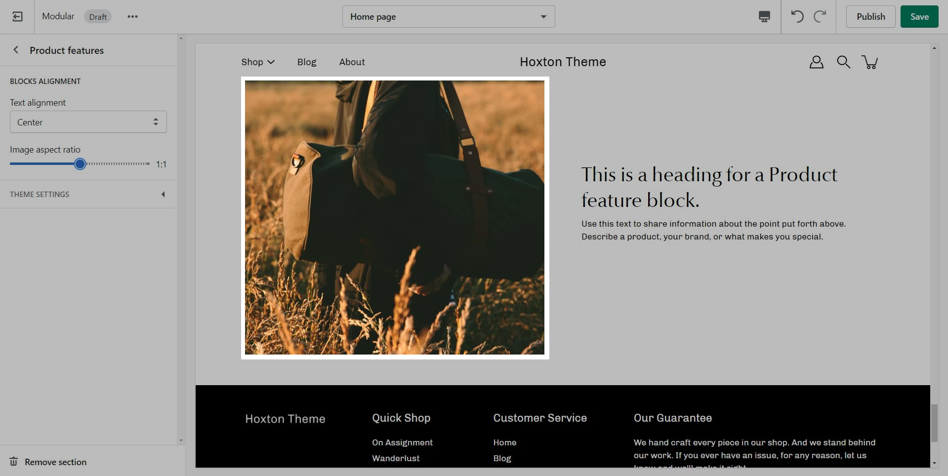
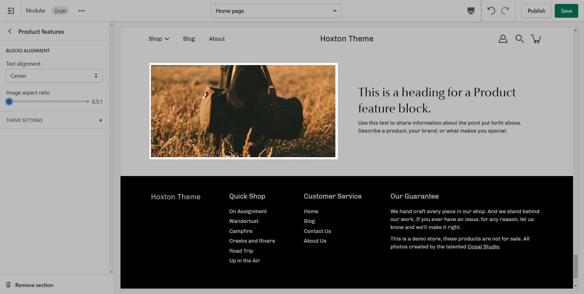
The product features section is designed to highlight the key aspects and benefits of your products, making it easier for customers to understand why they should choose your brand.
Text and description: Easily add headings and detailed descriptions for each feature.
Images for visual impact: Enhance the visual appeal with accompanying images for each feature. Choose the image position (left or right) for optimal layout.
The Slideshow section allows you to specify desktop and mobile images as well as specify the slide height.
Desktop: We recommend using images 1920px in width.
Mobile: We recommend using images 1080px in width.
Modular provides an option to specify various slide height sizes: Full Screen Height, Image Height, 750px, 650px, 550px,450px.
Static sizes: If you want to use a static slide height (750px, 650px, 550px, or 450px), make sure your image height is around that size.
For example, if you'd like to use a slide image height of 750px, you'll want to save your image around this same size. This will prevent image cropping both towards the top and bottom. This applies to the other slide height sizes (650px, 550px, and 450px).
A few distinctive styles can be created using Modular, and they all begin with the main appearance variables.
Here you can find an option to toggle different animations if you want that extra bump in speed. You can also set a few button features.
Pagination is a must in Modular. Product loops in Shopify are limited to 50 products, so pagination is the way to get around this.
The main thing to note about our 'infinity scroll' feature is that if it's disabled, pages with multiple items will be 'paginated' into smaller pages.
With this setting, you can show rounded corners on images and boxed components for your whole theme.
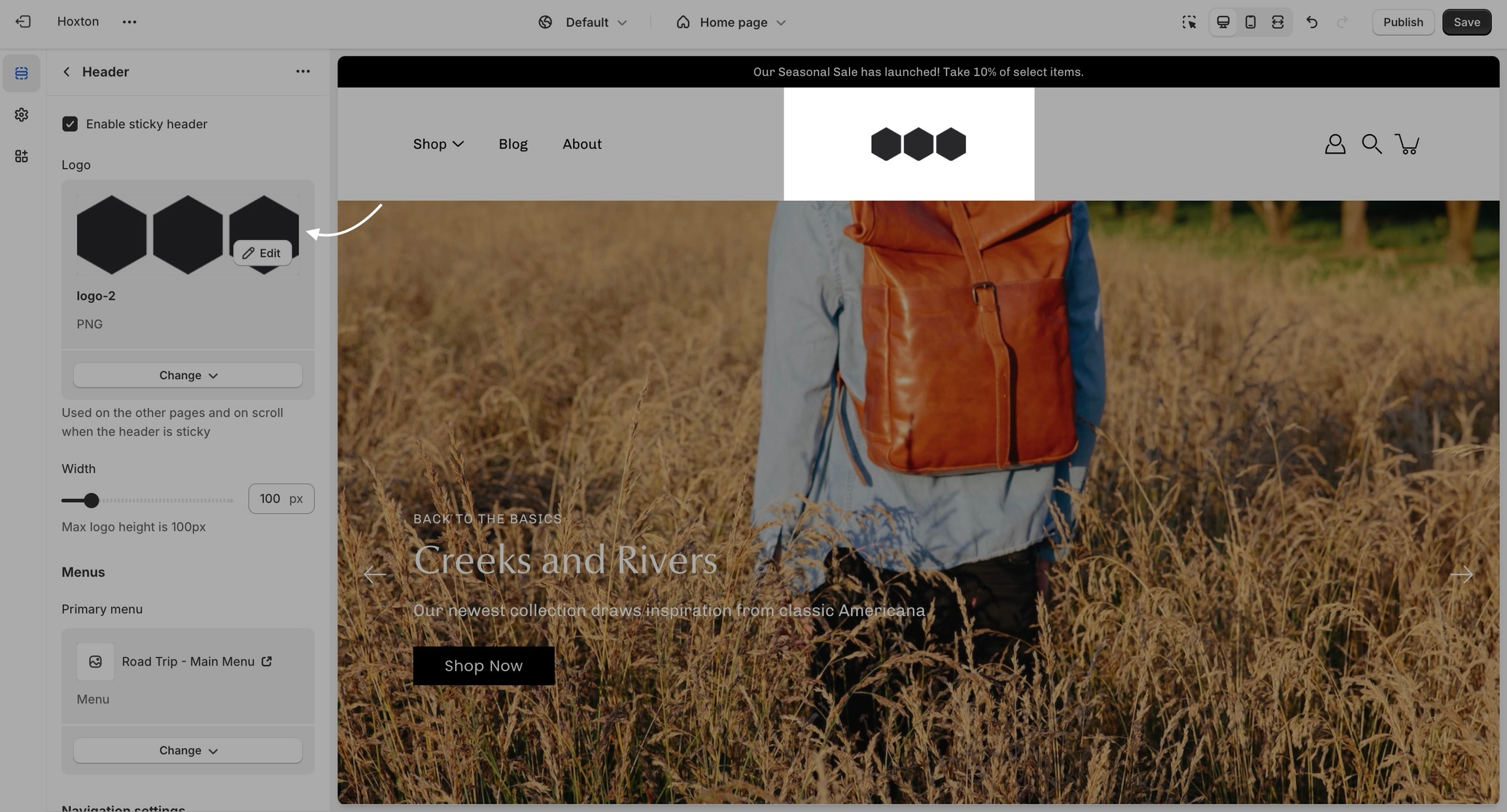
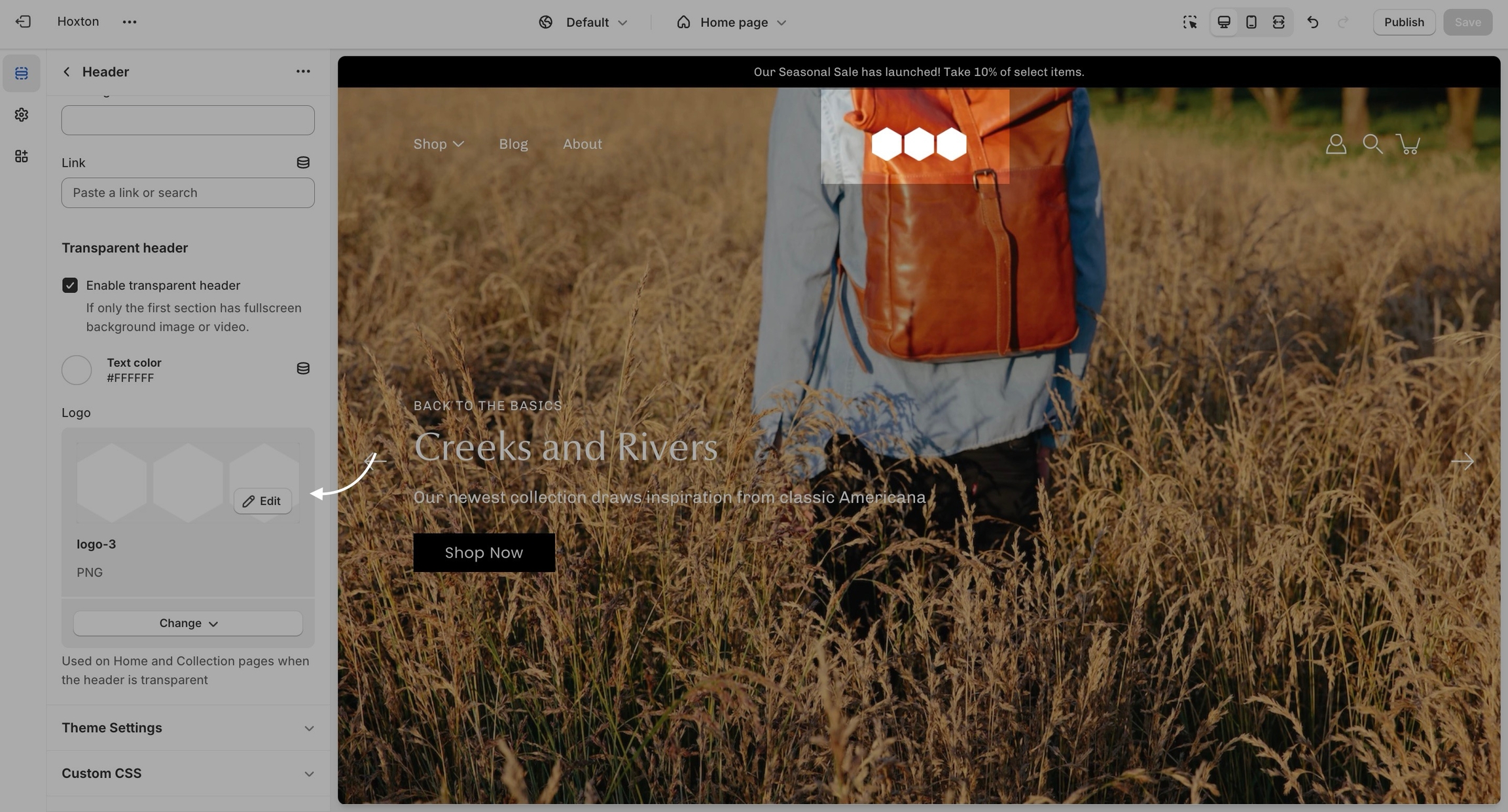
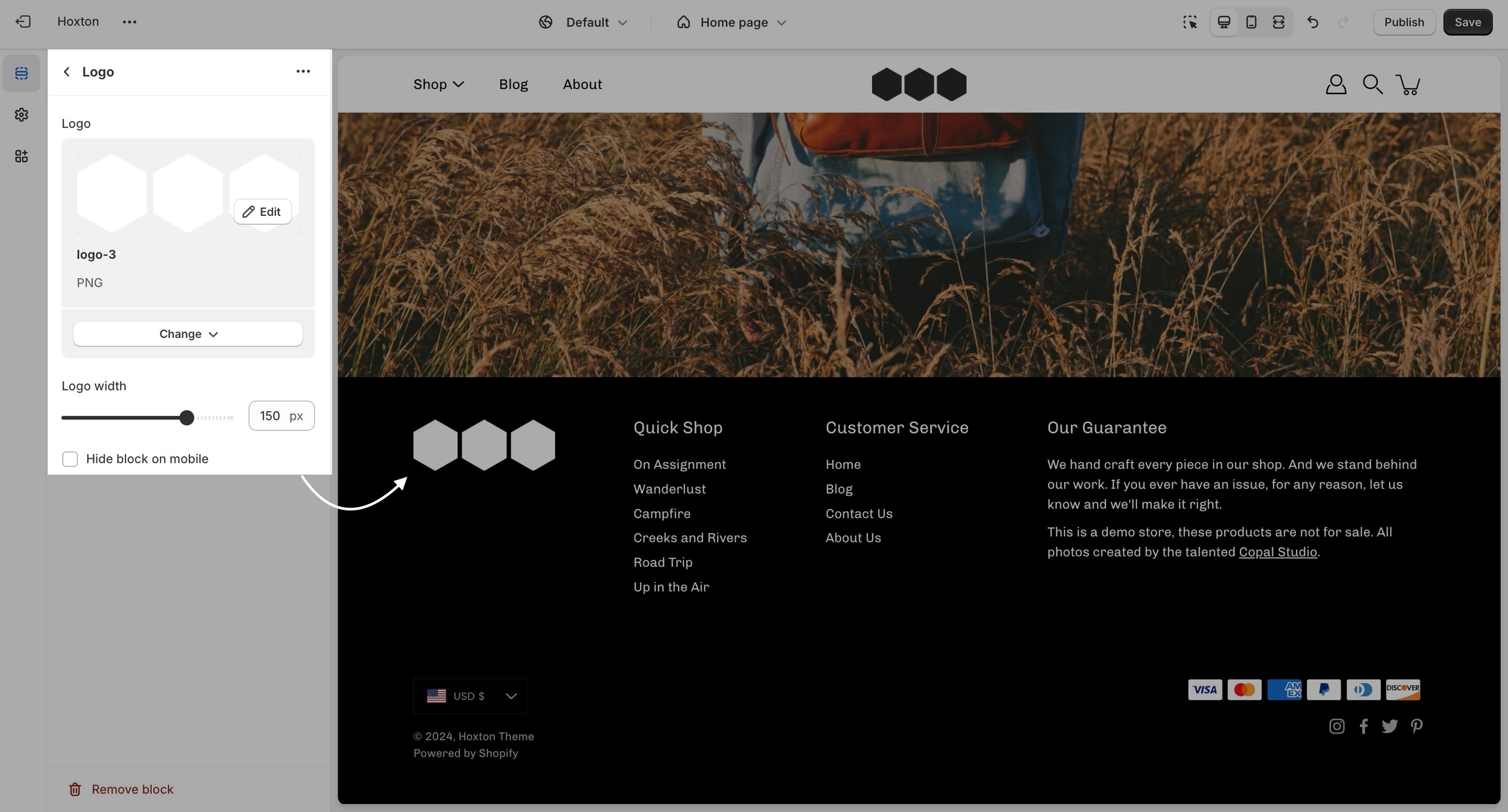
The logo block allows you to add an image (logo) and set its size. The image can be linked through a dynamic source to be shown differently on some pages (product pages, collection pages)
There is also the option to show or hide this block from your mobile view.
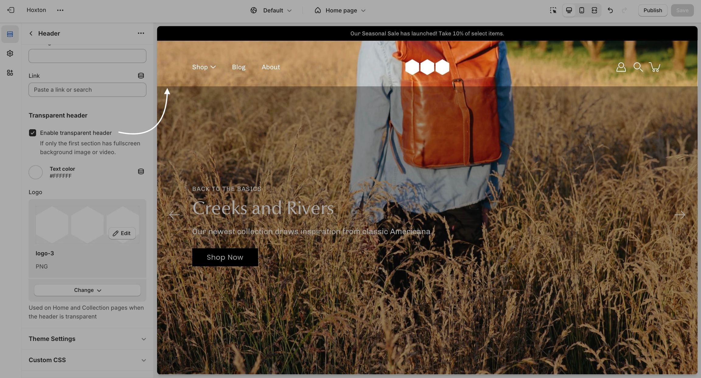
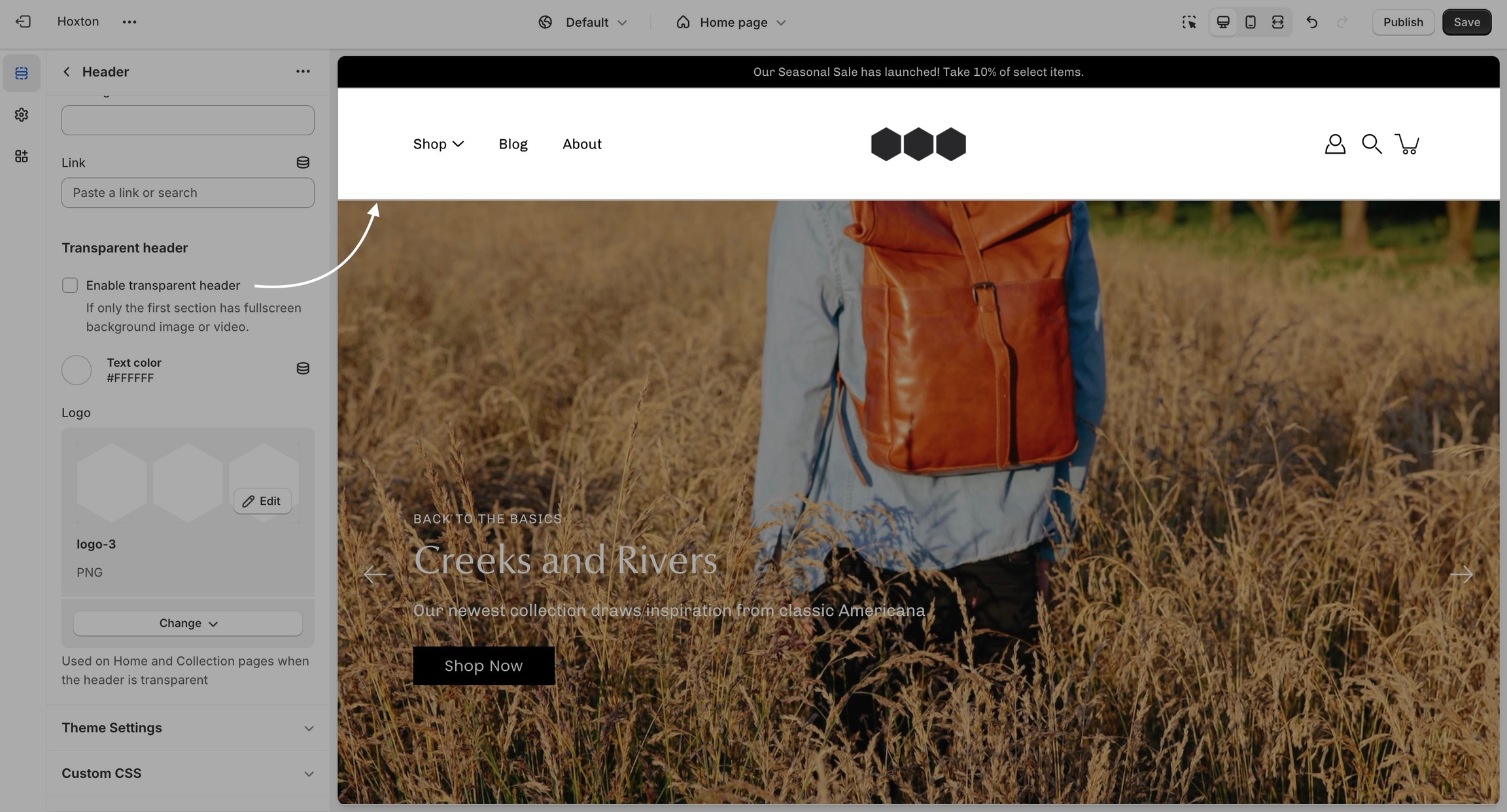
Change the opacity to blend the header with a background image (or video)
Modular can display a transparent header on the homepage, collection pages, and any customized pages that include a fullwidth background image (or video) section.
When using a transparent header, you may include a second logo to provide contrast with your main homepage asset.
To enable the transparent header you will need to first open the header section settings. From here, simply check the 'enable transparent header' checkbox and save the changes.
Testimonials section, you can effortlessly showcase glowing reviews and testimonials, fostering trust and encouraging conversions.
Heading: Tailor the heading of your testimonials section to suit your brand's style with customizable options for position and alignment.
Text alignment: Ensure that your testimonials are presented exactly as you envision by customizing the text alignment and opting to hide quotes if desired.
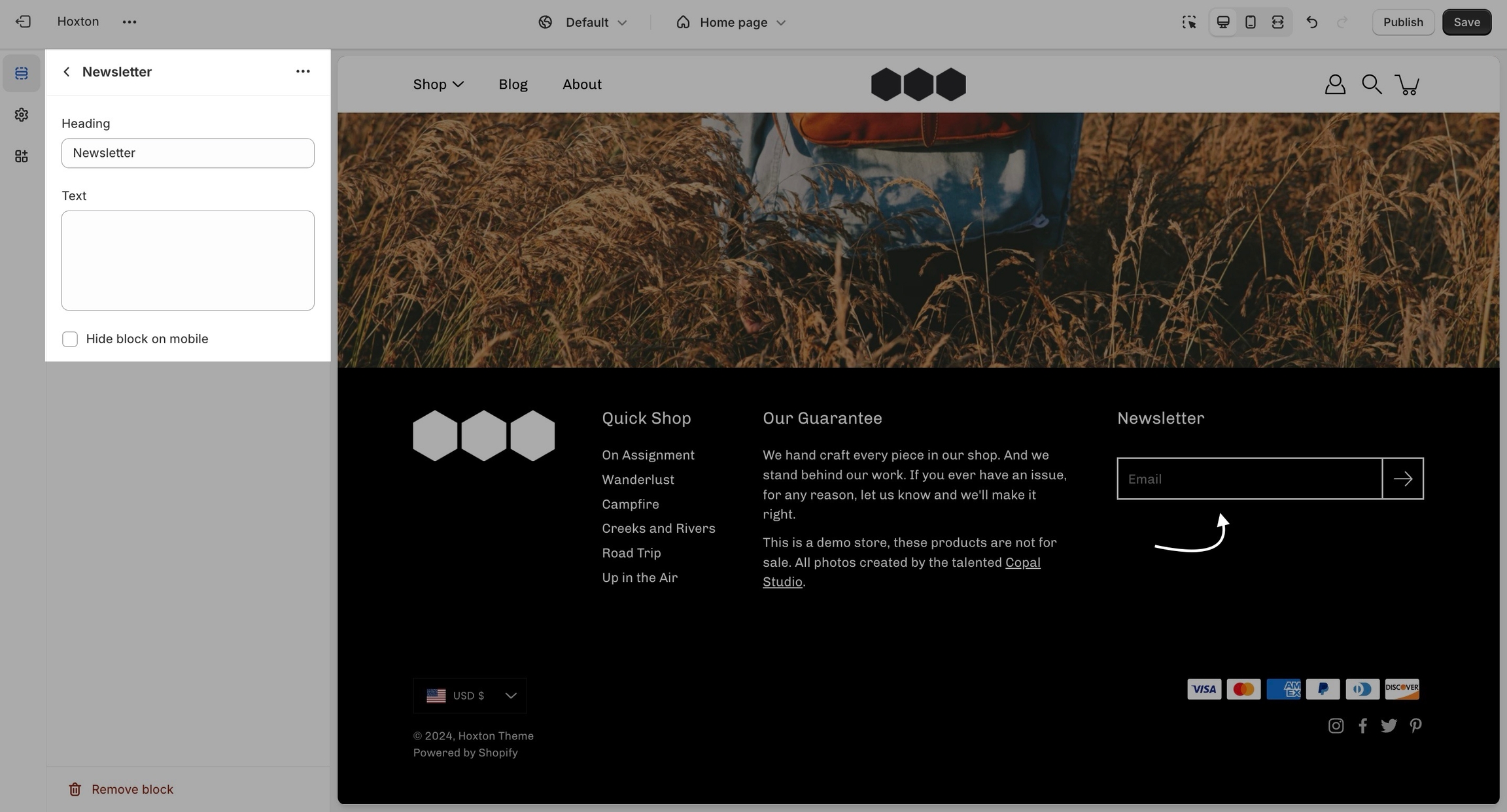
A newsletter block comes with an automatic newsletter subscription box. There are also settings to add a heading and text.
Add a 'recently viewed products' section to your store pages. This tool allows customers to easily find items they were previously interested in, enhancing their shopping experience and improving conversion rates.
This section can be added to any page and works automatically as users visit different product pages. To ensure consistency, it takes the same grid style and options as the collection pages. You can find and set these options in the Theme Settings tab.
Allows you to organize and present additional product information in a collapsible, space-saving format. Ideal for including specifications, materials, policies, or size charts without overwhelming the page visually.
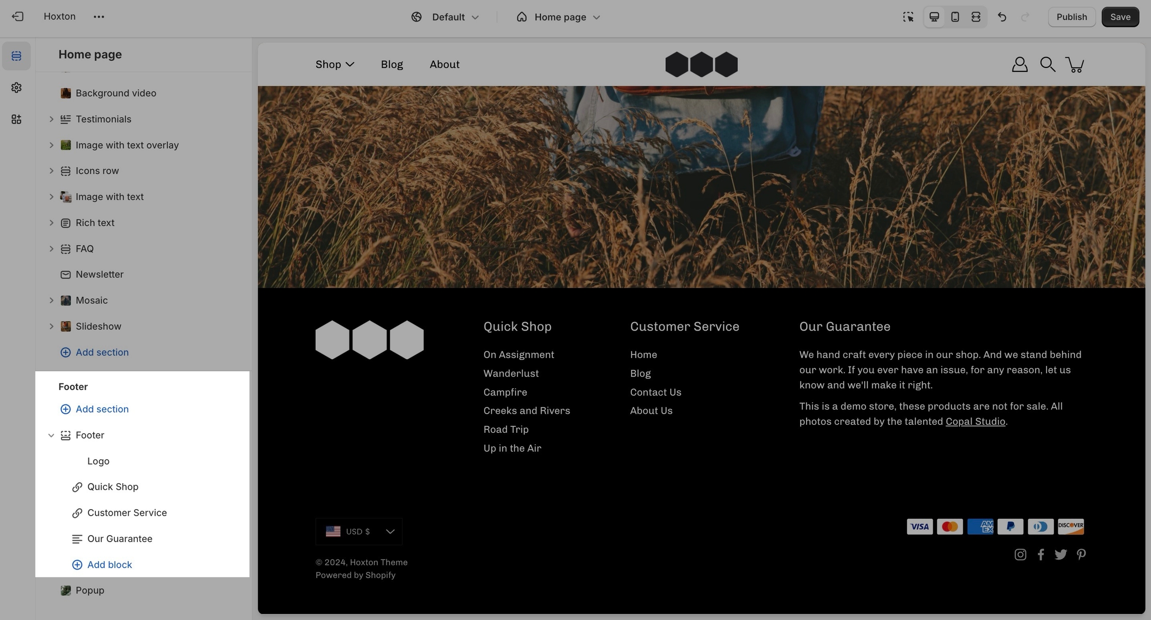
The footer in Modular has a lot of customizable elements in the form of section blocks. You can add in blocks by clicking the small arrow icon next to the footer section then clicking the 'add block' buttons:
Other than the individual blocks, the footer section also has a number of settings itself. You can set the background and text color for this section individually.
There is also the option to show payment icons, currency and language selectors, as well as a short menu in the bottom bar.
This is the standard (and recommended) setting that works well with square-shaped images.
This ratio will display wider images.
This ratio will display images in a portrait format.
This section gives the option to add a big full-width button, which has different settings for design customizations.
The section can be used to build a separation between your content. Use it on the homepage, product pages, blogs, and other pages.
The block allows adding a full-width image (logo) to the footer. The block has settings for the image alignment, width, padding, and dynamic source image.
Global theme settings that can affect all pages
The 'Theme settings' tab is located under all sections in the theme editor. This tab contains a bundle of all global settings in Modular.
An essential block with a few extra options.
This is the standard setting that works well with square-shaped images. We recommend this square ratio because the images will be cropped square on the blog overview page and they'll display in their uploaded ratio on the individual blog post page.
This ratio will result in taller images or portrait images.
This ratio can be used to display wider images. We recommend it for landscape images.
The Icon block highlights product features or benefits using visual icons, optional images, and supporting text. Ideal for building trust and conveying quick information.
You can have your icons stacked underneath each other or side-by-side as displayed in our example.
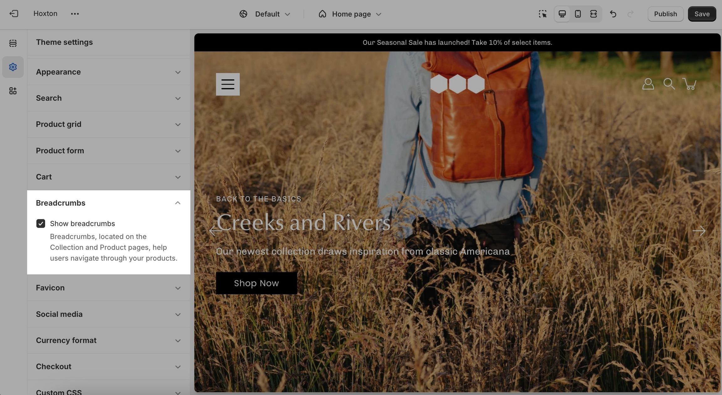
Breadcrumbs, located on the collection and product pages, help users navigate through your products. They are generated automatically depending on the path your customers take through the store.
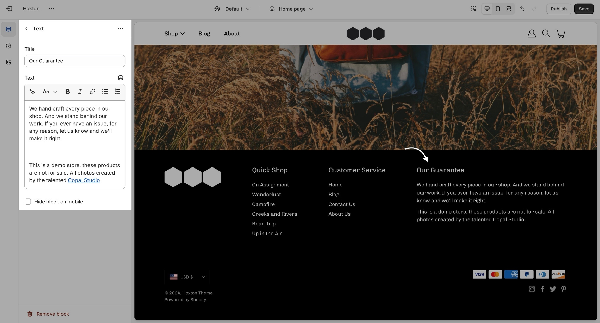
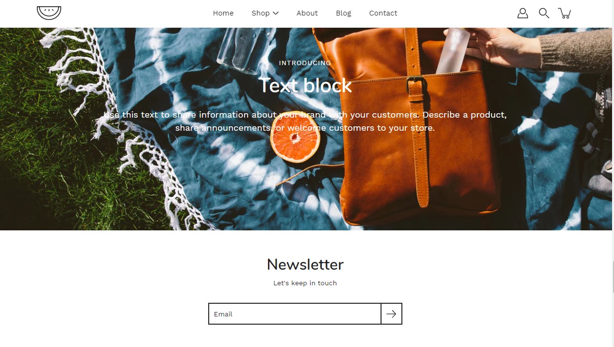
A text block does as a text block sounds. You can add a short message with a heading to give information about your brand or current promotions.
You can upload a logo in place of your store name by opening the header section settings and uploading a custom logo:
A separate option is available to help provide better contrast when transparency is used. This is an optional but helpful feature.
A very important note to make is that these settings are purely visual and aesthetic. Modular does not have any options to change the functionality of your checkout page.
The checkout page is generated entirely from the Shopify core code so for any issues, at checkout we highly recommend reaching out to Shopify support.
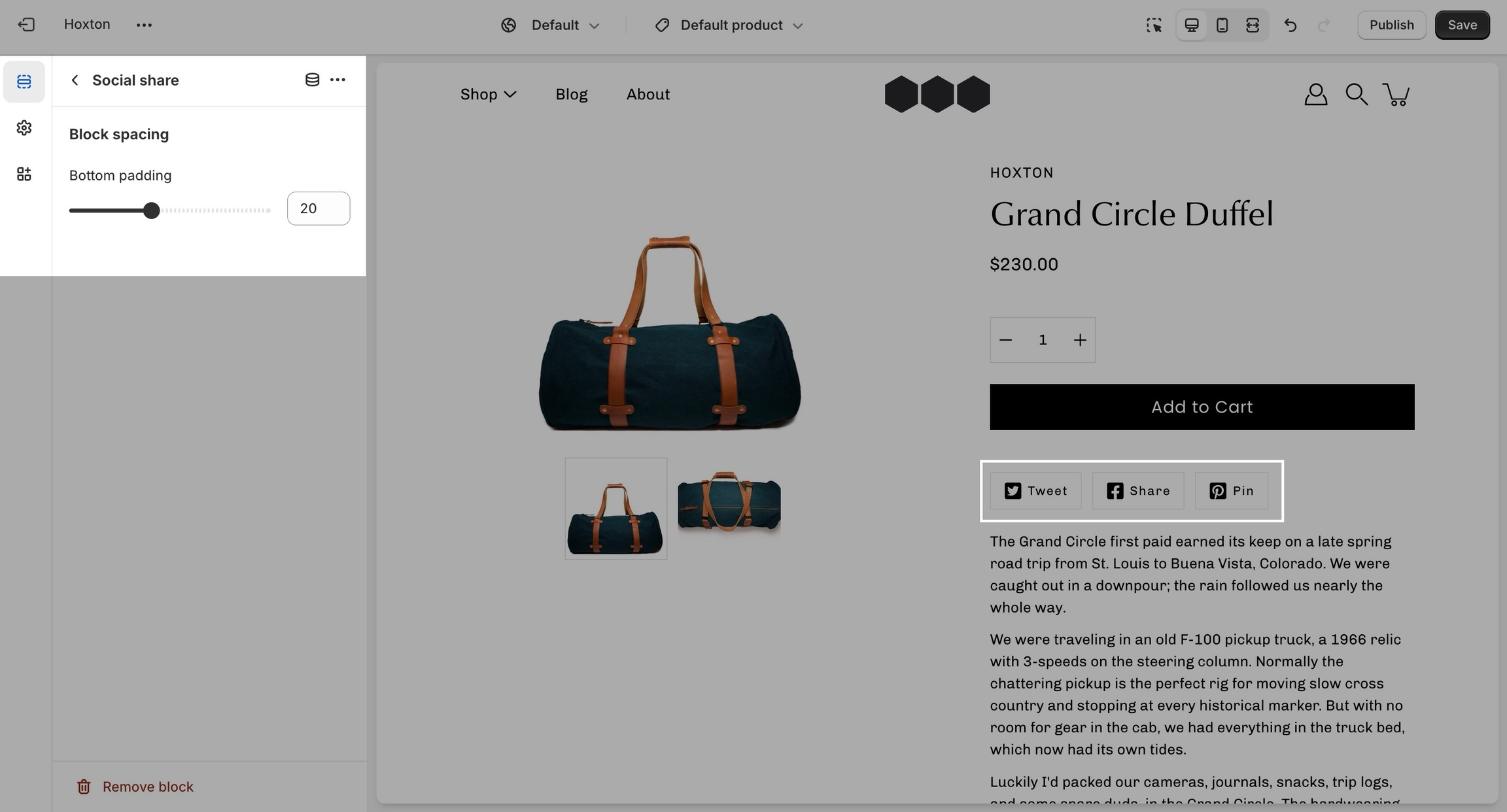
Include quick share buttons right on your product pages.
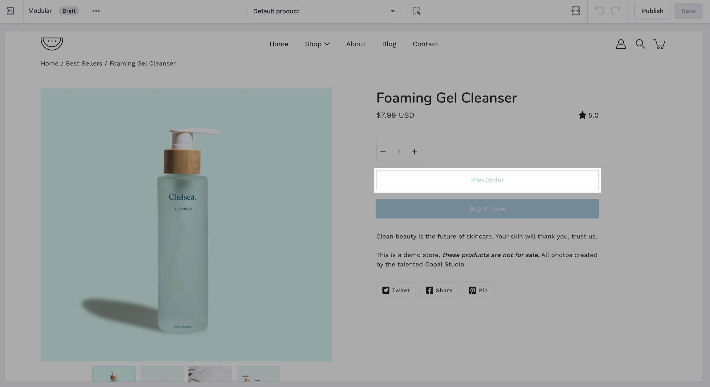
Replace the 'add to cart' button with a 'pre-order' button
Modular uses product tags for creating pre-order products. When you define a pre-order tag, you can easily convert the 'add to cart' button to a 'pre-order' button.
Setting up a pre-order tag is very simple and can be done right in your Shopify admin.
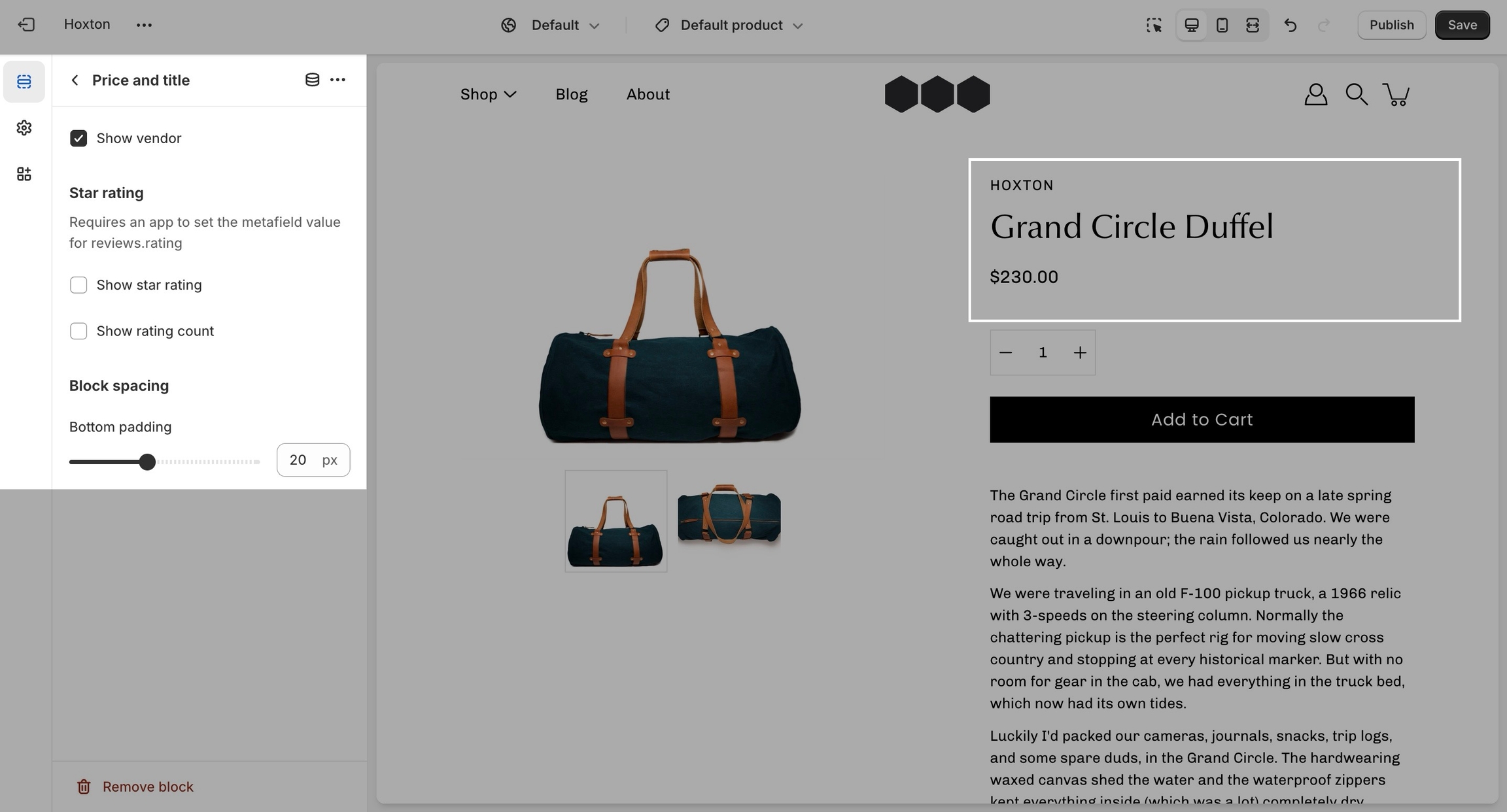
The Buy buttons block allows customers with the ability to add products to their cart, adjust quantity, and, if enabled, use dynamic checkout options like Apple Pay or Google Pay. It's the final interaction point before purchase and a crucial part of the product page
Only one Buy Buttons block is allowed per section (
limit: 1).
To add the price in the "Add to Cart" button you need to enable the option called "Display price" in the .
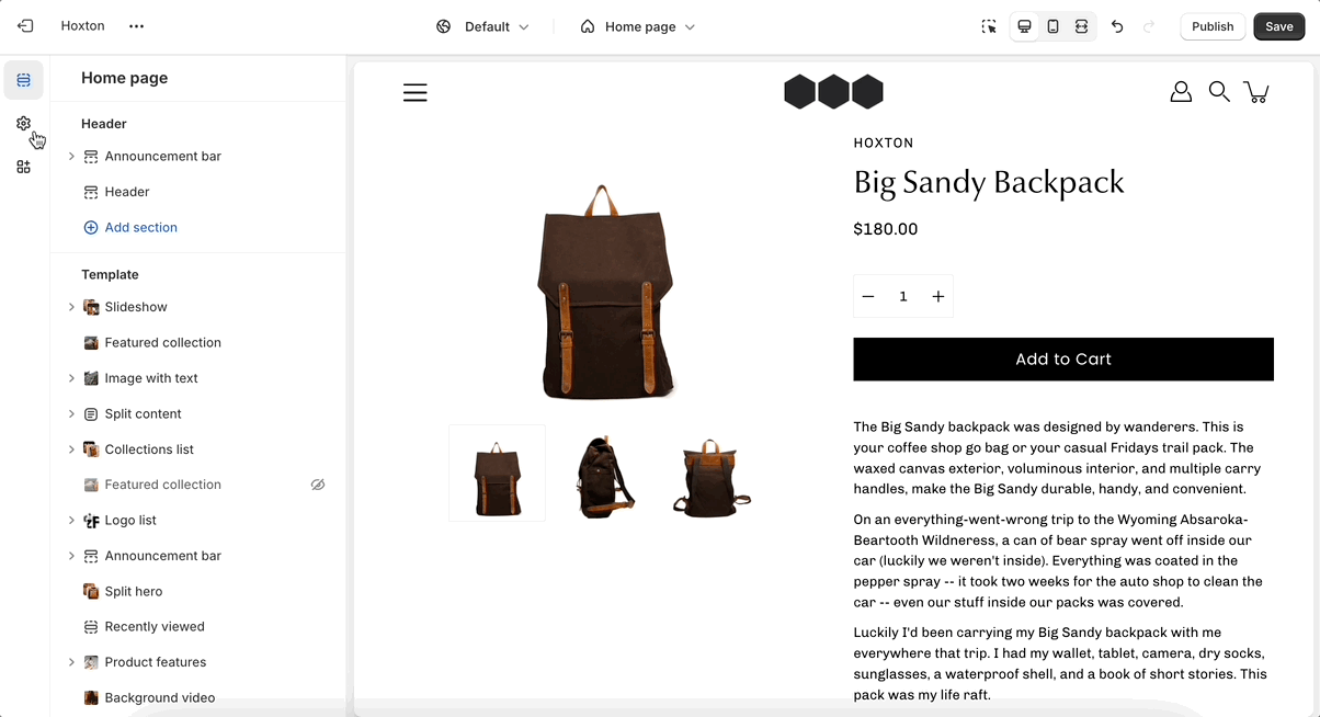
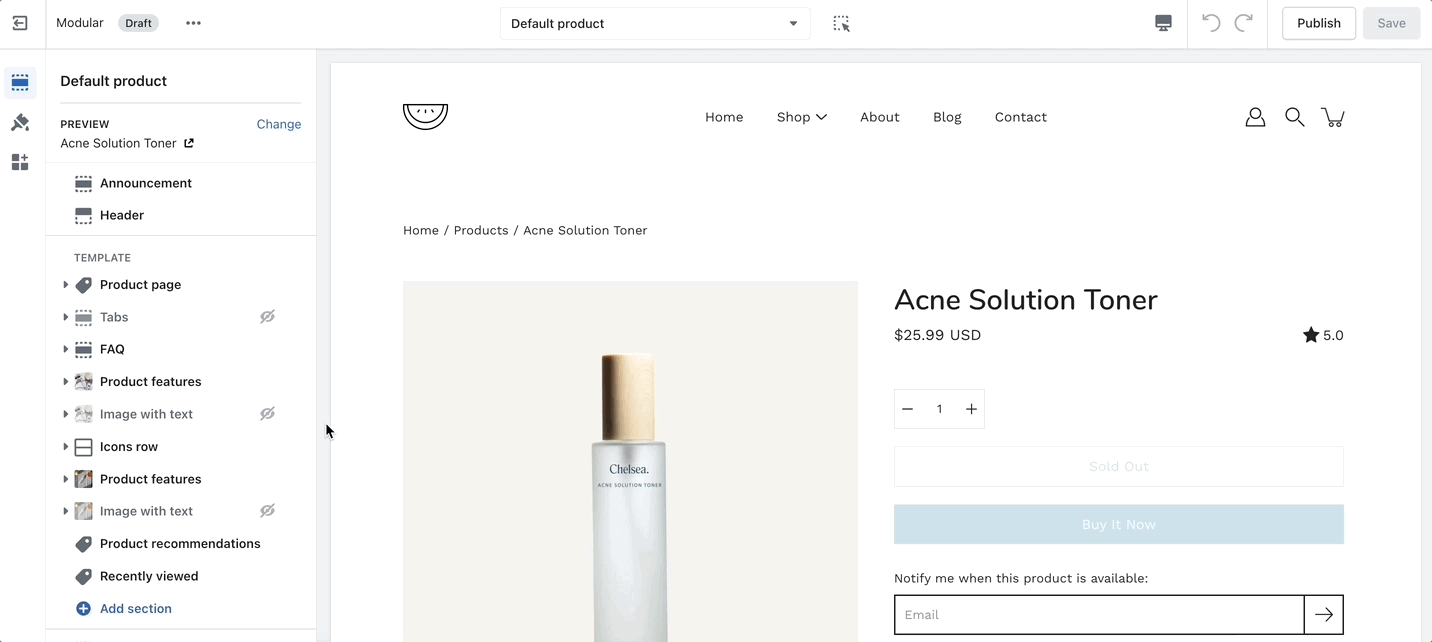
Settings and layout options for product pages
The new product page template in our Modular theme is built from the ground up with the new features introduced in online store 2.0 in mind. The use of JSON templates allows for dynamic sections to be used to truly customize your product pages to your style.
Accessing the product pages can be done by opening your theme editor and clicking on products. This will show all of the available product pages in the specific theme copy you are editing.
A big part of the settings can be accessed from the section blocks. They can also be moved around if you're looking to customize the look. You can move blocks the same way can sections. Each block has six small dots that you can click and hold to drag and drop them between one another.
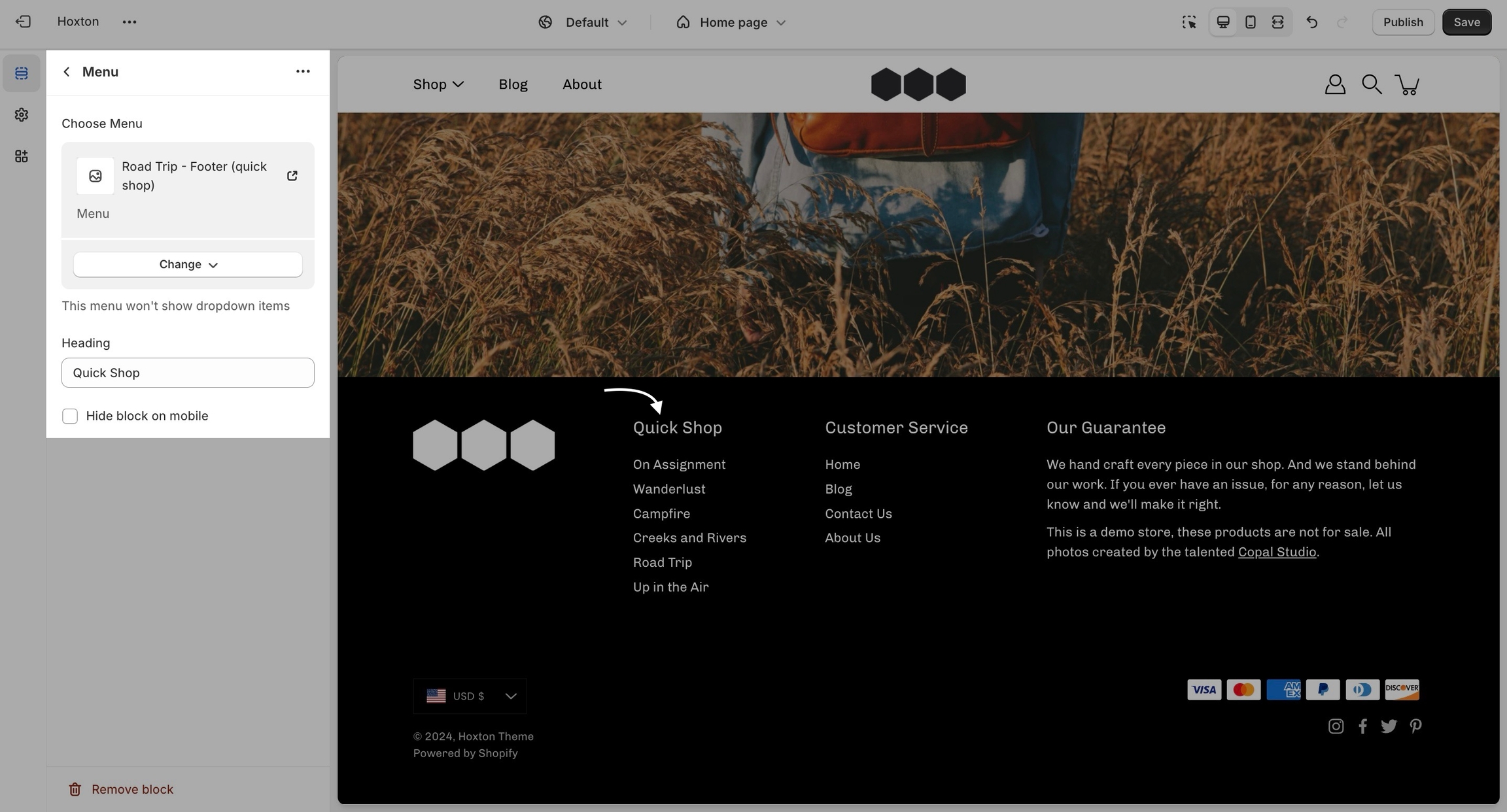
The menu block allows you to add a navigation menu. You have the option to add a heading as a title for the block.
Typography allows you to set a different font for general elements across your store. We kick things off with arguably the most important bits of text, your headings, and body text:
You can choose from predetermined font stacks, this is all coming from the Shopify core code and is not theme specific.
It's also possible to use fonts outside of the predetermined Shopify font stack. To learn more about this process you can check out our custom fonts post:
Announcement bar settings and layout
Click on the announcement bar section to reveal the section settings.
These settings will allow you to:
Enable the announcement bar on desktop and mobile separately.
Social links are mainly displayed in the footer. They open in a new tab to keep customers from bouncing off of your page.
Collection and product grid settings and configuration options
The new collection page template introduces infinite customization options that you never knew you needed!
Click on collection products to view settings for collection pages:
Expand the theme settings panel to view additional settings related to the product grid:
Use the product grid options to customize how many products per row are displayed on desktop and mobile. You can also configure how many products per page are shown before pagination is displayed.
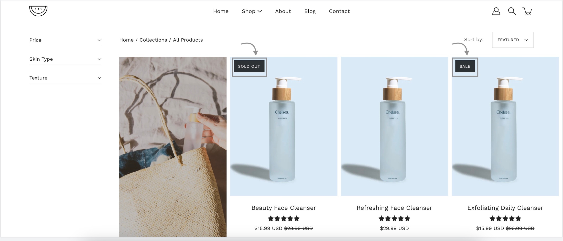
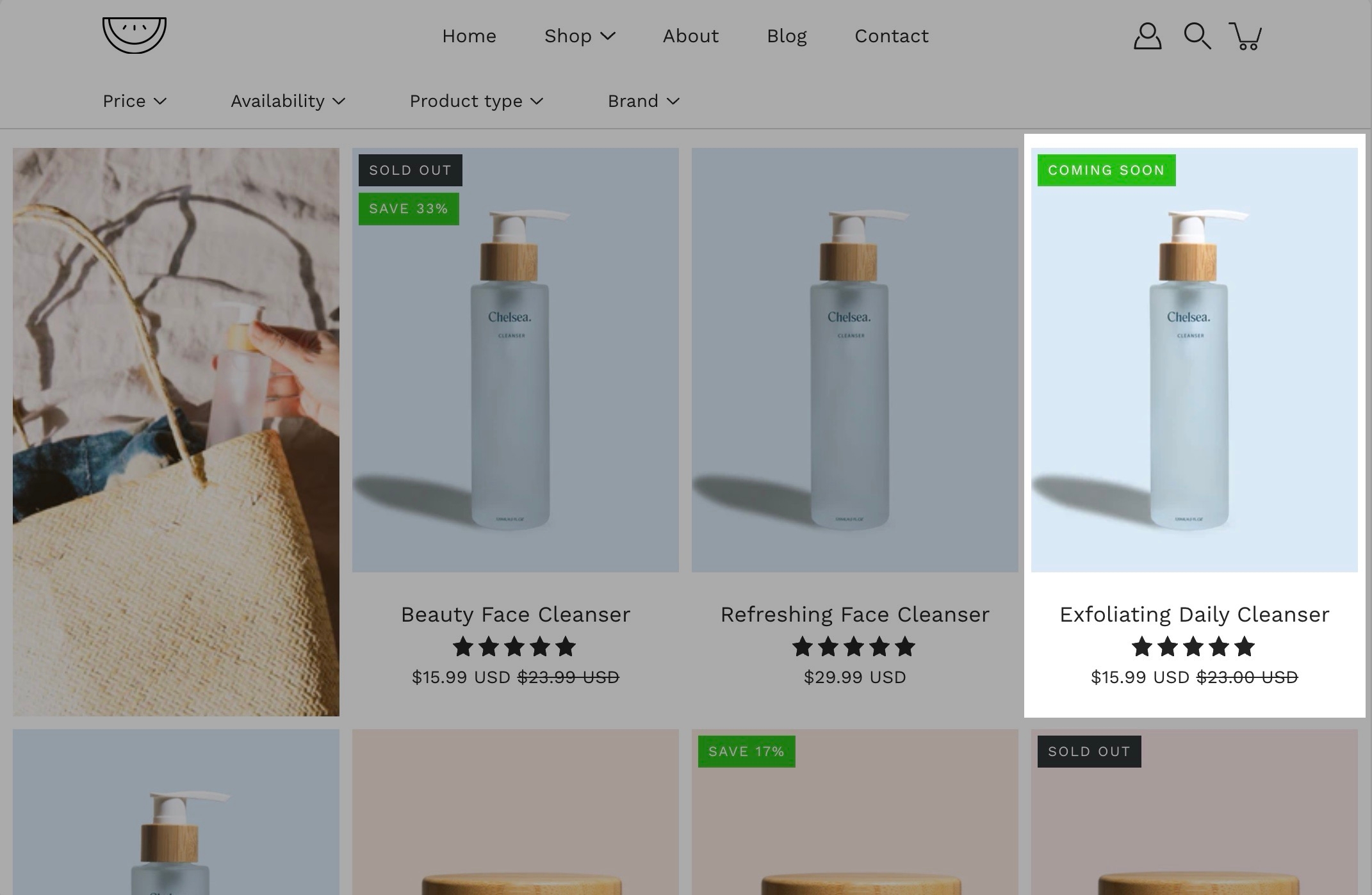
Add badges or 'stickers' to your individual products.
Badges, small yet powerful symbols, convey a wealth of information in a concise and visually captivating manner.
Custom product badges are simple to create and use a native Shopify feature - product tags.
Simply go into your Shopify admin page and click on the Products tab. Here, locate the product you're looking to add a custom badge for and add a tag starting with _badge_
The part after this unique identifier will be used by Modular automatically and displayed as the badge text.
Store availability (or local pick-up) is a core Shopify feature. Learn more about how to set up pick-up for online orders at the link below:
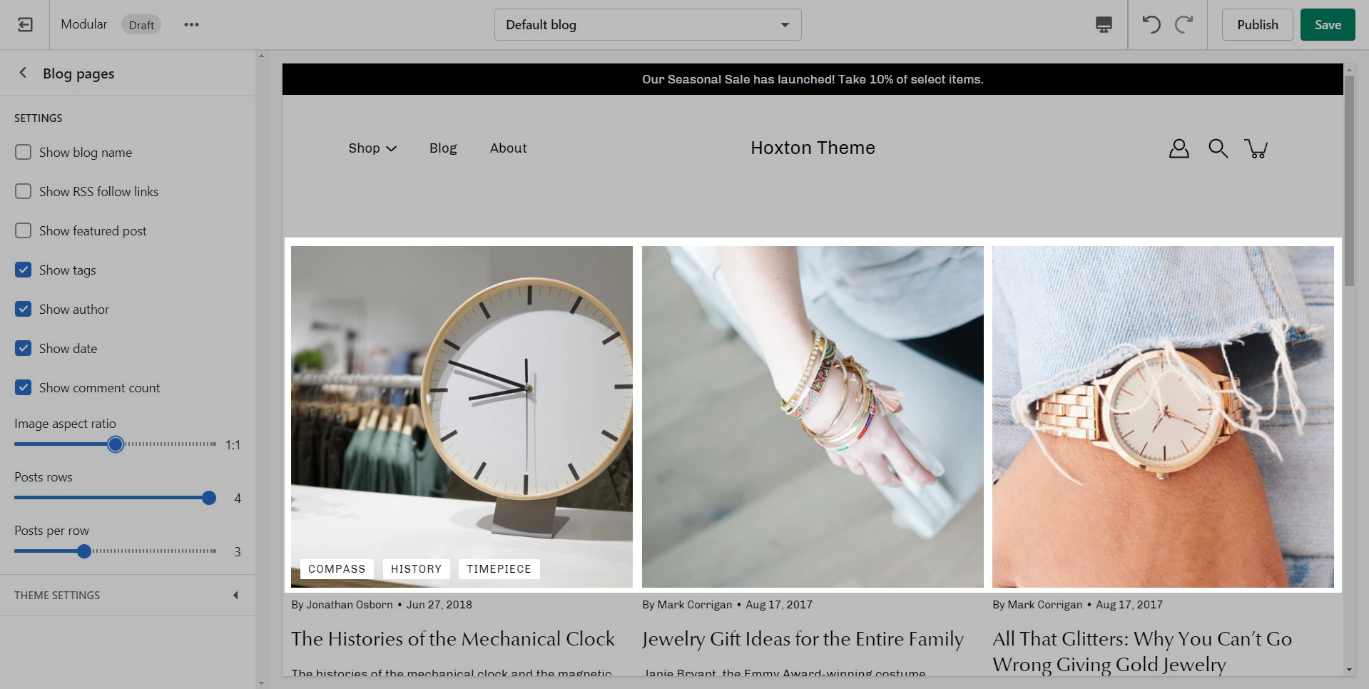
Blog pages are meant to be a simple assortment of articles but who's to say you shouldn't customize them?
The blog pages section holds a handful of settings but they can be quite important. These settings can be accessed by first navigating to the blog page you're looking to edit.
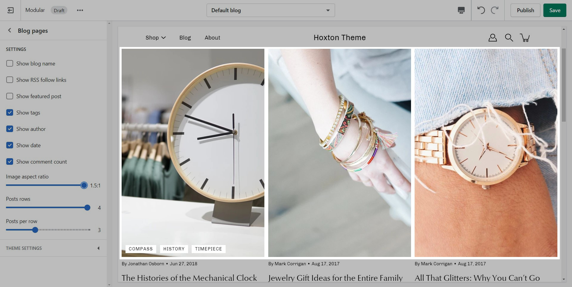
Modular displays a rich grid of all your blog post articles. Click on blog pages to configure the layout of your blog index page.


Tip: To display them side-by-side use the block's "half" width setting.

The quantity picker option is also controlled by the "buy buttons" block.


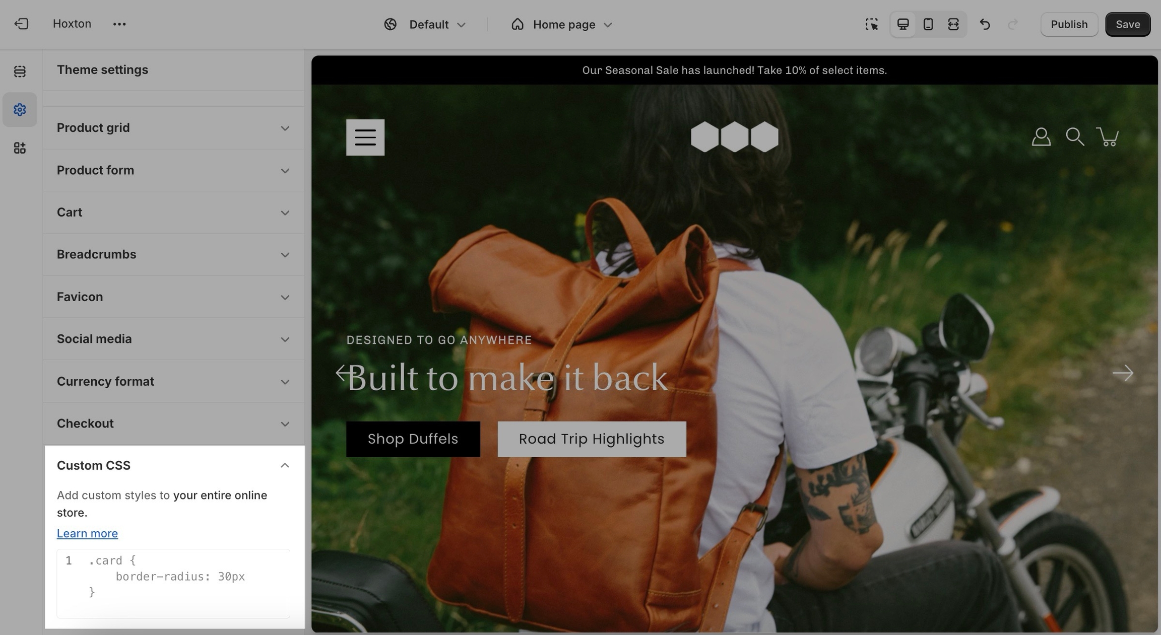

Image height: Setting this option will have the images displayed in the original height as uploaded. This option is quite useful if you want to have the full image displayed as there will be no cropping of the images.
For the best result on mobile view, we recommend using images that have a taller, or square, aspect ratio. Anything from 600px by 600px to 1200px by 600px (that's height to width) would fit the mobile aspect ratio the best.
Remember: Mobile devices are tall. You need to use an image that has a bigger height than it does width in order to fill the vertical aspect ratio.
Note: Because these settings keep the height static across all devices, the width will change. Your images may be cut off from the side so make sure that the focal point is in the center.
Note: It's important to use equal-sized images in terms of height for this option to maintain consistency in the slide height as the slideshow advances.
New templates need to be created on the published theme. They will not appear as a template option for assignments if created in a draft theme.
This is a Shopify platform restriction. Always make new templates on the live/published theme.
Flexible display: From displaying tags and author information to controlling the aspect ratio of featured images, you have the flexibility to create a layout that aligns perfectly with your vision.
Responsive design: Our blog posts section is optimized for a seamless viewing experience across devices, ensuring that your content looks great whether your visitors are browsing on desktops, tablets, or smartphones.
Padding controls: Adjust the padding at the top and bottom of the section to create the perfect balance between visual appeal and readability.
Text and call to action: Define your section's heading and customize the main button to invite your customers to explore the rest of your collection.
Layout options: As we mentioned above, there are two layouts:
- Grid: Show multiple rows of products. - Carousel: Show a single, scrollable, row of products.
Message and conveyance: Customize the text accompanying your featured collection by setting the text alignment, overwriting the collection title, and adding a short message.
Button styling: Add a compelling call-to-action button. Set its text, colors, style, and size.
Badges: You are now able to add multiple badges to your Image with text images.
Slideshow: Toggle navigation arrows, choose arrows and dots color, select transition style, and toggle autoplay with adjustable slide duration.
Width: Customize the section’s width by selecting between full-width or full-width padded options, controlling how the section spans across the page.
Height: Adjust the height of the slideshow. Use 'Image height' to show the most of your images.
Image settings: Choose the position and width of the image within the section.
Message and conveyance: Add text content and configure the call-to-action.
Image positioning: Control the position of the image within the mosaic layout, enhancing visual appeal and composition.
Overlay color: Add an overlay color to the image for a stylish and cohesive look, matching your brand's aesthetics.
Text content: Add descriptive text to accompany the image, providing context or highlighting key features.
Image block: Showcase additional images with associated buttons for seamless navigation or product promotion.
Video block: Embed videos with customizable overlays, creating interactive and immersive experiences for your audience.
Product and collection blocks: Highlight specific products or collections directly within the mosaic layout, facilitating product discovery and sales.
Product Collages: Feature multiple product shots in one grid for an overview of new arrivals or bestsellers.
Lookbooks: Create a lifestyle grid by showcasing collections or brand stories.
Brand Storytelling: Use a mix of images and text to tell your brand’s story visually, guiding users through your offerings.
Recommended image sizes: The blocks of the section will change based on your device. With that in mind, there are no set sizes for the section or its blocks.
The best practice is to use images with the focal point in the center to avoid cropping. This ensures that the images look balanced across various screen sizes.
For retina displays, images should be created at twice the size of their block to ensure sharpness.
Blocks alignment: Choose between center or top alignment for text within each feature block.
Image aspect ratio: Fine-tune the aspect ratio of images to ensure they display perfectly within the section.
Visual storytelling: Use images and text together to create compelling narratives around each feature.
Engage with buttons: Encourage action and exploration with strategically placed call-to-action buttons.
Add features: Simply add new blocks to showcase additional product features.
Customize content: Tailor headings, descriptions, images, and button details to fit your product specifics.
Add a link to your announcement bar. If the 'link' field is left empty, no link is applied.
Change the background and text colors of your announcement bar section.

Note: The newsletter blocks in Modular can only create a new customer in your Shopify admin with the qualities of a subscriber (agreed to receive marketing emails). If you want to create more custom and more detailed mailing lists we highly recommend using third-party apps to manage them.
While there are a good number of different blocks, you can only use five blocks here. Be sure to use the ones you need the most.
Note: There is no option to remove the 'powered by Shopify' text in the section settings. To remove it, please check out our next post.
Please note that global settings can affect multiple sections and multiple pages.
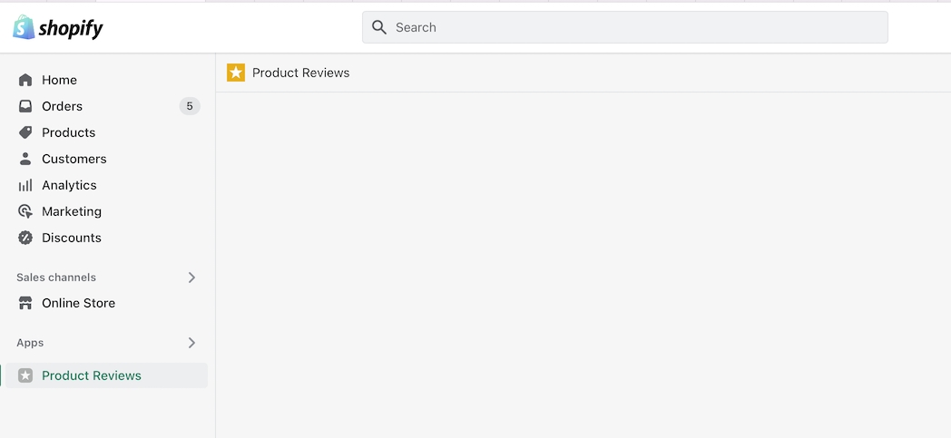
To accurately represent your product reviews and ratings you need to use a review management app.
The options here are predetermined and similar to most other themes.
Note: The navigation menu here is different from the header. It can not show dropdown items.
Only first-level links will be displayed.
If you're having issues with any of the fonts, it's recommended that you reach out to Shopify support.


This versatile section allows you to display a list of logos in an attractive and organized manner.
Logo showcase: Display logos of your partners, brands, or sponsors to build credibility and trust among your visitors.
Customizable background: Choose a background color that complements your website's theme and enhances the visual appeal of your logo list.
Logo size: Adjust the width of each logo to ensure consistency and visual harmony within the list.
Business collaborations: Showcase collaborations with other businesses and organizations.
Sponsor recognition: Acknowledge sponsors and supporters of your brand or events.
Affiliate marketing: Highlight affiliated brands or products to drive engagement and conversions.
Display options for product reviews app in Modular
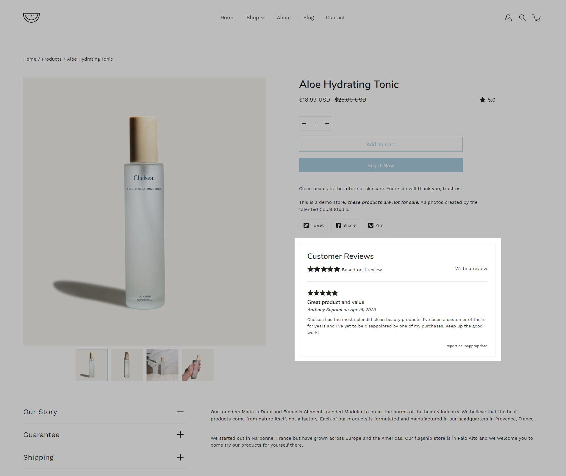
Modular has built-in support for Shopify's product reviews app. Star ratings can be shown throughout the theme.
Star and average rating value next to product name:
Individual reviews and forms to add a new review can be shown below the product description:
Collection page and product grid sections
Stars can be shown above product name and price:
The option to enable this can be found in the collection pages section under the theme settings tab.
Modular includes quick and easy settings in the theme editor to display ratings. The main requirement is that you have the Shopify reviews app installed:
If you don't have the app installed, use this link to download it.
For the product detail page, you can easily add the rating value, star, and the number of ratings from the price and title block under the 'product page' section:
There are checkboxes for the following:
Show star rating - Adds a star icon next to the rating number.
Show rating count - Displays the number of reviews for the current product.
Creating new JSON templates for your collections
When creating new JSON templates, you need to have at least one template to use as a base. The new Shopify theme editor is powerful and can create new templates without you ever needing to go into the theme code.
To create a new collection page template you need to click on the top drop-down menu and select the collections tab. From here, click on 'create template' after which give your new template a name, and choose a template to base it on.
After the new template is created, you will find it under the same collections tab in the drop-down menu. You will be able to set up each collection page template individually and create truly unique pages using this method.
Finally, after your collection page template is ready and customized all that's left to do is assign it to the collection it was meant for. You can do this by going into your admin panel and clicking on products > collections. After you locate the collection you're looking for, simply scroll down to the 'theme template' tab and select the appropriate page template.
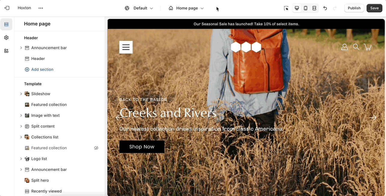
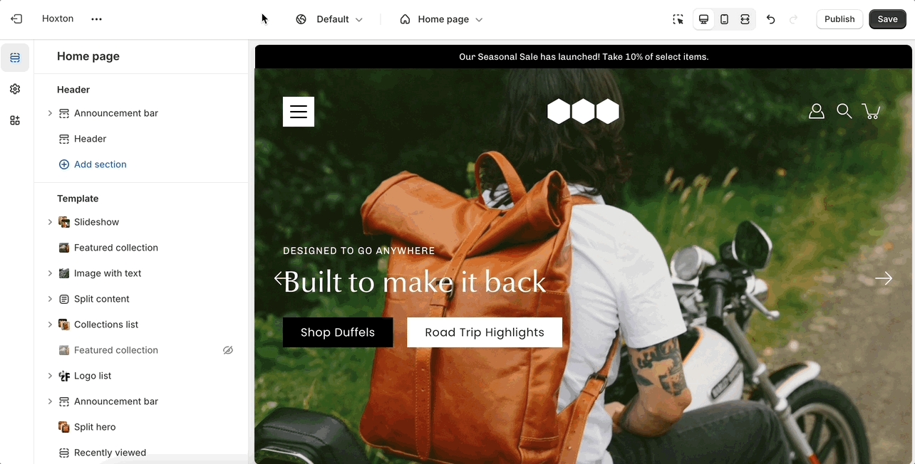
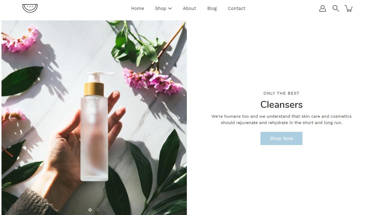
This is the perfect hero section for most stores. Use the slideshow to create a home page banner with incredible customizability.
Layout: Choose from various height options such as full-screen, fixed heights, or custom sizes to suit your design needs.
Arrows: Enable or disable navigation arrows for seamless browsing through slides.
Autoplay: Engage your audience with an autoplay feature that transitions slides at customizable intervals.
Styles: Select from slide, fade, or zoom-out transitions for captivating visual effects.
Badges: You are now able to add multiple badges to your Slideshow images.
Heights: Customize slide heights specifically for mobile devices to ensure optimal viewing experiences.
Image: Add desktop and mobile-specific images for each slide to optimize visual appeal across devices.
Content alignment: Align slide content as per your preference, whether centered, left, right, or bottom-aligned.
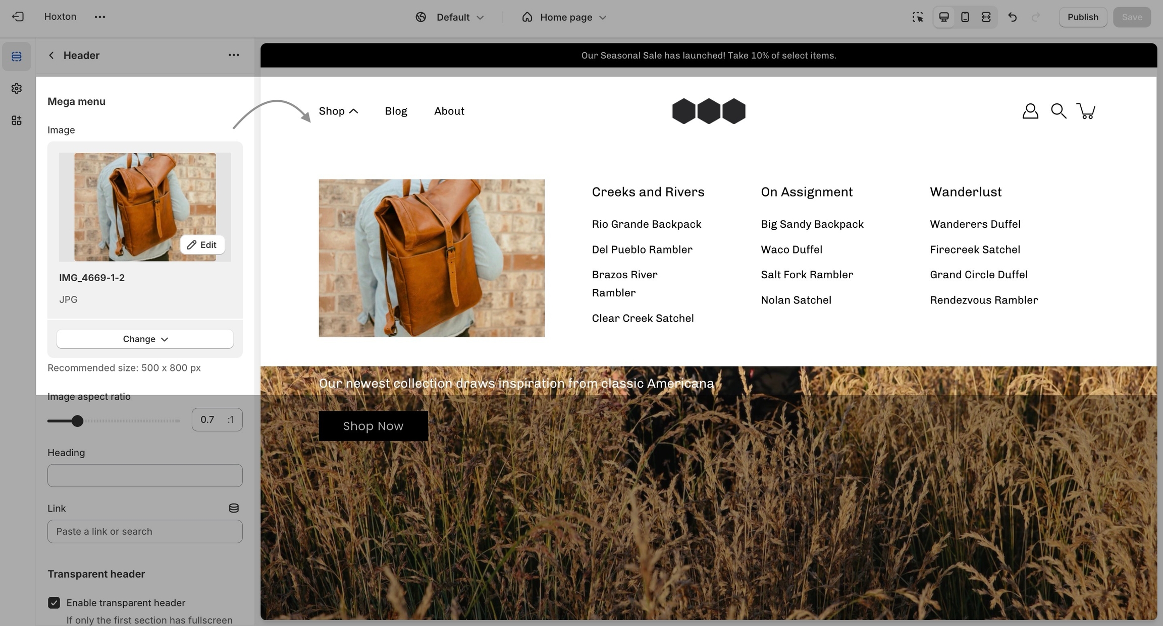
Setting up a mega menu for your header
A mega menu is a stylized submenu that allows you to also add an image and highlight a portion of your navigation. It can be used to put more links together and group them in a form of subcategories.
The mega menu feature in our Modular theme is automated, meaning that there aren't settings in the theme editor to enable or disable it. Instead, you'll need to create a navigation menu (link list) from your Shopify admin that has third-level drop-downs. There is a great article for settings this up by Shopify that goes into amazing detail about the process of creating drop-down menus:
Once you have set up your navigation menu, you need to make sure that the header section is using it. You can do so by opening your header section settings and checking which menu is being rendered.
Lastly, the mega menu feature will also allow you to add an image to the expanded state. You can also add a link and a title to it if you want to use it as a call to action.
If you have any questions that were not answered above, please refer to the FAQ section below. If you don't find your question in the FAQ section, please feel free to contact our support: support@presidiocreative.com
The mega menu columns resize automatically depending on how many second-level links there are. Setting up more than four columns is possible but they will break into a new line. This is done automatically to prevent your store from getting too cramped.
Yes, you can set up more than just a single mega menu by creating multiple submenus with third-level links. However, if you're using the mega menu image, it will be repeated across all mega menus.
In Modular, the cart popover is an AJAX cart solution. We build a dynamically generated cart without refreshing the page which allows for the flow to remain constant and uninterrupted.
This extends to the functionality of the 'add to cart' button to also update the Shopify cart object without having to refresh the page.
A lot of apps might not work with AJAX carts so if you are experiencing trouble integrating app code into the cart consider changing the 'cart type' to a 'page'.
The 'cart' icon can not show the number of items in the cart but the 'circle' icon can.
You can change the label for this checkbox but please note that enabling this option will disable the 'buy it now' buttons.
The reason for this is that their main function is to skip the cart page. If your customers must agree with the terms of your store, skipping the cart shouldn't be done.
A good question is why not add this to the checkout page but the scope of a theme stops at the cart page? As third-party theme developers, we do not have access to the Shopify core code and our theme does not have access to the checkout page template.
Modular includes ready-to-use page templates for your store including:
About
Contact
FAQ
Default page
These templates make it easy for you to quickly add content and build out pages that add value to your customer experience and company branding.
Pages are created in your Shopify admin under pages. Choose add page to create a new page:
Give your page a title (required), the content is optional. Next, choose a theme template to be used, also known as page template:
Using the theme editor, you can customize the template that's been assigned to your page:
You can start customizing the page with the pre-defined sections included in Modular. You can hide, reorder, remove sections that are included, and also add any new selection from Modular's list of over 25+ sections.
Learn more about using sections and blocks in Modular:
From the top drop-down menu select pages and click on create template. Give your new template a name and a template to base it on. This will make it so that there are one or two sections predefined but they can be removed or hidden later.
In Modular you have the option to select between two states of the collections list gird. You can either have all collections shown (in alphabetical order) or only have a few selected collections (in your own order).
To switch between them, you can use the radio buttons labeled 'select collections to show':
The 'all' setting will show all collections in alphabetical order
The 'selected' option will show all collections that you've added as blocks for the section. To add blocks to this section, you need to click on the small arrow next to the 'collections list' section and click on 'add collection':
You can also set a replacement image for each individual block:
A simple way to integrate your product description into the product pages section with an extra spacing option.


User-friendly interface: The image picker and URL input make it easy to add logos and link them seamlessly.
Padding control: Fine-tune the padding settings to create optimal spacing around the logo list, maintaining a clean and professional appearance.
Buttons: Drive conversions with customizable buttons, directing users to specific pages or actions.


Blog posts
Showcase the latest posts from one of your blogs on your store pages.
Collections list
Аdd links to collections you want to highlight on your store pages.
Contact form
Let your customers get in touch.
Custom HTML
Add your own HTML or Liquid blocks.
FAQ
A place to promote your services, and brand strengths and also include product reviews.
Featured collection
Generate blocks with links to each product page.
Featured product
Bring a product gallery and form to your store pages.
Icons row
Present short bursts of information to your customers.
Image with text
Use this more striking design to grab your customer's attention.
Image with text overlay
A great banner section for your store pages.
Logo list
Include partner brand logos.
Mosaic
A unqiue layout with great flexibility.
Newsletter
Display a small-sized newsletter signup message.
Product features
Showcase a product.
Rich text
A split text section.
Slideshow
A home page banner with incredible customizability.
Split hero
Showcase side-by-side images.
Testimonials
Add quotes from business partners and client testimonials to your store pages.
Video
A video background section.

This release is a major step forward: a top-to-bottom design modernization, four brand-new presets alongside a full overhaul of the Modular preset, and a wide set of new sections, blocks, and settings that give you more ways to merchandise, highlight, and style your store.
⚠️ Important - action required when upgrading If you're updating from a previous version, you'll need to reset your color and typography settings. The new palettes and type system replace the old ones, so existing settings won't carry over cleanly.
The whole theme has been redesigned with a cleaner, more contemporary feel. That includes refreshed product cards, a new icon set, faster animations, and an updated slider — small changes that add up to a noticeably more polished store.
Five distinct starting points, so you can launch a look that fits your brand out of the box.
Sparkling, Pattern, Companion, and Kiln join the lineup as brand-new presets — and the flagship Modular preset has been completely restyled.
Surface your key selling points, collections, products, anything, in a clean, layout that is built to convert.
Pair short blocks of copy with supporting imagery to tell a story, explain a process, or break down product features side by side.
A bold, oversized call-to-action that's impossible to miss (literally). Perfect for driving shoppers toward a sale, collection, or campaign.
Turn a styled lifestyle scene into a shoppable moment, letting customers buy multiple products straight from a single image.
Showcase your social and lifestyle content to add authenticity and social proof to your homepage.
Add a large logo to your footer for a more finished, branded close to every page.
Formerly the Image with text overlay section, Hero now gives you a more flexible way to build high-impact banners with layered content, supporting images, and badges - ideal for featured launches, seasonal campaigns, and other collections or products you want to put front and center.
The product form has been removed, but replaced with individual elements for better customizability.
Two new blocks for your product pages: an Icon block for visual callouts, and an Accordion block for tidy, collapsible details like sizing, care, or shipping info.
The Marquee section now supports Image and Icon blocks, so your scrolling banners can do more than text.
Now available on the Hero, Slideshow, Image with text, and Text columns with images sections - a modern way to highlight product features, brand identity, and more.
You can now display the product price directly on the ATC button.
Show a short description under your product titles using the theme.cutline metafield -great for surfacing a tagline or key detail right in the grid.
A new Subheadings badge style option.
A global "Rounded corners" setting for images and boxed elements.
Grid and Width settings added to every section.
The quick view CTA was coded from scratch to deliver a modern design that converts. It now appears at the bottom right corner
We've refreshed a lot under the hood, too:
New color palettes and a new typography system with updated styles and settings.
Image with text and Slideshow are now built with theme blocks, and Image with text overlay has been renamed to Hero — also rebuilt with theme blocks.
Testimonials redesigned and modernized.
Accessibility (A11Y) improvements throughout.
Top/bottom padding settings now available in every section.
Updated Language and Currency selectors.
Improved Add to cart bar on the Product page.
Ready to explore? Update your theme and take the new presets for a spin - and don't forget to re- setup your color and typography settings.

Quick view redesigned for both desktop and mobile.
Slider updated with a new fixed scroll setting.
Rich text and Split content sections gained background color, vertical padding, and border radius controls.
The Announcement bar is now the Marquee section, with additional text and color settings.
A "Heading SEO tag" setting added to all Heading blocks.
A new Header style added; two older styles — "Menu center, logo center" and "Menu right, logo left" — have been removed.
The Complimentary products block on the Product page now displays correctly.
Improvements to the Text block in the Mosaic section.


