Modular documentation
Support
Modular latest
Modular latest
  • Modular theme documentation
  • Sections
    • How to use sections
      • Section settings
      • Adding sections
      • Hiding sections
      • Reordering sections
      • Theme Settings
    • Modular sections
      • Announcement bar
      • Background video
      • Blog posts
      • Collections list
      • Contact form
      • Custom code
      • FAQ
      • Featured collection
      • Featured product
      • Icons row
      • Image with text
      • Image with text overlay
      • Logo list
      • Mosaic
      • Newsletter
      • Product features
      • Recently viewed products
      • Rich text
      • Slideshow
      • Split content
      • Split hero
      • Testimonials
      • Video
    • Recommended Image Sizes
      • Product Images
      • Blog Images
      • Slideshow Section Images
      • Catalog Banner Images
      • Product Feature Images
  • Theme Settings
    • Theme settings
      • How to make changes
      • Colors
      • Typography
      • Buttons
      • Appearance
      • Search
      • Product grid
      • Product form
      • Cart
      • Breadcrumbs
      • Favicon
      • Social media
      • Checkout
      • Custom CSS
  • Header
    • Announcement bar section
    • Header
      • Transparent header
      • Logo
      • Mega menu
  • Footer
    • Footer
      • Blocks and settings
      • Logo
      • Menu
      • Text
      • Newsletter
  • Products
    • Product pages
      • Pre-order
      • Product ratings
      • Creating new product page templates
    • Blocks
      • Price and title
      • Form
      • Product description
      • Social share
      • Store availability
  • Collections
    • Collection pages
      • Creating more collection page templates
      • Customizing the collection list page
    • Badges
  • Pages
    • Page templates
  • Blogs
    • Blog pages
      • Creating new blog page templates
  • Popups
    • Popup section
  • License
    • Theme license
  • Custom
    • Custom
      • How to add custom color swatches
      • How to make CSS customizations
      • How to set up custom filtering options
      • How to add custom fonts
  • Online Store 2.0
    • The new experience
  • FAQ
    • Frequently asked questions
      • Checking your theme version
      • Downloading the latest version
      • How to use sections
      • Section settings
      • Theme settings
      • Reordering sections
      • Hiding sections
      • Adding sections
      • Recommended image sizes
        • Product images
        • Blog images
        • Slideshow section images
        • Catalog banner images
        • Product feature images
      • Updating your theme
      • Sharing a preview link
      • How to remove the Shopify credit
  • Support
    • Contacting support
Powered by GitBook
On this page
  • Uploading your font files
  • Defining the new font families
  • Assigning your custom fonts
Export as PDF
  1. Custom
  2. Custom

How to add custom fonts

PreviousHow to set up custom filtering optionsNextThe new experience

Uploading your font files

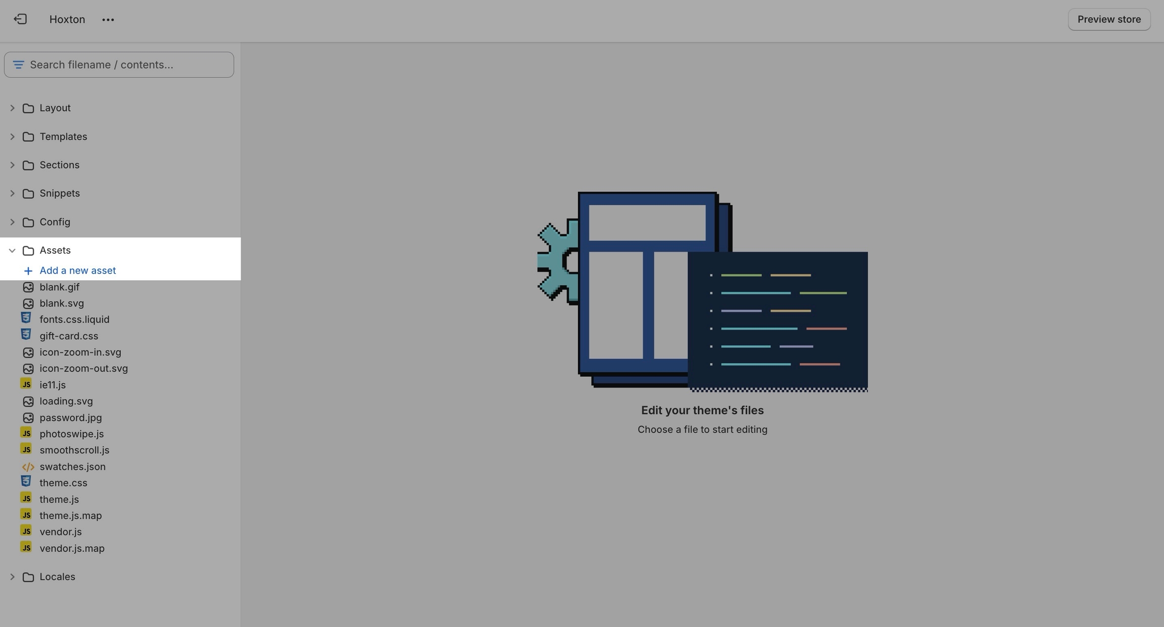
In order to use your own custom fonts, you will first need to upload the font files. To do this, you'll need to head on over to your online store > themes and click on actions > edit code.

From here, open the assets folder and upload your font files into it:

Defining the new font families

Now that we have the assets sorted out we can head on over to the 'css-variables.liquid' file. It's located inside the snippets folder.

Here you need to scroll all the way to the bottom and add a bit of code before the closing style tag (' {%- endstyle -%} '):

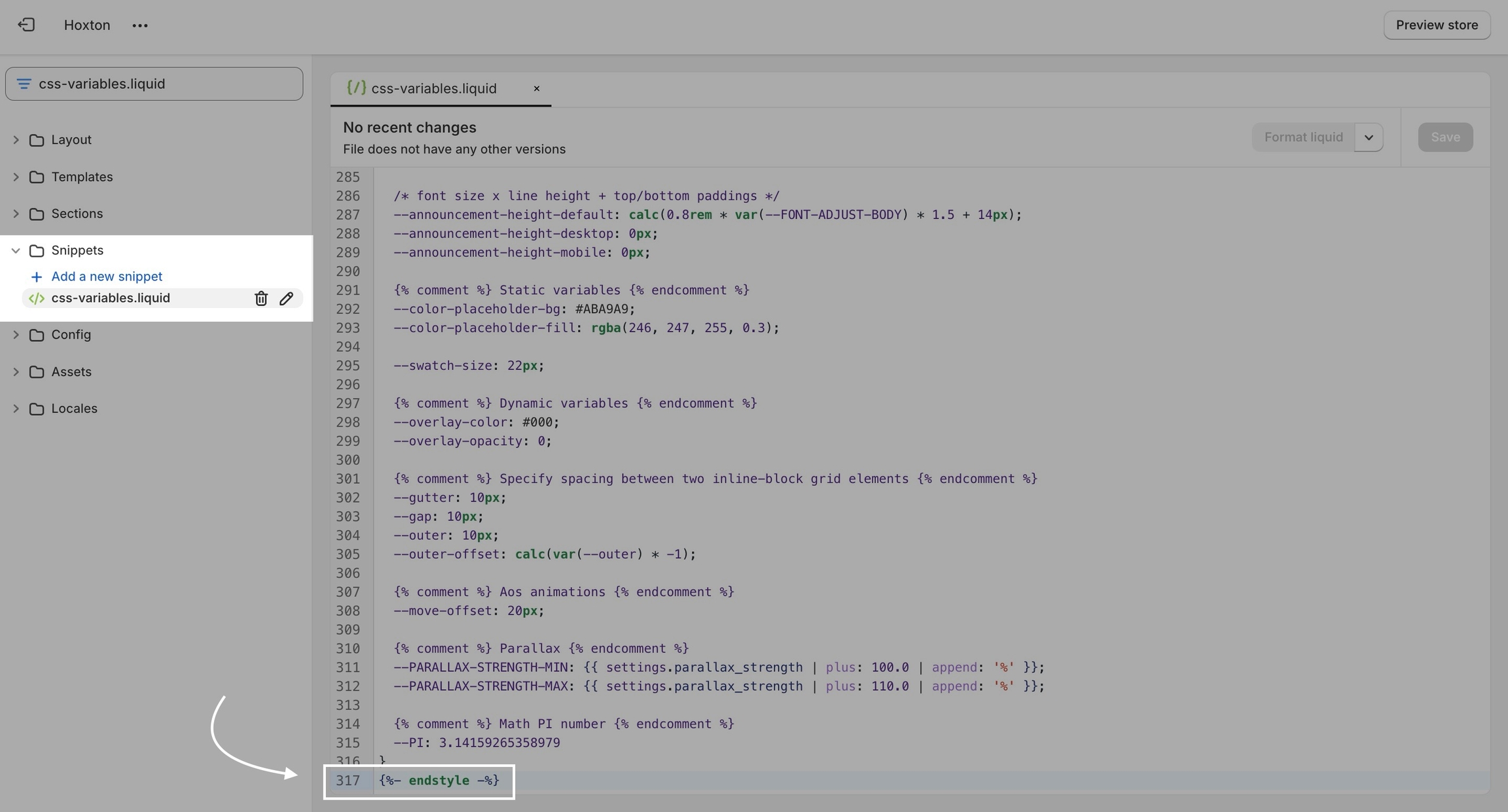
This is the place where you need to add this code snippet:

/* -- code to use Gotham font-family in theme -- */
 @font-face {   
    font-family: 'Gotham';  
          src: 	url('{{ "Gotham.eot" | asset_url }}');   
          src: 	url('{{ "Gotham.eot" | asset_url }}#iefix') format("embedded-opentype"),
        	url('{{ "Gotham.woff" | asset_url }}') format("woff"),
        	url('{{ "Gotham.woff2" | asset_url }}') format("woff2"),
         	url('{{ "Gotham.svg" | asset_url }}#GothamBold') format("svg");
         font-weight: normal;
         font-style: normal;
 } /* - end - */

In this code snippet, you need to replace all references of 'gotham' with your own font name and font files names.

If you have to upload more than one font, you need to declare each one individually and use multiple instances of this code snippet.

Assigning your custom fonts

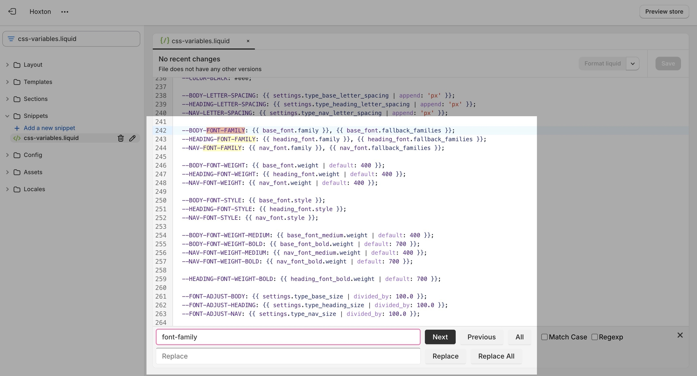
Finally, all we need to do is assign the new fonts to be used. There are two global font variables that control the fonts for the headings and body text.

You can easily find all of them by using CTRL + F (or command + F) and searching for 'font-family':

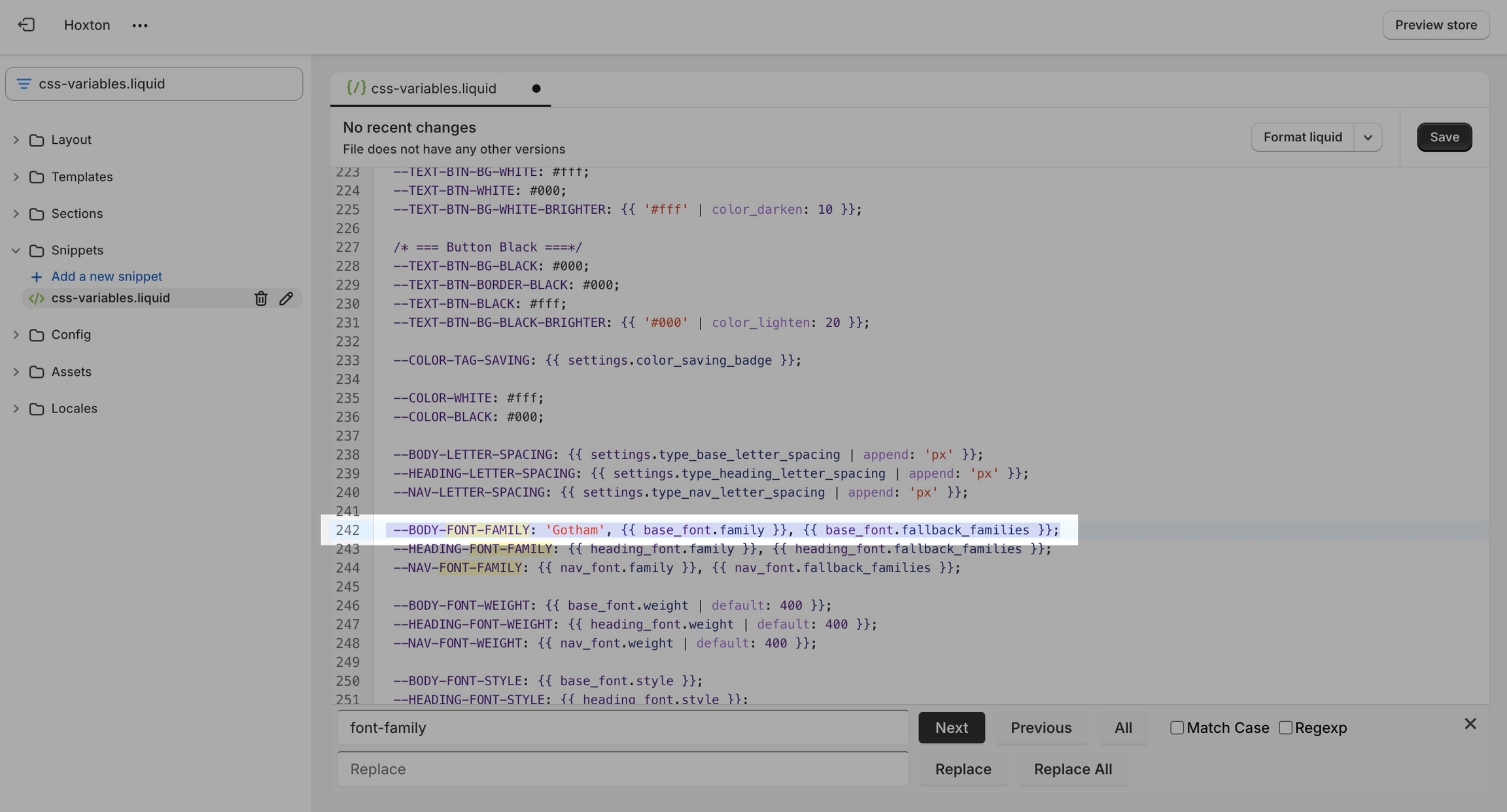
All you need to do here is to replace the first value assigned to the variables you're looking to change, we'll continue to use 'gotham' in our example to keep it consistent but this is also a place where you input your custom font name:

That's it, you're all set and ready to go. Don't forget to save the changes.