Modular documentation
Support
Modular latest
Modular latest
  • Modular theme documentation
  • Sections
    • How to use sections
      • Section settings
      • Adding sections
      • Hiding sections
      • Reordering sections
      • Theme Settings
    • Modular sections
      • Announcement bar
      • Background video
      • Blog posts
      • Collections list
      • Contact form
      • Custom code
      • FAQ
      • Featured collection
      • Featured product
      • Icons row
      • Image with text
      • Image with text overlay
      • Logo list
      • Mosaic
      • Newsletter
      • Product features
      • Recently viewed products
      • Rich text
      • Slideshow
      • Split content
      • Split hero
      • Testimonials
      • Video
    • Recommended Image Sizes
      • Product Images
      • Blog Images
      • Slideshow Section Images
      • Catalog Banner Images
      • Product Feature Images
  • Theme Settings
    • Theme settings
      • How to make changes
      • Colors
      • Typography
      • Buttons
      • Appearance
      • Search
      • Product grid
      • Product form
      • Cart
      • Breadcrumbs
      • Favicon
      • Social media
      • Checkout
      • Custom CSS
  • Header
    • Announcement bar section
    • Header
      • Transparent header
      • Logo
      • Mega menu
  • Footer
    • Footer
      • Blocks and settings
      • Logo
      • Menu
      • Text
      • Newsletter
  • Products
    • Product pages
      • Pre-order
      • Product ratings
      • Creating new product page templates
    • Blocks
      • Price and title
      • Form
      • Product description
      • Social share
      • Store availability
  • Collections
    • Collection pages
      • Creating more collection page templates
      • Customizing the collection list page
    • Badges
  • Pages
    • Page templates
  • Blogs
    • Blog pages
      • Creating new blog page templates
  • Popups
    • Popup section
  • License
    • Theme license
  • Custom
    • Custom
      • How to add custom color swatches
      • How to make CSS customizations
      • How to set up custom filtering options
      • How to add custom fonts
  • Online Store 2.0
    • The new experience
  • FAQ
    • Frequently asked questions
      • Checking your theme version
      • Downloading the latest version
      • How to use sections
      • Section settings
      • Theme settings
      • Reordering sections
      • Hiding sections
      • Adding sections
      • Recommended image sizes
        • Product images
        • Blog images
        • Slideshow section images
        • Catalog banner images
        • Product feature images
      • Updating your theme
      • Sharing a preview link
      • How to remove the Shopify credit
  • Support
    • Contacting support
Powered by GitBook
On this page
Export as PDF
  1. Footer
  2. Footer

Blocks and settings

PreviousFooterNextLogo

The footer in Modular has a lot of customizable elements in the form of section blocks. You can add in blocks by clicking the small arrow icon next to the footer section then clicking the 'add block' buttons:

While there are a good number of different blocks, you can only use five blocks here. Be sure to use the ones you need the most.

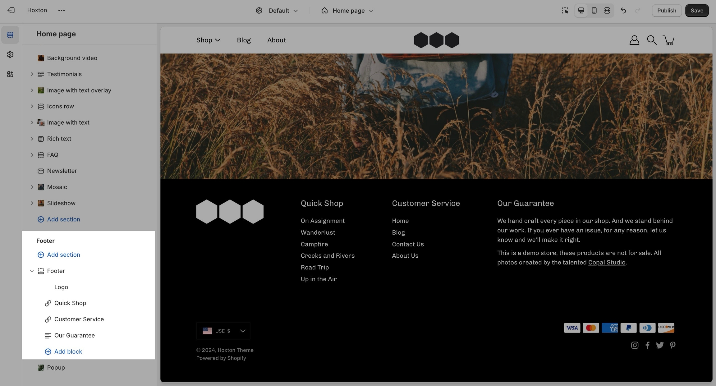
Footer section settings

Other than the individual blocks, the footer section also has a number of settings itself. You can set the background and text color for this section individually.

There is also the option to show payment icons, currency and language selectors, as well as a short menu in the bottom bar.

Note: There is no option to remove the 'powered by Shopify' text in the section settings. To remove it, please check out our next post.